Create Artistic Typography Designs with Amadine
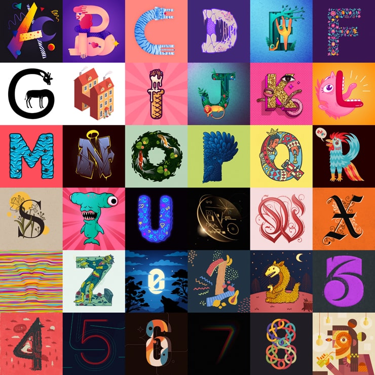
Every spring is a high time for new arrivals to blossom in each field with impressive improvements and trends. In the design field, this is the best opportunity for practicing and finding missing inspiration, checking the new 36 Days of Type challenge, which has been founded by Barcelona designers and is now supported enthusiastically throughout the world.
So graphic artists bring gorgeousness to reign by their creativity and accuracy. Thanks to a combination of software support and designer’s persistence, excellent results have been achieved by the Amadine Team. Customers are welcome to check them on the brand’s Instagram or a separate Pinterest board.
If you are looking forward to getting a new vibe in the field, stay tuned and analyze how stylish and attention-grabbing your heading can be. Onwards!
Typography Designs in 36 Days of Type
The Amadine team managed to show off both their skills and the program’s functionality. Overall, there were twelve styles presented at the expert and target audience judgment (listed in the spontaneous order):
- nature fonts;
- games;
- logo style;
- line fonts;
- icon art;
- neon light;
- image masking and negative space art;
- letters as cartoon characters;
- gothic styles;
- graffiti;
- 3D fonts;
- abstract effects.
Keep on reading to find out what these notions refer to.
3D Fonts
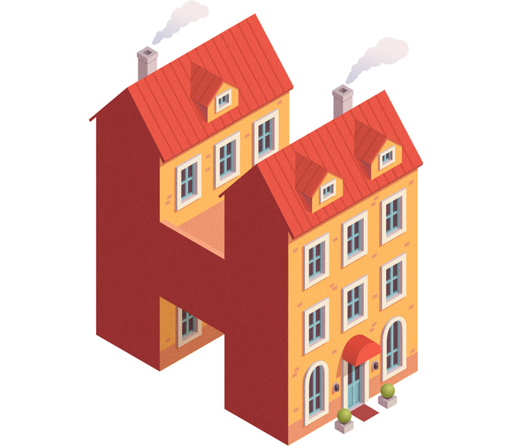
Without a doubt, this style often ranks first when it comes to choosing breath-taking and eye-catching designs. Apart from ultra-realistic elements when letters and numbers look like voluminous versions of average things, it is a great idea to experiment and make your layouts more fashionable—color fonts will become a great combination solution in this case.
Neon Light
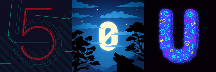
Black backgrounds with highlighted neon and glow signs are frequently associated with nightclubs and similar establishments. At the same time, this style is used for evening talk shows, shopping locations that work 24/7, etc. to ensure that life doesn’t end at 9/10/11 p.m. With the help of Amadine, this effect will be at your disposal and delight with its visual attractiveness in a twinkle of the eye.
Icon Art
Why not bring more associations to the ground? It is a great idea to remember how people start learning any alphabet. Apart from songs, they tend to remember the letter’s sound by notions that have the same beginning. This idea was taken at the core of this style, but nobody prevents you from going further. For instance, an “i” will look stunning as ice cream, “c” as a cookie, and more.
Nature Fonts
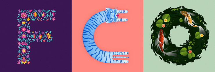
Being environmentally friendly is slowly becoming a lifestyle rule accepted and preferable by the majority of people. That’s why it is so easy to trace the connections between nature and things that surround us. Nature-oriented fonts aren’t necessarily green and flowery—they can be combinations of different rocks, water phenomena, plants, etc., and form a silhouette of a necessary layout.
Game Style
The game industry is big, really big. So nothing is surprising in its captivating powers and desire to find similar styles in the headings. Let’s be more precise—a letter can be a pure visualization of Fortnite, Hearthstone, or any other activity you are passionate about. Depending on the overall game style, the layout can vary from minimalist to somewhat overwhelming designs, where the major part is created in juicy colors and contrast combinations of the sample elements.
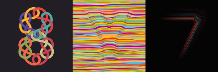
Lines
Do you like geometry? Then the idea of visualizing letters in numerous lines will serve you best. Their space orientation may differ from parallel lines of unlike thickness and colors to interconnected circles or signs of eternity.
Logo Style
In general, this format incorporates imagery and symbols. What differentiates it from others is the special necessity to be reproduced well at both small and large sizes, so tiny elements have to stay legible, regardless of the display scaling. The color divergence isn’t typical—monochrome or duo-chrome options are preferable. You can always learn more about the possibilities of Amadine in the logo design field.
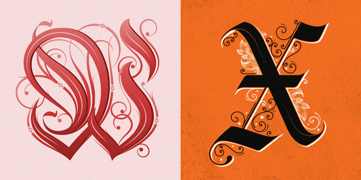
Gothic Vibe
When it comes to architecture, it is easy to define which buildings look gothically—they will have the flying buttress, the pointed arch, and the rib vault. But what about typography? In this case, let your imagination travel further than Halloween-themed parties. For instance, letters can become a reflection of gothic stained glass windows, frescoes, ornate decorations, and more.
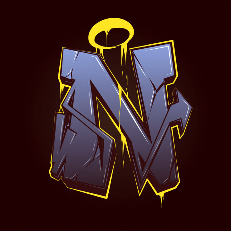
Graffiti
In a nutshell, graffiti is the art of painting on a surface (like building walls). There are numerous styles of this handwritten science, and it is a good idea to transfer this freedom and independence into the virtual universe. Feel free to experiment with tagging, as well as using blockbuster, sticker, stencil, wildstyle rules to boost up your typography.
Textures
What makes art so vibrant? There could be dozens of variants, but the one to note is texture. Without it, any image would seem plain and life-lacking. The number of textures is enormous, but the subdivision of soft, silky, rough, and slick surfaces.
In typography, adding extra visual effects to your layout is a key to finding the best way to express ideas on virtual papers. Making your letters just gray won’t be accepted as they’re crafted of metals like stainless steel. That’s why working on textures will bring the realism level of your layout to horizons.
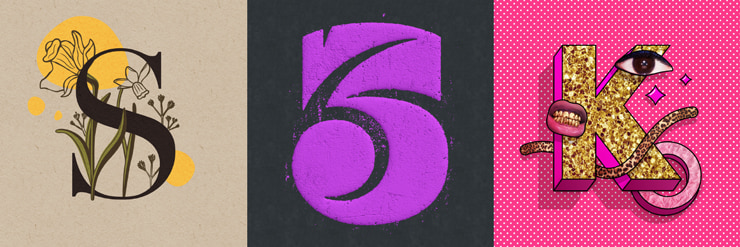
Image Masking and Negative Space Art
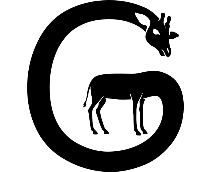
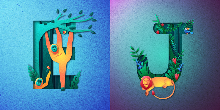
This format is a brilliant way to make standard fonts extraordinary. All you need to do is to create a foreground silhouette out of decorations you like and hide the basic letter behind it. The lines should be matching though. With the help of the space between an object in typography and another symbol, you are welcome to create your own visual story in different genres—from horror to fairy tales.
Letters as Cartoon Characters
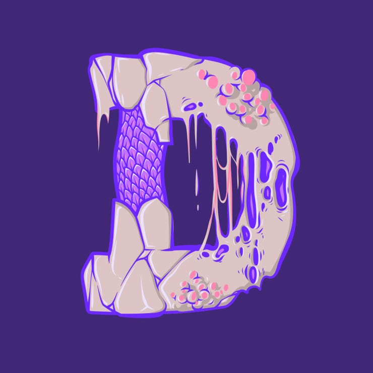
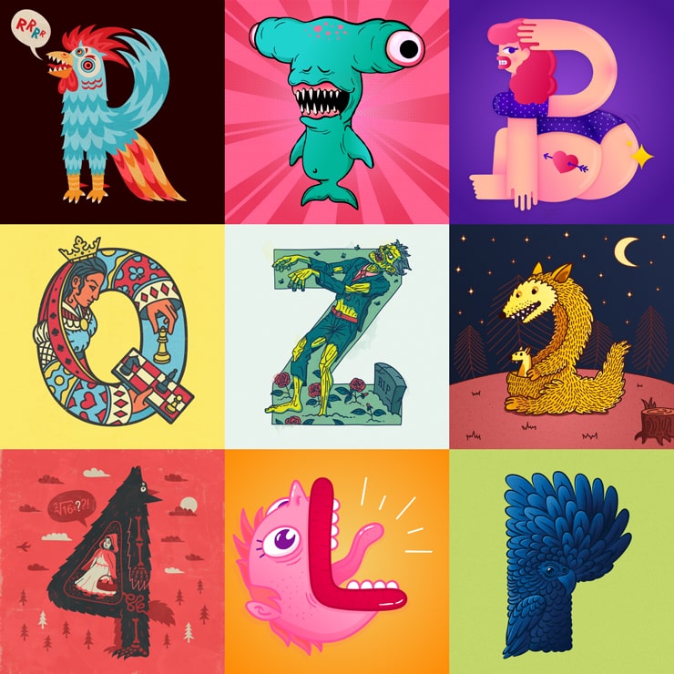
It may seem this style has a lot in common with the previous solution, but there is a huge difference between them—here fonts are the opposite layout from standard fonts. If it seems to you that the letter “P” looks like a beautiful bird, just visualize it. That could be animals and humans in different poses and showing divergent emotions with the only requirement to be recognizable as the elements they are associated with.
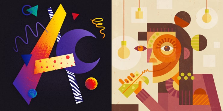
Abstract Effects
These designs are a pure reflection of graphic designer’s creativity. Whether you would like to mix some of the previously described styles or invent a new one, they would show off your sense of beauty. Of course, don’t hesitate to check what abstract art principles are to succeed. The main thing you need to know is that no matter how bizarre and foreign elements of your layout may seem if placed separately—this style allows creating their sound composition.
Conclusion
Each of these typography examples proves that any part of reality is magnificent. If you would like to avoid cases when your words are speechless, then being attentive to details and learning how you can implement your knowledge and improvisation in typography will turn your visual content into a treasure. This challenge can be accepted and achieved with the help of Amadine tools—just check it out!