What Are Pantone Colors and Where to Use Them
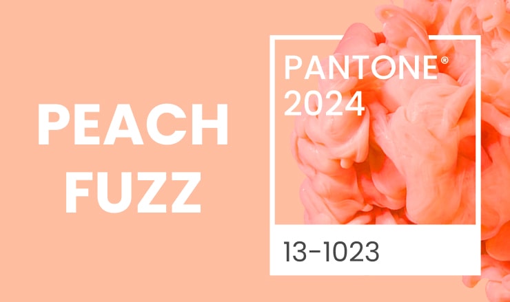
Pantone delivers a global color language that enables marketers and manufacturers to make color-critical choices at every process level. Pantone products and services are used by more than 10 million designers and manufacturers worldwide to help specify, express, and regulate color from concept to completion. Graphics, fashion, and product development may all benefit from these techniques, which work with various materials and finishes. Since the year 2000 Pantone Color Institute created a trendsetting tradition to name the color of the year. Notably the color of 2022, Very Peri 17-3938, was customly created specifically for this occasion and was designed to celebrate the resilience of humans during the pandemic. The color of 2023, 18-1750 Viva Magenta, brings a new philosophy of promoting a joyous and optimistic celebration. And in 2024 Pantone calls for sharing kindness with a velvety gentle peach tone 13-1023 Peach Fuzz.
Pantone Color Systems: What Are They?
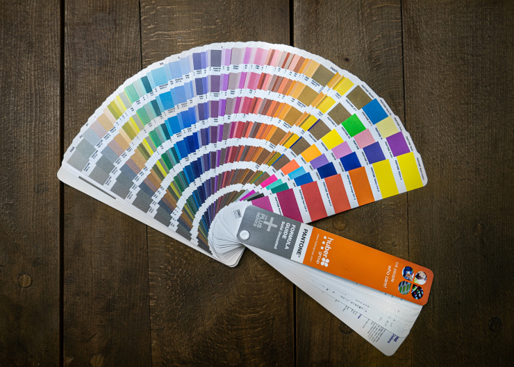
Pantone has two globally recognized regulated color systems: the Pantone Matching System (PMS), and the Pantone Fashion, Home + Interiors (FHI) system, which are differentiated because of their purposes and materials used. They were created to assist printers, designers and the fashion industry with color specification and management for printing and decoration jobs. Colors that you can’t combine in typical CMYK can be specified using the Pantone Color System. What is CMYK? The CMYK color process uses cyan, magenta, yellow, and black color bases. It’s a type of color model used in print work.
Pantone Matching System (For Graphics)
Pantone colors are identified by the number assigned to them. PMS 205, for example, is a pink color. The Pantone Color Matching System has over 1,000 colors, including metallic and bright hues.
A suffix after the color also identifies the solid palette. The suffix code represents the type of paper used to print the color. Coated paper, for example, is denoted by the letter C, whereas the letter M denotes matte paper, and uncoated paper is denoted by the letter U.
A Pantone Plastic Color reference number is utilized to fabricate colored plastic components. A Q or T precedes the color reference, followed by a three-digit number that identifies the color. For example, the letter Q denotes color imprinted on opaque plastic, while the letter T denotes color on transparent plastic.
Pantone Fashion, Home + Interiors (For Textiles, Coats & Pigments)
In the most precise, internationally recognized color system, you may quickly locate the colors that excite you and construct your palettes with 2,625 meaningful colors on cotton and 21 on nylon.
The Pantone Swatch Card is at the heart of the Fashion, Home + Interiors (FHI) color system. Swatch cards are the industry standard for all other FHI products. The Pantone Swatch Card offers color strength and color consistency and is made on a double-layered cloth to meet the most demanding color requirements in the business.
Digital spectrum data is used to support all FHI Swatch Cards, ensuring that your final output matches your concept. All Cotton, Nylon, and Polyester colors have swatch cards available. Each option has its own set of qualities, hence a set of colors that can only be achieved by that material.
When it comes to home decoration, interior design, and fashion, your color choices are based on off-the-shelf, full-size color standard specimens backed by spectral color data, so you won’t have to worry about matching your color. These will let you design your next color palette without issues, and you can liven up your home, fashion choice, or interior design right away.
Commercial Design Use of Pantone Colors
The Pantone Color System may be used by various producers in different regions with no direct interaction because it is guaranteed that all colors will match using this standard. Color uniformity eliminates any guessing, resulting in uniform artwork or company logos.
Pantone color is frequently used in manufacturing to define color specifications at the point of product development and decorating. Color products are manufactured when color palettes are blended with polymers to achieve the appropriate color for numerous custom order (or built-to-order) plastic objects.
The Pantone color system is frequently used to transmit color requirements from the designer to the producer to achieve color accuracy. The Pantone color system determines colors in graphics for accurate printing and in home design for decorating. Because colors might appear differently depending on the lighting, utilizing the Pantone color system will assure accurate color matching from idea to completion.
What Is CMYK Color System and How We Coordinate It With Pantone Colors?
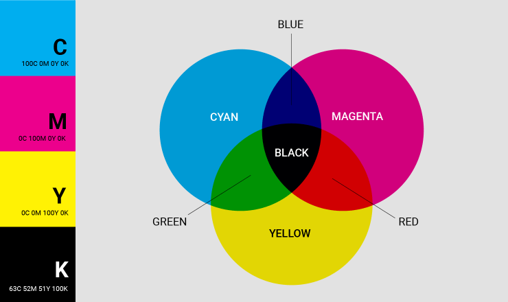
CMYK is an abbreviation for the four ink colors used in the printing process: cyan, magenta, yellow, and key (better known as black). These colors are created by mixing different RGB hues. Since the CMY plates in four-color printmaking are “keyed” (aligned) with the black plate’s key, the phrase “key” was initially used instead of black.
The CMYK model partially or completely masks colors on a lighter, generally white backdrop. The ink reduces the light that might normally be reflected. This paradigm is termed subtractive because inks “subtract” the hues red, green, and blue from white light. White light with red leaves turned cyan, green leaves turned magenta, and blue foliage turned yellow.
In Pantone (PMS) colors, CMYK can play a significant role. CMYK is used to recreate a specific subset of Pantone colors. Colors that can be replicated using cyan, magenta, yellow, and black inks are highlighted in specific rules. The bulk of Pantone’s colors, on the other hand, are made from thirteen basic pigments rather than CMYK (as well as black). These are meticulously blended to provide a range of distinct hues.
Where Do I Need Pantone Colors as a Designer?
Pantone’s main benefit is that it eliminates color discrepancies in print and digital media. Pantone color identification, though mostly employed in graphic design and marketing, has proven effective in a startling number of industries, including fashion, cosmetics, and real estate, to name a few. Therefore, designers can rely on the Pantone color system for consistency throughout production.
As Pantone colors are recreated with the help of CMYK color system, you cannot use it to its full potential with the graphic design apps which only rely on the RGB color system. That’s why Amadine introduced the CMYK color model with the 1.4.8 update. You can enjoy your vector graphics on both Macs and iPads (and iPhones) without worrying about the visual results if you have to print out documents in the future—Amadine has you covered.
Conclusion
Pantone colors were created to provide manufacturing, designing, and textile production a higher level of accuracy. Color matching is regulated via the Pantone system, making it simple to connect with producers and acquire the right color each time.
Pantone also offers a variety of Color Guides (and other color choosing tools) that allow you to explore colors matched to your business and media type, whether you’re working on a printed graphic design process or a textile for home furnishings.
Traditional printers use the Pantone Matching System to duplicate colors and graphics by generating inks in different hues. During the production process, some colors are difficult to achieve. Some colors of orange and green, for example, might take a long time to duplicate. The Pantone Matching System ensures color consistency. Therefore, it can be ideal for achieving consistency from concept to production.