Color, Gradient and Image Fill
The Color Panel
The Color panel lets you choose plain colors, create gradients or select an image to use as a texture. To open the panel, tap on the appropriate color button. For example, each Stroke item in the Appearance panel has its own color button.
The Color panel has individual sections for plain color, gradient and image. You can apply only one of these features at a time. You may need to use more than one feature, for example, an image and a color that tints that image. In this case, you should add two Fill attributes to the object: one for the image and another for the tint color.
Color
The Color tab lets you select a plain color.
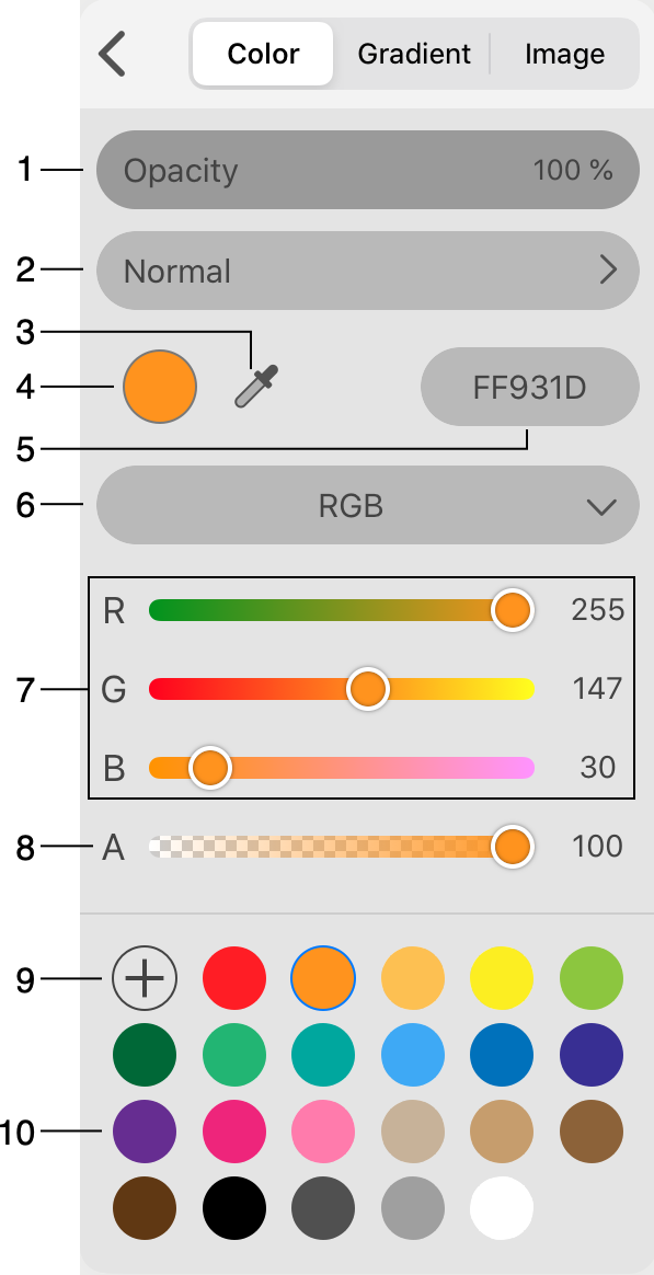
1 - Opacity. You can set up the opacity of the selected color. Unlike the opacity of an object or layer, here you can adjust the transparency of an object's part, for example, the object's body, while the stroke will remain opaque.
2 - Blend mode. It defines how the colors of Fill, Stroke and effects interact with colors below them. If you wish to select a blend mode for the whole object, use the Layers panel.
3 - Eyedropper tool. It helps you copy colors from other objects. Read Selecting Colors for more details.
4 - Sample of the currently selected color.
5 - Hexadecimal representation of the current color. By long-pressing, you can bring up the context menu that lets you copy or paste the value.
6 - Color model. You can select RGB, CMYK or HSB. There is also an option to choose Grayscale.
7 - Values of the primary colors that create the final color. The Grayscale color model has only one parameter here. If you select the HSB color model, the panel will show the Hue, Saturation and Brightness parameters. You can tap on the numeric value of any color to the right from the slider in order to edit it.
8 - Opacity of the current color. This opacity will be preserved if you save this color as a swatch. This opacity is independent from the effect opacity. The app applies both of them at the same time.
9 - Save the current color as a swatch.
10 - Library of color swatches. You can save a color to the library in order to use it at a later time.
Using Swatches
You can save a color as a swatch in order to use it later. The library of swatches can save you time when you need to apply the same color many times. The library contains a number of colors by default.
To save the current color as a swatch, tap on the plus button.
To restore a color from a swatch, tap on that swatch.
In order to delete a swatch, long-press it and choose Delete.
To delete multiple swatches, long-press on one and choose Multiple Delete. Then tap on swatches to select them. Finally, press the munus button.
You can change the order of swatches in the library. To do this, drag and drop a swatch to a new position.
The library of swatches works with gradients in the same way as described above.
Gradient
You can create either a linear or radial gradient. To select one of the types, tap the corresponding button that is located above the gradient preview field. The Gradient Fill section explains how to create and modify gradients.
Linear Gradient
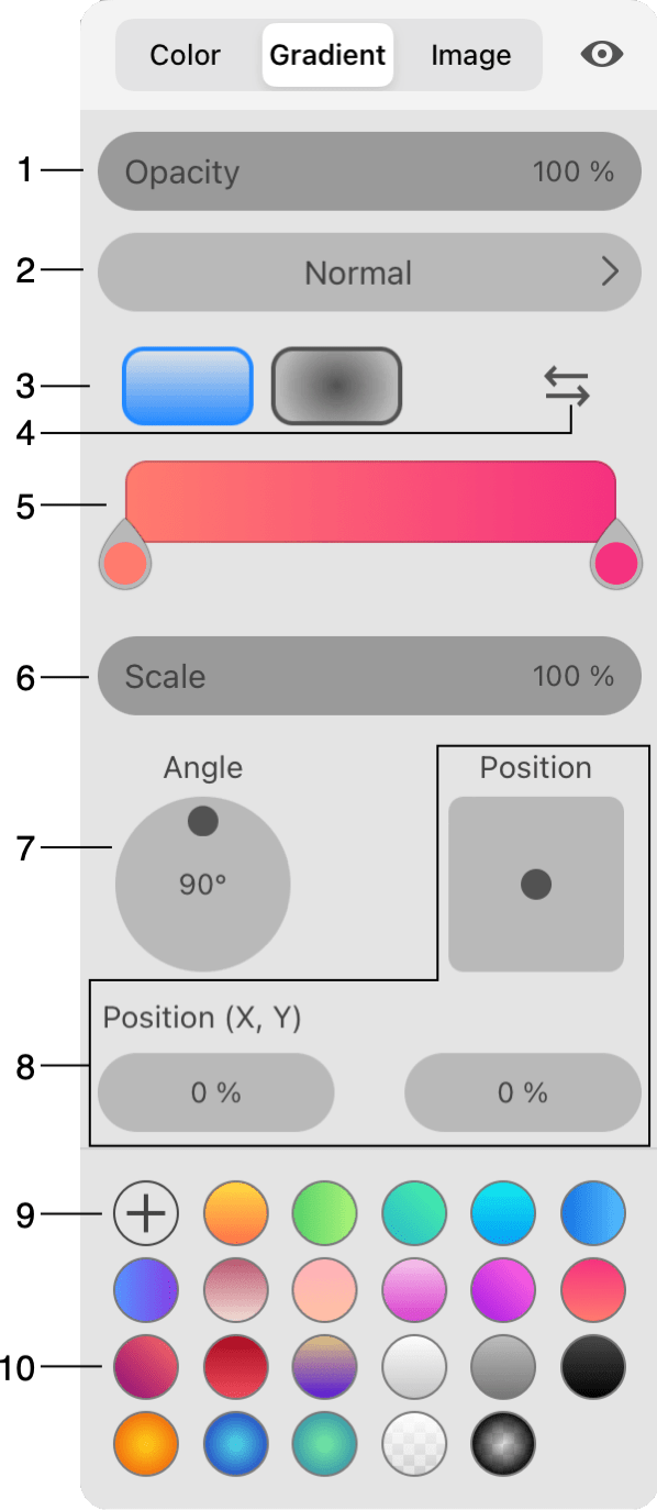
1 - Opacity of the whole gradient. You can also adjust the opacity of the colors that create your gradient. This lets you create a transition from some color to a fully transparent area.
2 - Blend mode. It defines how the colors of Fill, Stroke and effects interact with colors below them. If you wish to select a blend mode for the whole object, use the Layers panel.
3 - Buttons to select the linear or radial gradient type.
4 - Reverse the direction of the gradient. The result will be similar to rotating the gradient by 180 degrees.
5 - Gradient preview field. This is not only a preview but a tool to adjust your gradients. We will describe later how to use it.
6 - Scale adjusts the width of the color transition area in relation to the whole size of the gradient.


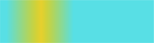
With 20% scale, the pure black and red colors took up most of the image space.
Note that the preview doesn't change when you adjust this parameter. Therefore watch how the object with the gradient updates on the canvas.
7 - The angle of the gradient. You can rotate a gradient in relation to the object it was applied to. Changing the angle doesn't affect the gradient preview field.
8 - Offset of the gradient from the centered position. Drag the round handle and preview the result on the object to which the gradient was applied. Use the X and Y fields to set up the offset precisely.

9 - Save the current gradient as a swatch.
10 - Library of swatches. You can save a gradient to the library in order to use it later.
Radial Gradient
Radial gradients share most options with linear gradients. Let's look at those that are specific to radial gradients.
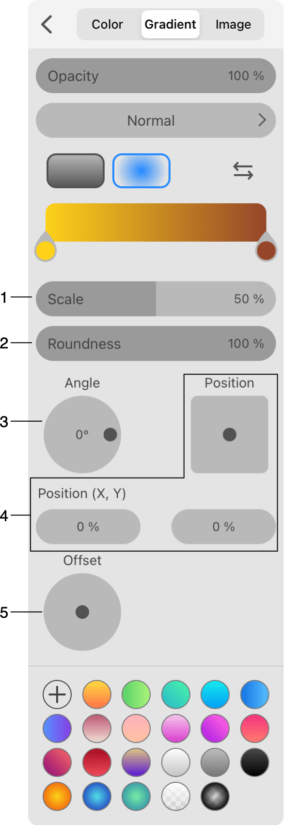
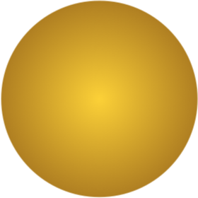
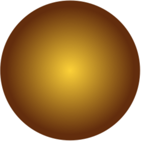
1 - Scale adjusts the width of the color transition area in relation to the whole size of the gradient. By adjusting this parameter, you can create objects that look like a sphere under different lighting conditions.
Note that the preview doesn't change when you adjust this parameter. Therefore watch how the object with the gradient updates on the canvas.
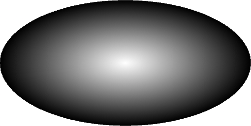
2 - Roundness changes the aspect ratio of the gradient. It is circular at 100%. If you decrease the value to 50%, the gradient will look like an oval with the height two times smaller than the width.
3 - The direction of a non-symmetrical gradient that has the offset applied.
4 - Offset of the gradient from the centered position. The original transition between colors will be preserved. Drag the round handle and preview the result on the object to which the gradient was applied. Use the X and Y fields to set up the offset precisely.
5 - Offset of the middle gradient color from the center. This property extends the gradient in a particular direction making it non-symmetrical. Drag the round handle and preview the result on the object to which the gradient was applied.
Image
The Image tab lets you fill an object with an image. There are various options that define the position and size of the image inside the object boundary.
For more details, read the Image Fill section.