Layout
Layout Basics
Your documents can consist of one or multiple sheets and layers. There must be at least one sheet and one layer at any time, and you can add or delete them as your work progresses.
Layers and sheets help you keep your document structure manageable even with a complex design by putting together elements that are related to one other.
Sheets
A sheet is an area on the canvas where you create your design. You can think of a sheet as a page in a text editor, or printable area. The boundary of a sheet defines a crop area. Objects placed outside the sheet partially or completely will be trimmed.
Sheets are located on the canvas side by side. Frequently, each sheet holds a separate design, but all of the sheets in a document are linked together as parts of a particular project (e.g., pages of a brochure, or different versions of the same design).
It is possible to change the size and position of sheets individually. You can learn about this in the Sheets section.
An example of how sheets can be used is a design of two states of a button: normal and pressed. It is useful to store all artwork in the same document. In this case, each button takes a separate sheet.

If you already used other graphics software, you could use the artboard term for what we call a sheet.
Layers
Layers can help you arrange objects within a sheet. A layer serves you like a folder, inside of which you can place objects. Properties, that you apply to a layer (e.g., visibility or opacity), will also affect the objects of this layer.
Objects added to a document are arranged as a layered structure. It becomes clear that, when you place objects one over another, they overlap. Objects are stacked even if they don't overlap. The program lets you put the objects in different layers (inside those virtual folders) without breaking the global stacking order. We can say that layers define the vertical structure of the document.
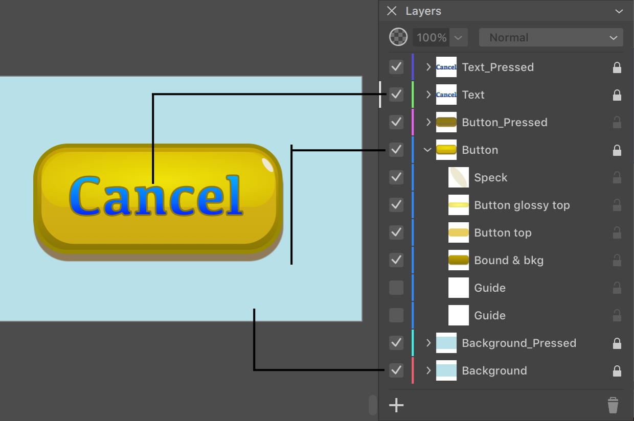
Let's have a look at a small example—a button. The artwork consists of three parts organized as three individual layers: Background, Button and Text. This structure lets us separate the design of the button from the background and text. The background was added only to preview the artwork with certain color around. The background won't be exported because the button will be used in the interface, which already has the background.
Taking text aside from other objects makes sense if it is a variable part of the design. We may need to create multiple buttons with different texts (e.g., "Cancel", "OK", etc.). In this case, you can place all of the text in a separate layer. By hiding all of the text but one, you can get one of the buttons. To edit the button itself, you hide the whole layer containing the text.

You can manage layers using the Layers panel.