Psychology of Colors in Illustration
People tend to see the world with all its beauty with open minds and hearts. However, that doesn’t mean at all there are no means to influence someone’s insights in a hidden way. A lot of specialists in today's competitive market are interested in attracting as many customers as possible. If you would like to evolve subconscious desires among your customers, it is definitely recommended to take into account the influence of colors on your target audience, especially in commercial illustration.
How Color Palette Choices Influence the Perception and Impact of Visual Design
In graphic design, the color palette is not just an aesthetic choice—it functions as a powerful tool that subtly shapes how a viewer perceives and emotionally connects with a visual piece. In the realm of illustration, where storytelling meets visual expression, the psychological undertones of color become even more vital.
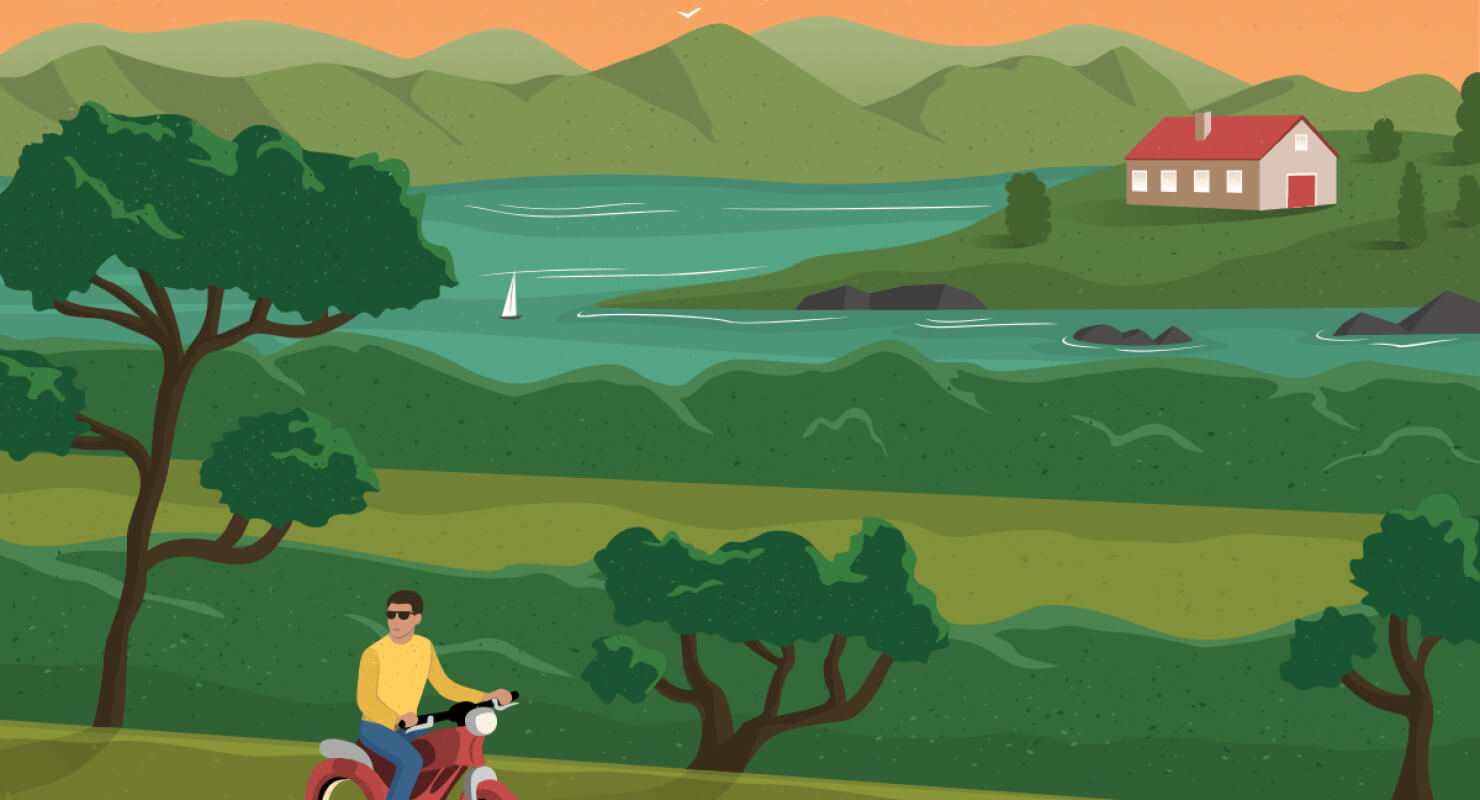
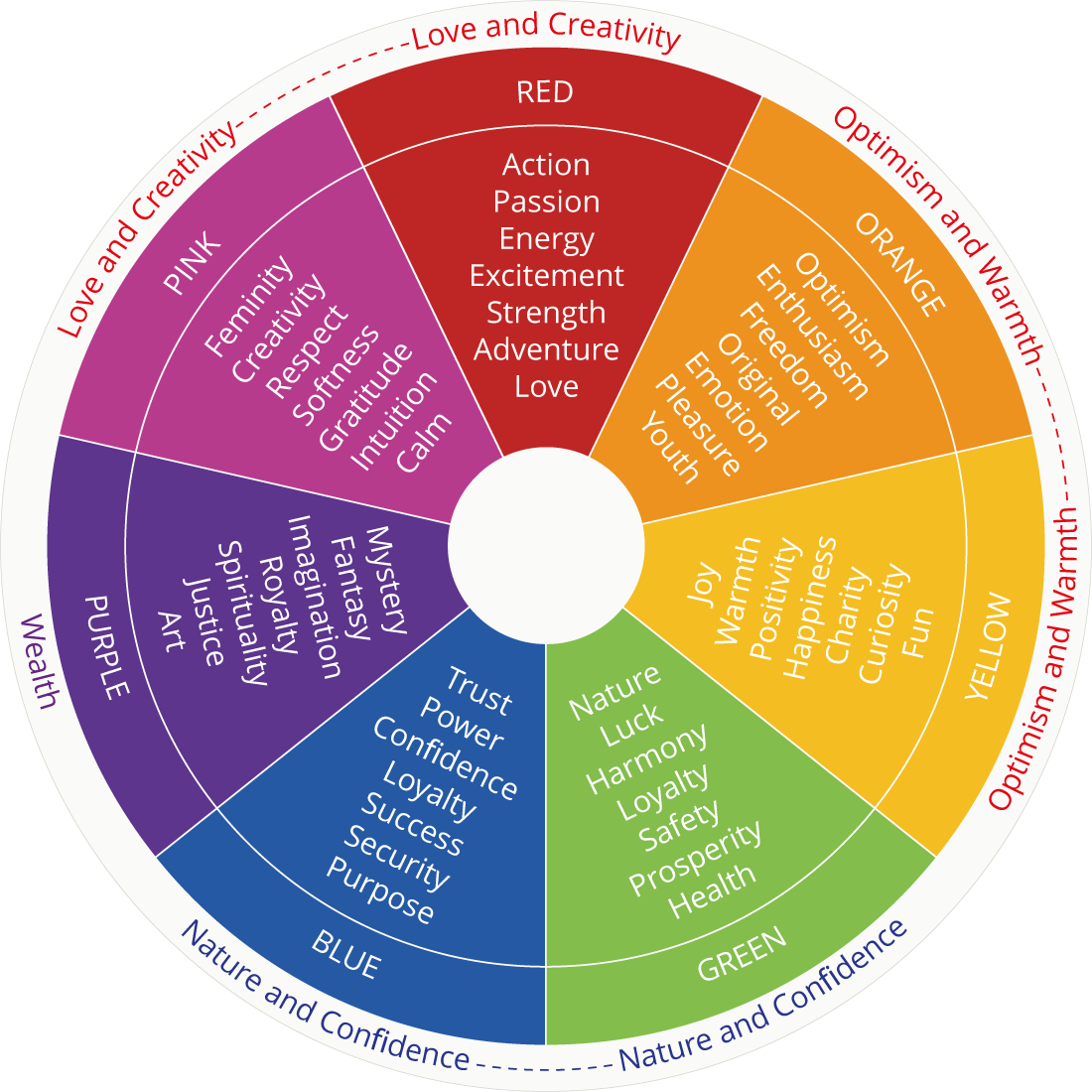
First, consider how colors invoke immediate emotional responses. Warm hues like red, orange, and yellow radiate energy, excitement, and warmth. A flash of cerise can spark a sense of urgency or passion; bright yellow might instantly uplift viewer moods with optimism and cheer. In contrast, cool shades such as blues, greens, and purples breathe calm, trust, and stability. A blue-infused scene can evoke serenity or professionalism, while green tones often suggest growth or eco-conscious values. By thoughtfully balancing warm and cool tones—such as pairing vibrant reds with tranquil blues—you can guide the viewer’s emotional journey, amplify narrative intent, and craft a nuanced visual impact.
Second, beyond emotional tone, palette choices deeply influence clarity, hierarchy, and focus within a piece. High-contrast combinations—like warm versus cool or light versus dark—naturally draw attention to specific elements, helping viewers intuitively understand what’s most important. For example, in branding or UI design, a bold orange call-to-action against a cool, muted background instantly commands attention and prompts a response. Conversely, analogous schemes—colors sitting next to each other on the color wheel—offer harmony and elegance, perfect for conveying unity or softness. When you understand how the psychology of hues works in tandem with compositional goals, you can forge visuals that resonate emotionally and communicate effectively.
Ruby-colored, Scarlet, Cerise: Red Palette
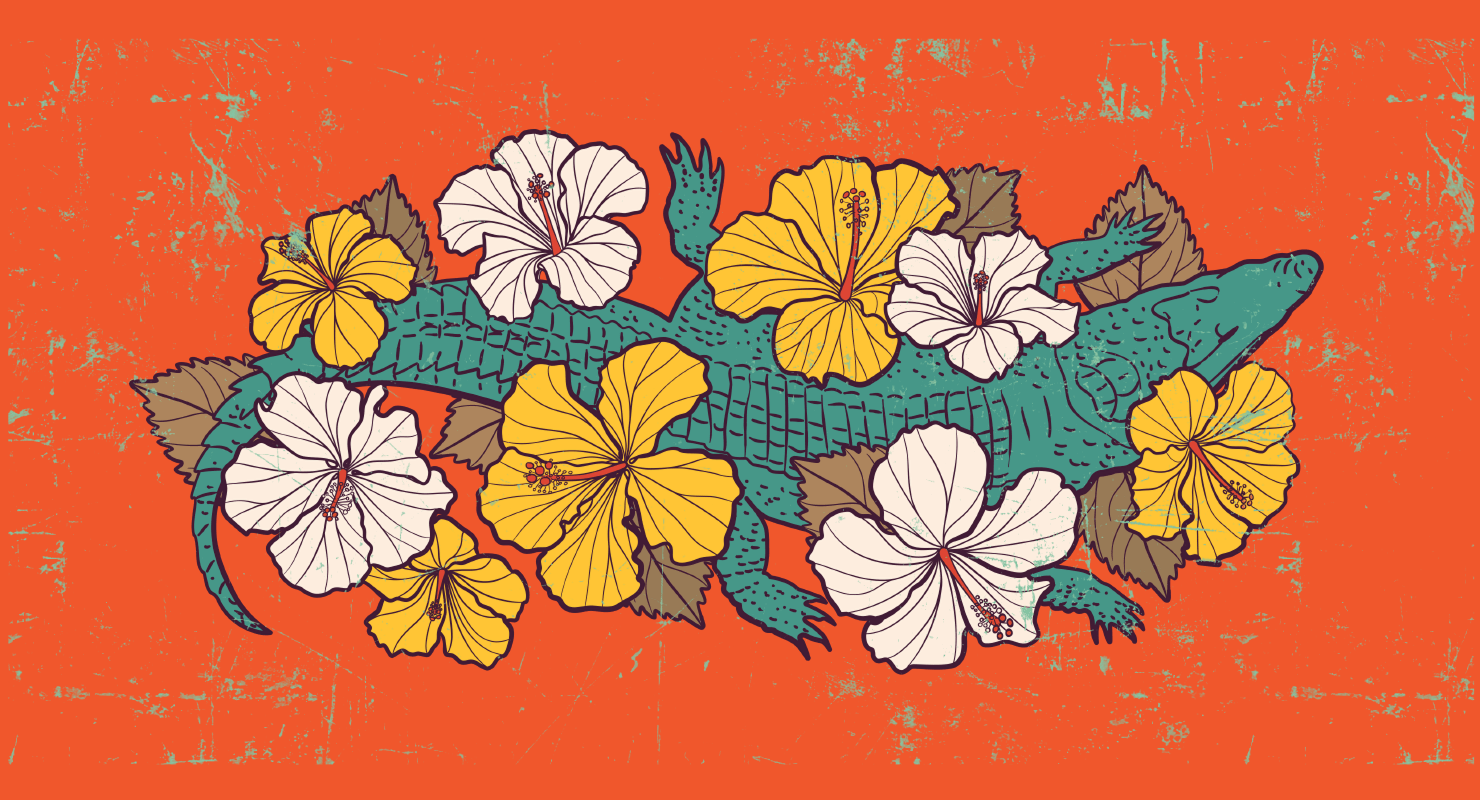
If you compare all the colors of the spectrum, you will obviously see that this shade is most noticeable among them. In this perspective, it is frequently used if shops or other establishments need to attract customers’ attention to particular things. For instance, that could be sale-signs or any sort of warning information. In general, the color indicates strong and extreme feelings and is connected with excitement. Illustration fill of red palette colors can evolve passionate memories or even aggression, so be careful when using them.
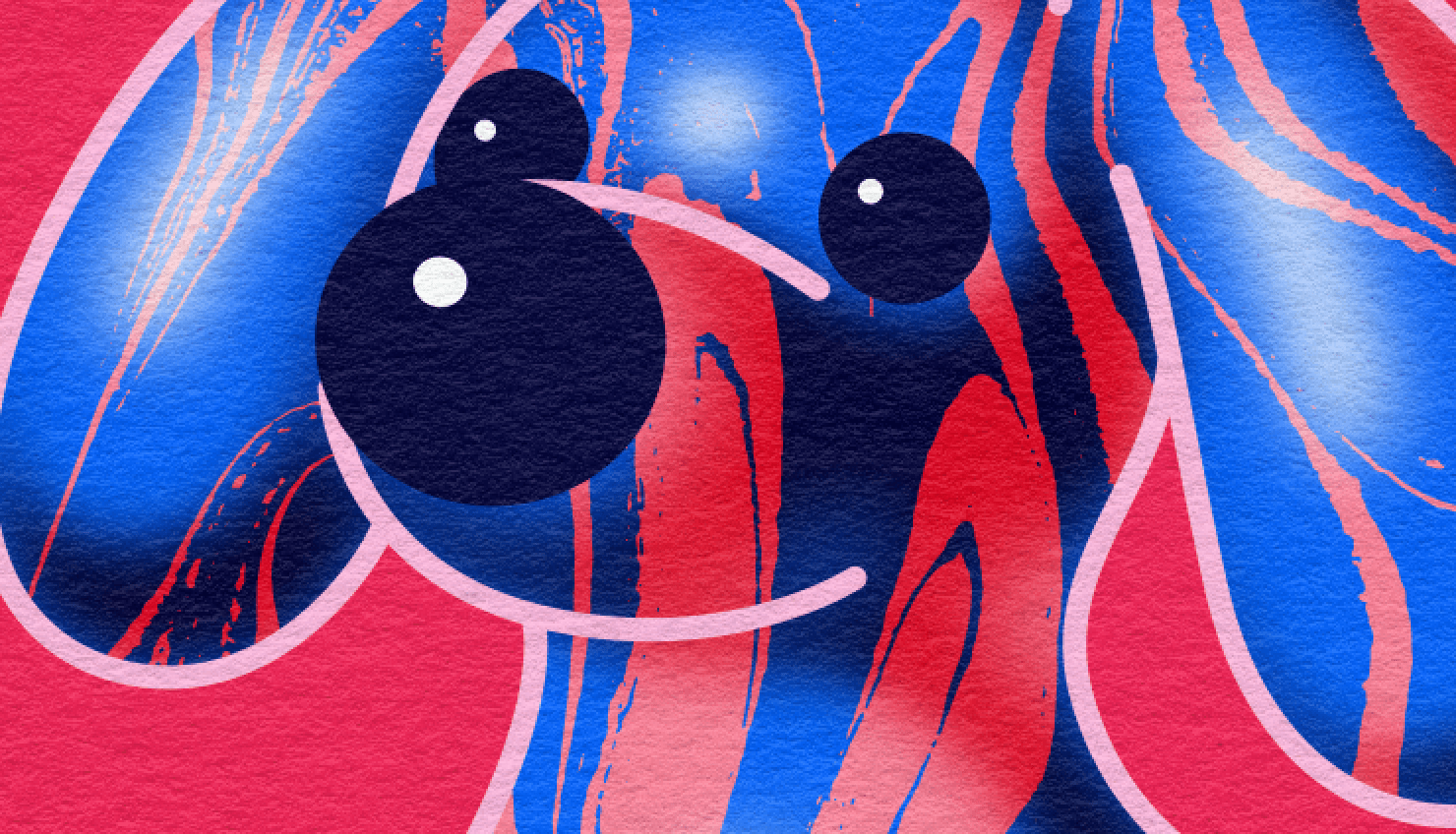
Navy, Azure, Ultramarine: Blue Palette
If you would like to add a feeling of calmness and security to the picture, you are welcome to apply blue elements. This color is a frequenter of bank websites and other platforms where reliability of the relations between a service provider and its target audience is to be highlighted. Such relaxing notes will influence careful consumers more.
Chartreuse, Emerald, Basil: Green Palette
In case you would like to make an accent of the environment-oriented values of your company in promotional materials and illustrations, green is always there to help you. Taking into account it is a sign of eco-friendliness, a lot of food producers and packaging companies prefer this color. However, shades are to be selected carefully. While light tones are more airy and fresh, dark green may evolve negative emotions. Anyway, this color is considered to be a sign of luck, and such brands as Animal Planet, Spotify, Tropicana just prove that.
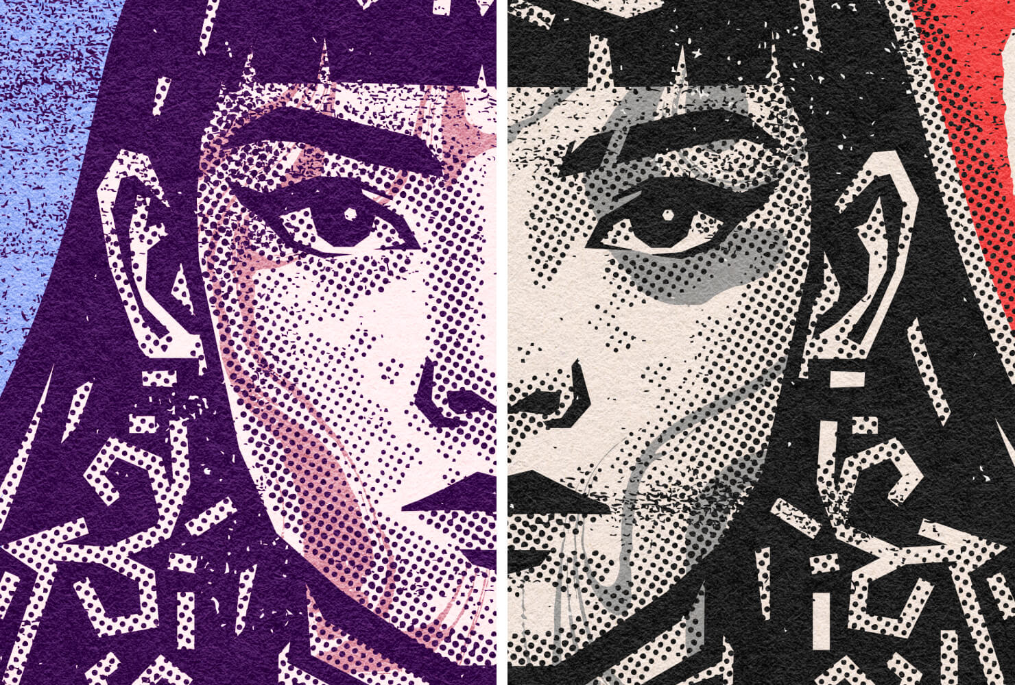
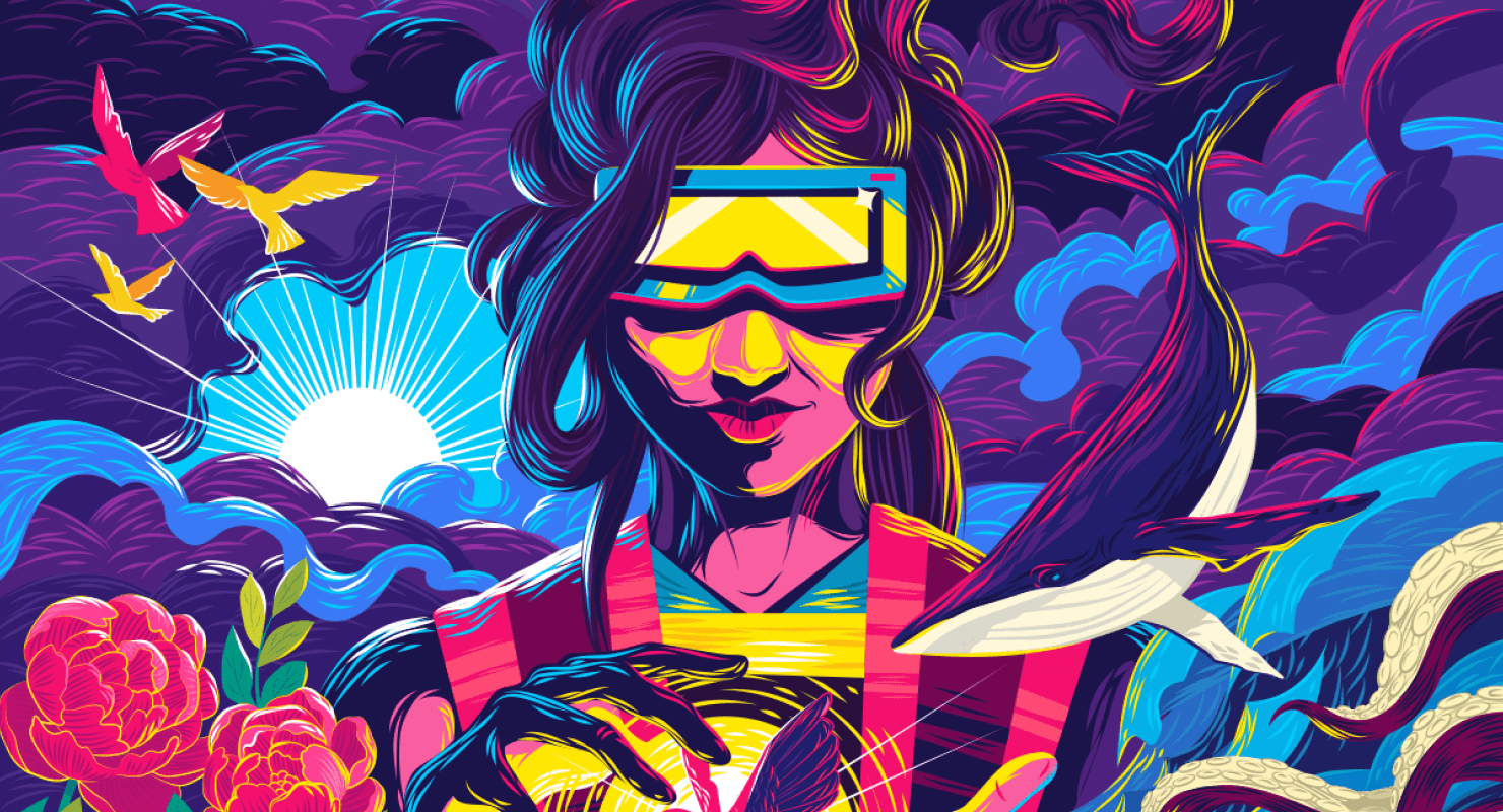
Violet, Lilac, Maroon: Purple Palette
This color is multifaceted, and each shade may have a particular influence on a personality. In general means, purple is deep and royal. Apart from defining something luxurious, this tone can be applied in the design to define mystery and magic. Choose the illustrations wisely, as thematically it’s more preferred in the industry of beauty products to attract wealthier visitors.
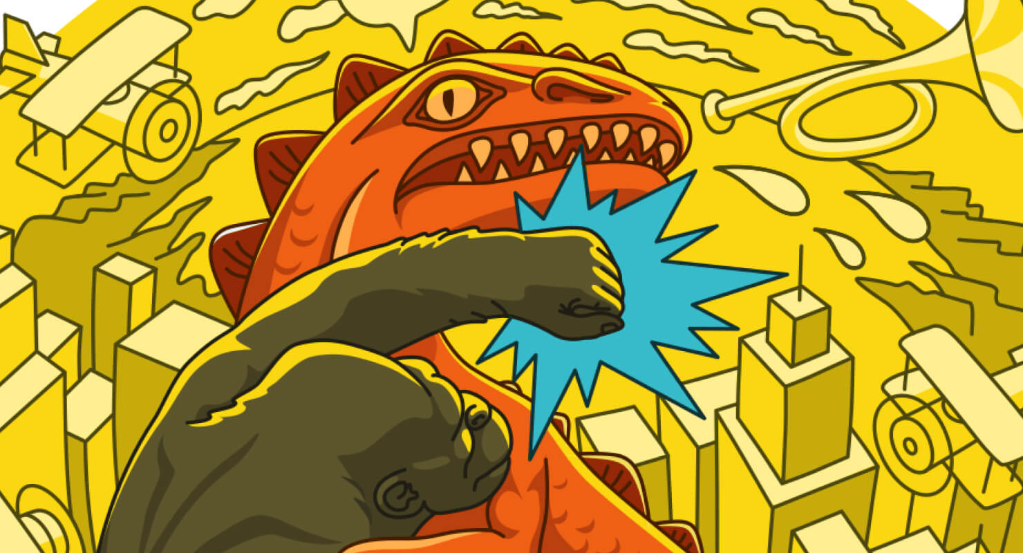
Gold, Amber, Canary: Yellow Palette
Positive emotions can be easily triggered by yellow and its shades. It is the best tool to make people cheer up and be more energetic. If you are to design youth illustrations or highlight creativity and joyfulness of particular activities, a yellow palette will definitely come in handy.
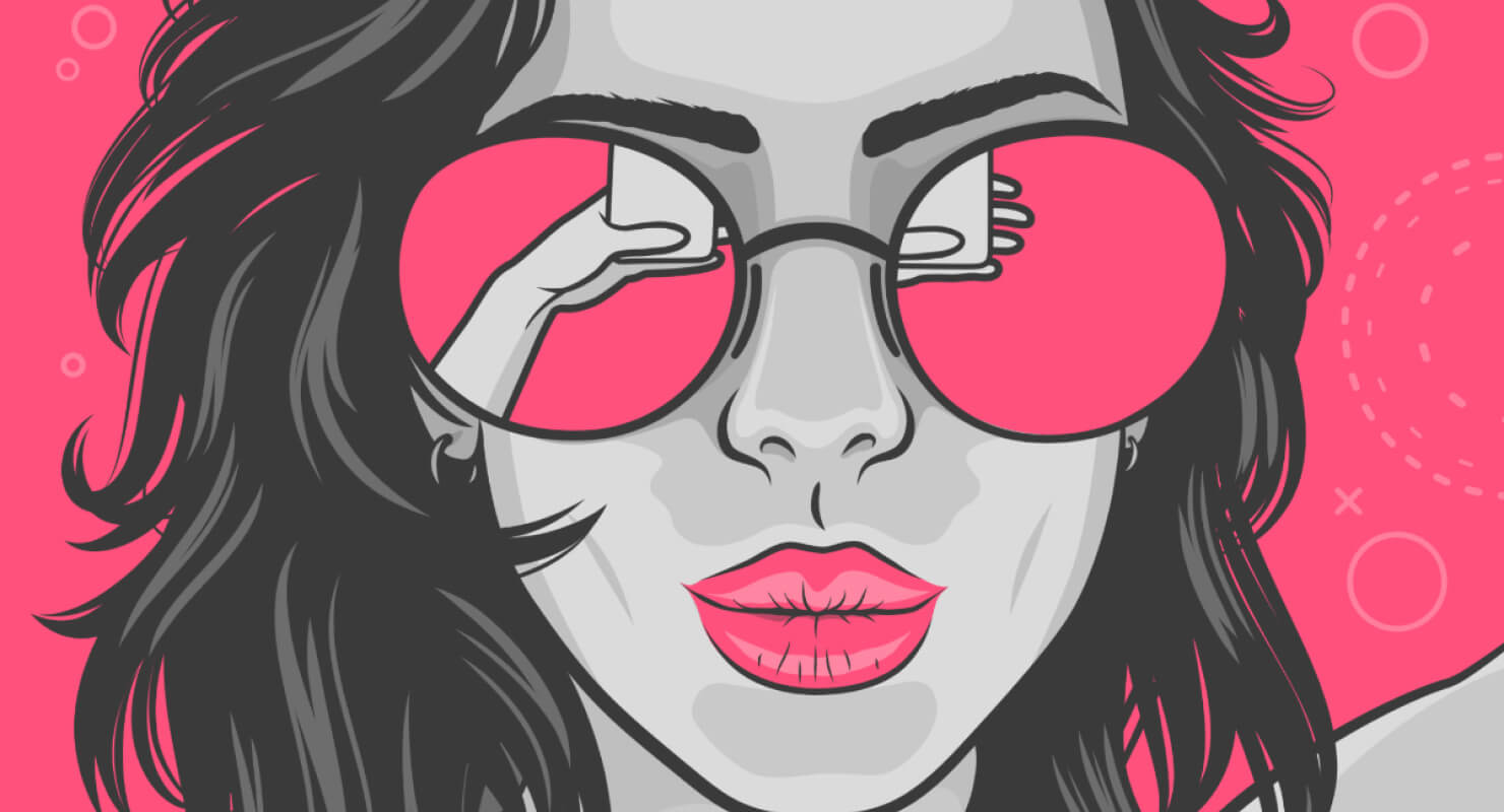
Fucshia, Watermelon, Rouge: Pink Palette
Without a doubt, things associated with romance and love are typically voiced with pink palette illustrations. This tone specifically focuses on a particular group of consumers. For instance, Barbie and other girlish goods like beauty products in pink style are designed for little princesses and queens, and consumers searching for such items will know what to look for.
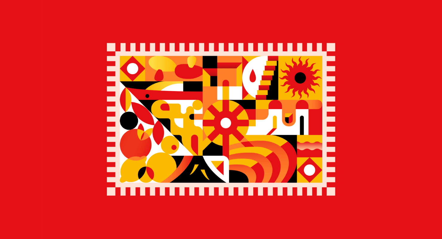
Bronze, Apricot, Tangerine: Orange Palette
Like yellow, orange has powers to create a positive and funny mood among customers. However, it is also applied when brands desire to show something cheap and economical. Be wise when combining this color not to undermine your illustration impact on the audience. One of the greatest examples of correct use of orange is the multinational technology company Amazon.
The Art of Color Matching
Of course, a lot of companies prefer mixed colors, and each component then creates its special influence on customers. For instance, several fast food enterprises prefer red and yellow designs to make people feel cherished and evoke their desire to eat more. If you want to find a winning combination for your particular needs, take into account the color wheel’s properties.
In simple words, that is a chart of colors which promotes understanding the correlation between tones, which are placed in a harmonious order. Cold color range includes shades associated with ice and depth, while warm colors remind individuals about heat, fire, summer, etc. Apart from this basic and logical division, there are other color categories that will help designers dive into the topic more fluently.
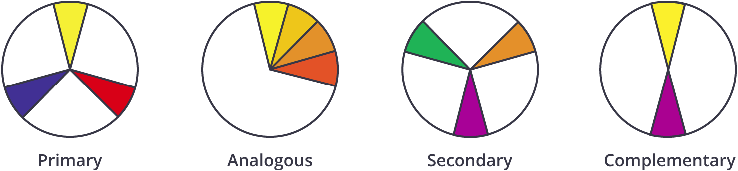
For instance, primary colors are blue, red, and yellow, and they are the best option to start with if you have no ideas. Then you can place secondary tones between them to find a perfect match.
The next scheme includes analogous colors which are located on the same side of the wheel (similar to fifty shades of green or red). If you would like to make your design full of contrast, then a complementary color wheel will help you most. It is like to find antonyms among colors—green and red or yellow and purple.