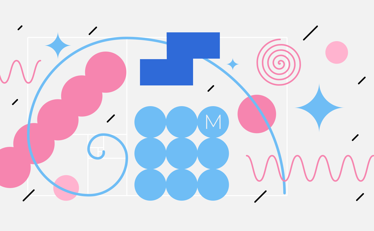
Composition in Graphic Design
Composition is a concept that focuses on many aspects and is undoubtedly of great importance in design. If this part of a design is lacking, you can immediately conclude that the design is bad. Even an amateur designer or an occasional creative artist knows that composition rules graphic design like a queen bee governs the hive. But, what is graphic composition? What are its primary means? Which types of composition do professionals use to differentiate themselves? The answers to all of these questions directly affect the final result of your graphics piece. That’s why we chose to thoroughly explore it in the article below. So, let’s dive into professional reading!
What Is Graphic Composition
Composition is a space in which individual elements must become one, where images, text, color and graphics become a single design in which everything is combined. In graphic design, composition is understood as a creative process aimed at ensuring the integrity, interconnectedness and harmonious combination of all elements. In any case, the whole needs an idea to really become a composition.
The Idea Is the Basis of the Composition
Anything can be perceived as a creative idea; it is not necessarily the starting point for creating a composition. An idea can also occur as an interpretation of an already existing composition. This also counts as a separate kind of idea. In graphic design, as in art, however, the idea is not always clear and understandable.
Rational and Emotional Information in Graphic Design
Graphic design targets the user. Everyone perceives information on two levels. When contemplating graphic composition, we always perceive it on both analytical and emotional levels. That is, you can tell stories only with the help of images without using words. And, our consciousness will read and decipher the message laid down by the designer. For this to happen, you need to understand graphic composition in more detail.
Components of Graphic Composition
Let’s take a deeper look into the key components of graphic composition.
Space
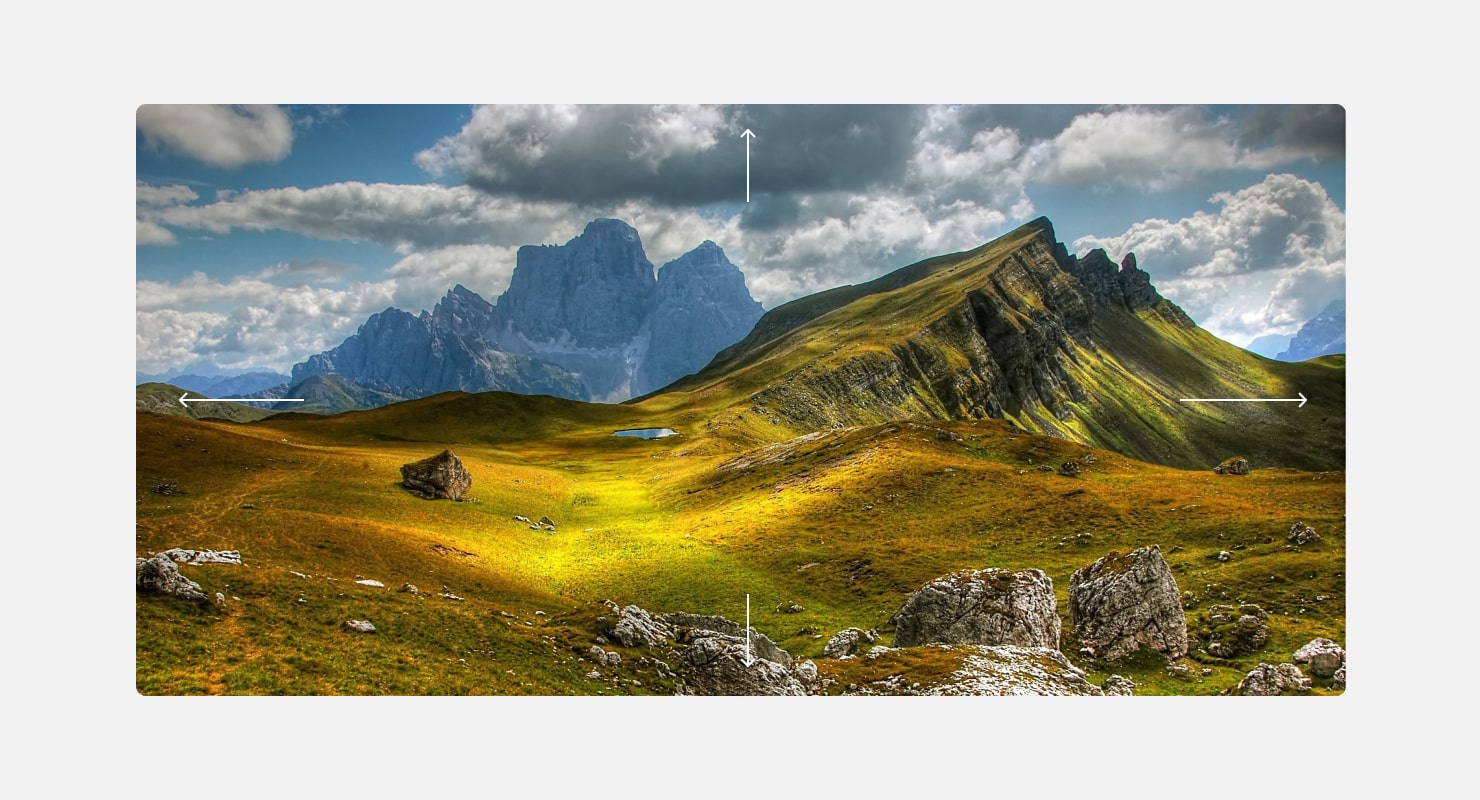
Any composition exists within certain limits, and graphic composition is limited by the plane on which it is created. That is why it is called a planar (flat) composition. This plane can be represented by anything: a monitor or smartphone screen, a sheet of paper, etc.
Graphic composition is physically two-dimensional, flat, with height and width. But, you shouldn’t forget the imaginary dimension of depth in the composition, which allows us to name which objects are closer and which are farther away from us. In this way, we divide the space into plans. There can be many of them, most often the foreground, middle and background. The more complex the composition, the more plans there are.
Graphic Elements
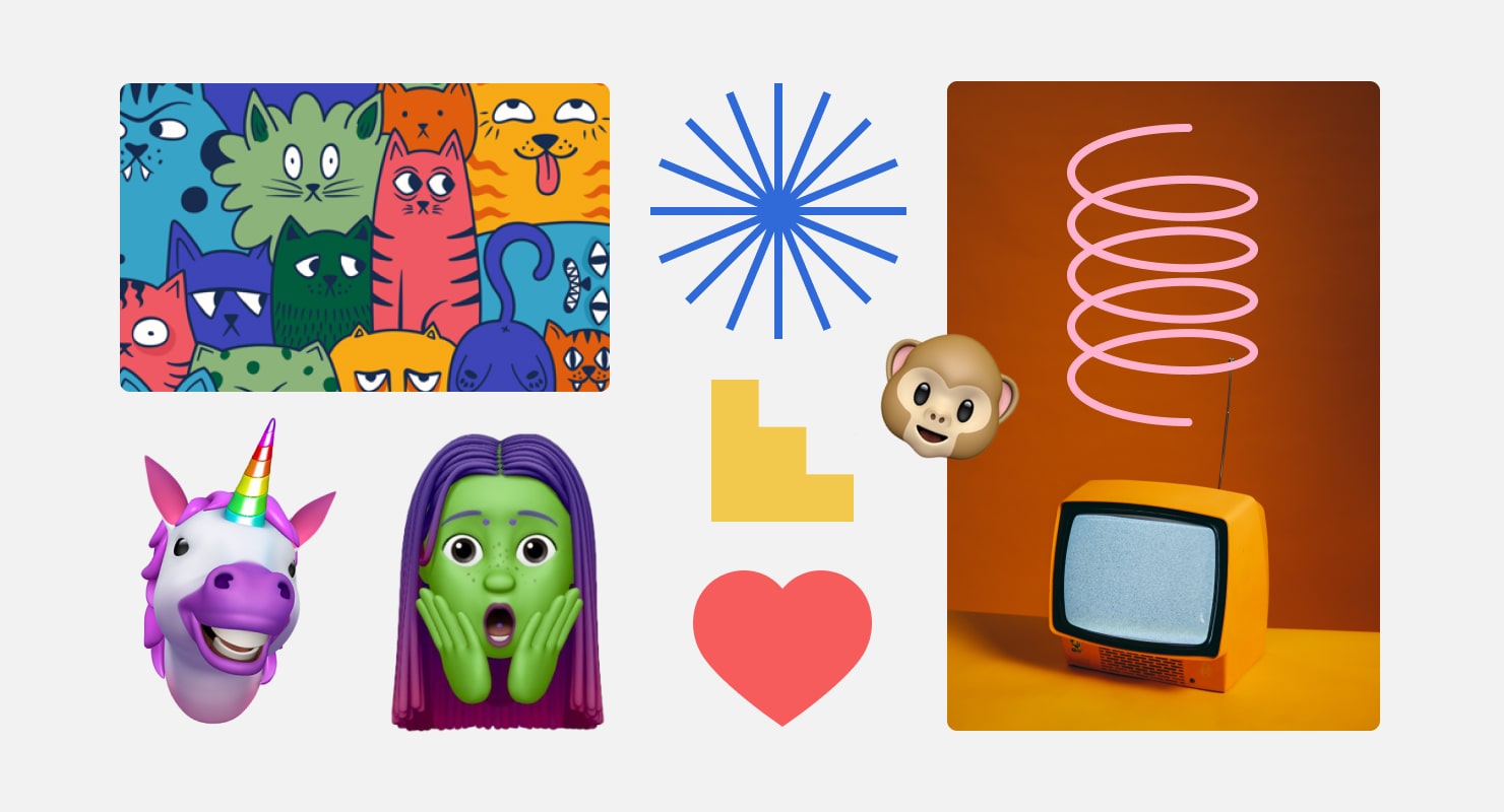
Inside the composition, the texts actively interact with graphic elements, which are also an effective tool for conveying content. These can be illustrations, icons, photos, etc.
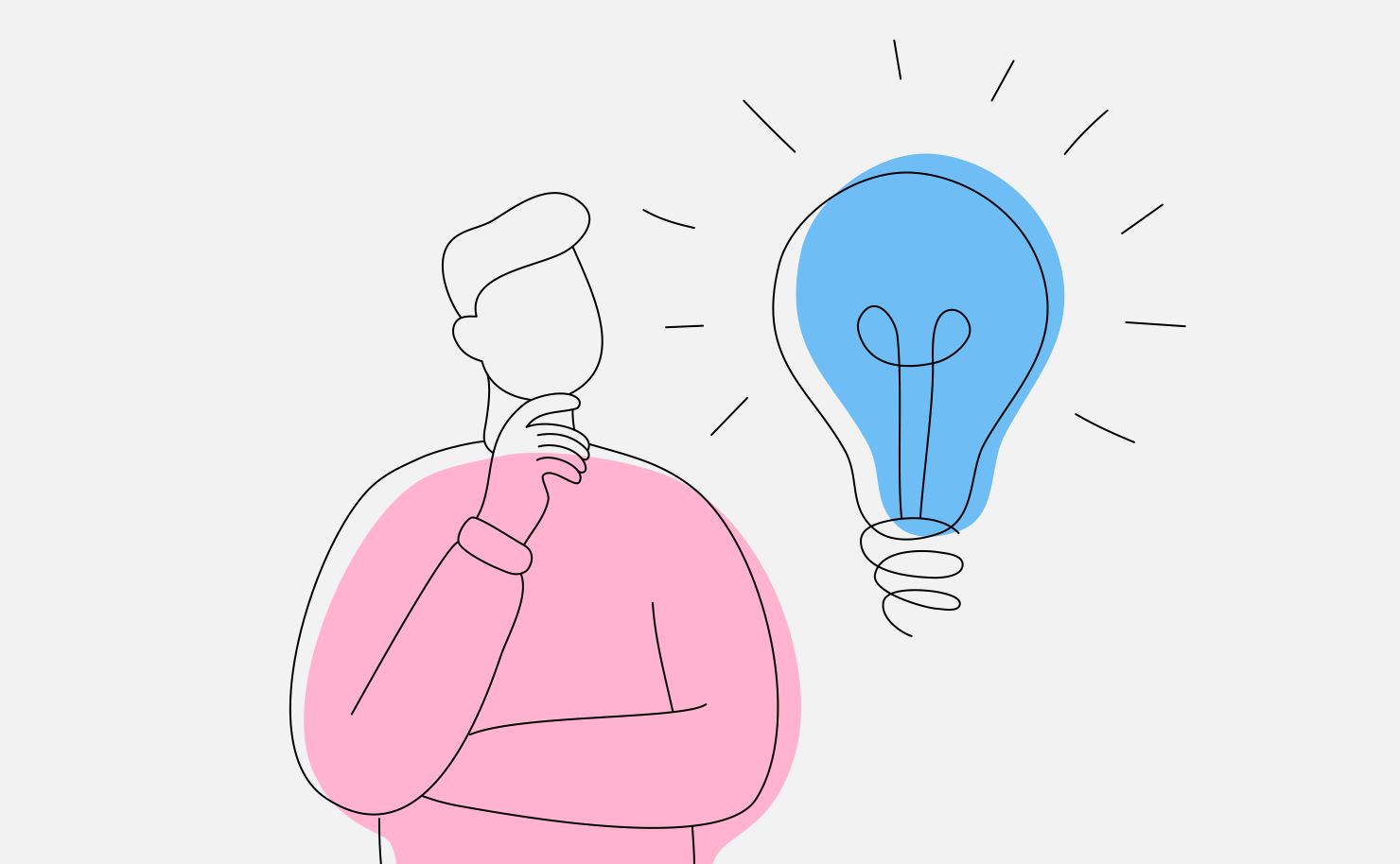
The images can be straightforward and literally convey the meaning (for example, in toothpaste advertising, people brush their teeth). In other cases, they can convey the meaning with the help of a graphic metaphor, e.g., on the principle of associations and symbols (for example, the image of a glowing light bulb symbolizing an idea). There can be many such symbols and associations.
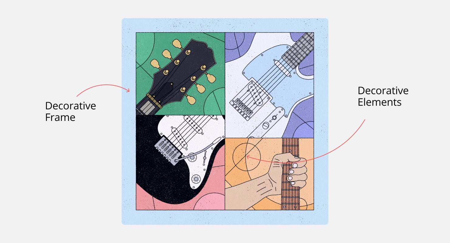
Decorative Elements
Composition is not limited to plot elements. Patterns, frames, ornaments, abstract spots, etc., can be added to them to act solely as decorative elements. They do not carry any semantic load and serve only an aesthetic function. Dosed and accurate use of decorative elements will make your composition more interesting and rich, but thoughtlessly adding too many elements can turn your work into a complete disaster.
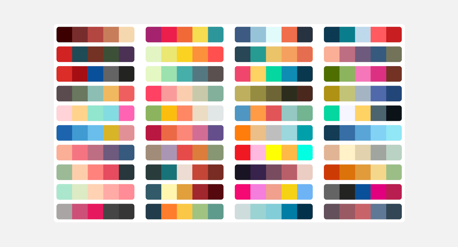
Color
Colors are a whole separate world of composition perception. With the help of colors, you can highlight the main element in the space or convey the general mood and atmosphere.
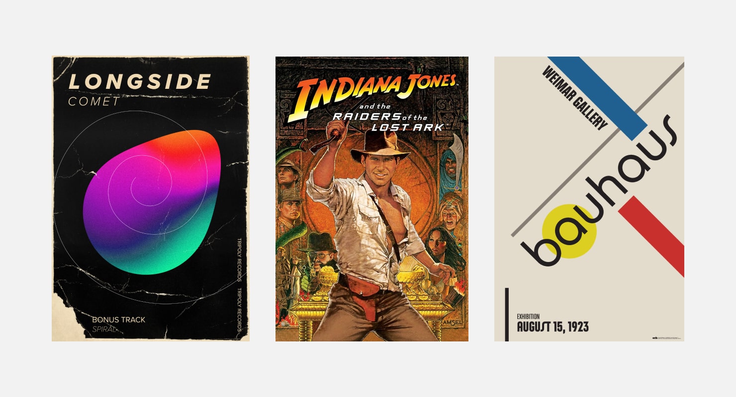
Text (Captions)
Text is present in graphic design one way or another, which differentiates graphic design from fine arts. Text is a very handy tool for conveying content. Thanks to the letters, not only can we convey the rational component of the design, but we can also incorporate the emotional part. Typography is very helpful in creating a certain image and immersing yourself in the atmosphere provided by the designer.
Components of graphic composition interact with the help of certain compositional principles and techniques. Thanks to these principles, the viewer understands and feels the plot, context and the main idea of the composition. Compositional principles are an approach to the construction of a composition, or its type. These techniques are also called expressive means of composition, or means of harmonization. As you can see, nothing can be done without them, so let’s explore them in more detail.
Types of Composition
The types of composition themselves are its powerful expressive components. The main thing to remember is that the placement of the elements in the composition determines our perception of it, and vice versa—the perception of the composition depends on how the elements of the composition are placed in its space.
You can radically change the viewer’s perception of the composition by placing the elements in a certain place in the composition at a certain angle and at a specific distance from other elements. Therefore, before you start working, you need to determine what type of composition you want to convey the original idea.
The following describes three pairs of types of composition.
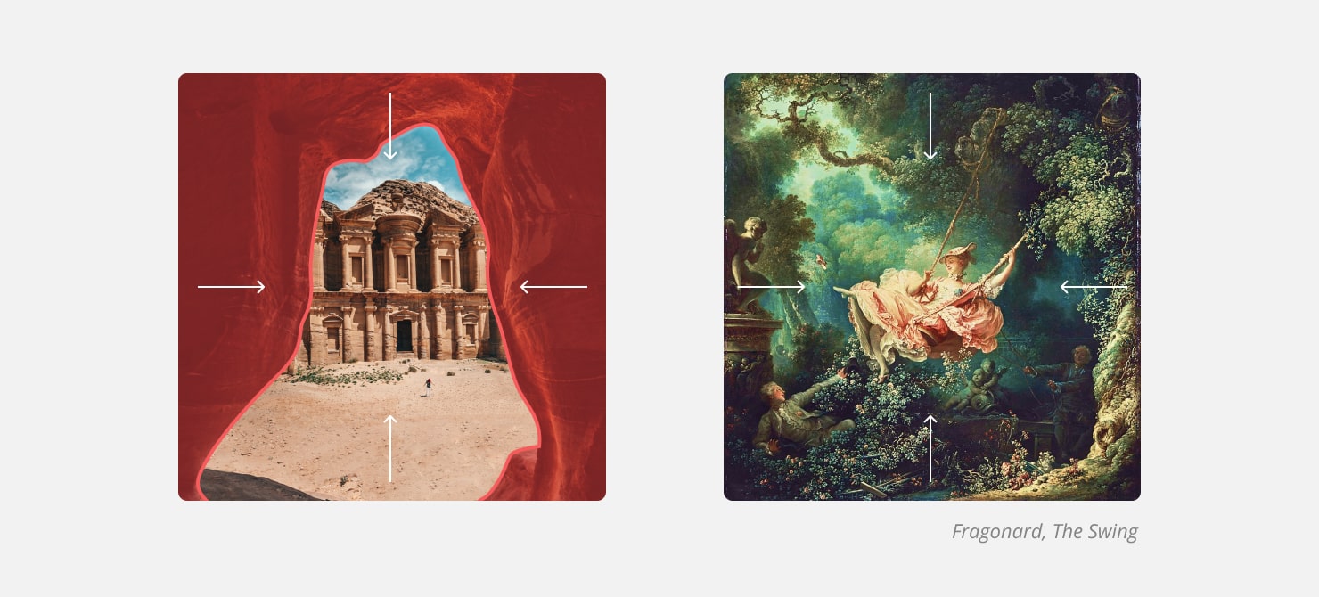
Closed or Open
Let’s consider these two compositional types and how they differ. In a closed composition, key elements are often surrounded by elements that limit them, making it look closed. In graphic design, this can be achieved by adding contour frames or abstract limiting shapes to the composition.
Conversely, in an open composition, there are no limiting frames. This allows you to convey a sense of space, freedom and scale. This type of composition is most often used in the depiction of landscapes. Thus, in graphic design, a composition is open when there are no limiting elements or frames. Therefore, an open composition is often perceived as freer and more spacious.
At the same time, a closed composition feels less spacious, but it allows you to direct your viewer’s gaze more effectively. With this type of composition, you can highlight the main character or focus on a key plot element. Separate elements can be made integral, grouped together using frames. The usual rectangular shape on the background, which performs the same task, will also help to close the composition. By placing the text in a separate container, you can highlight it and make it stand out amid the general information.
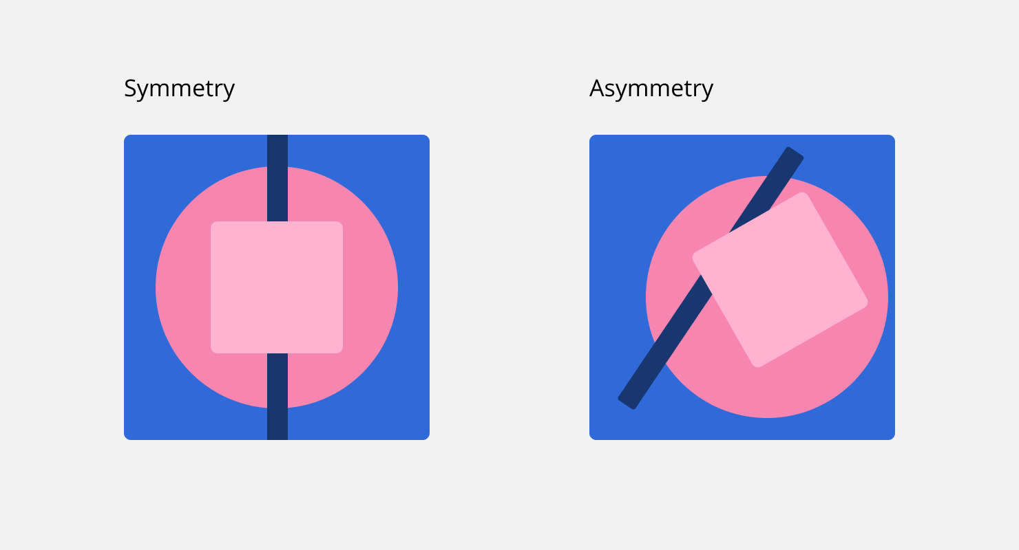
Symmetrical or Asymmetrical
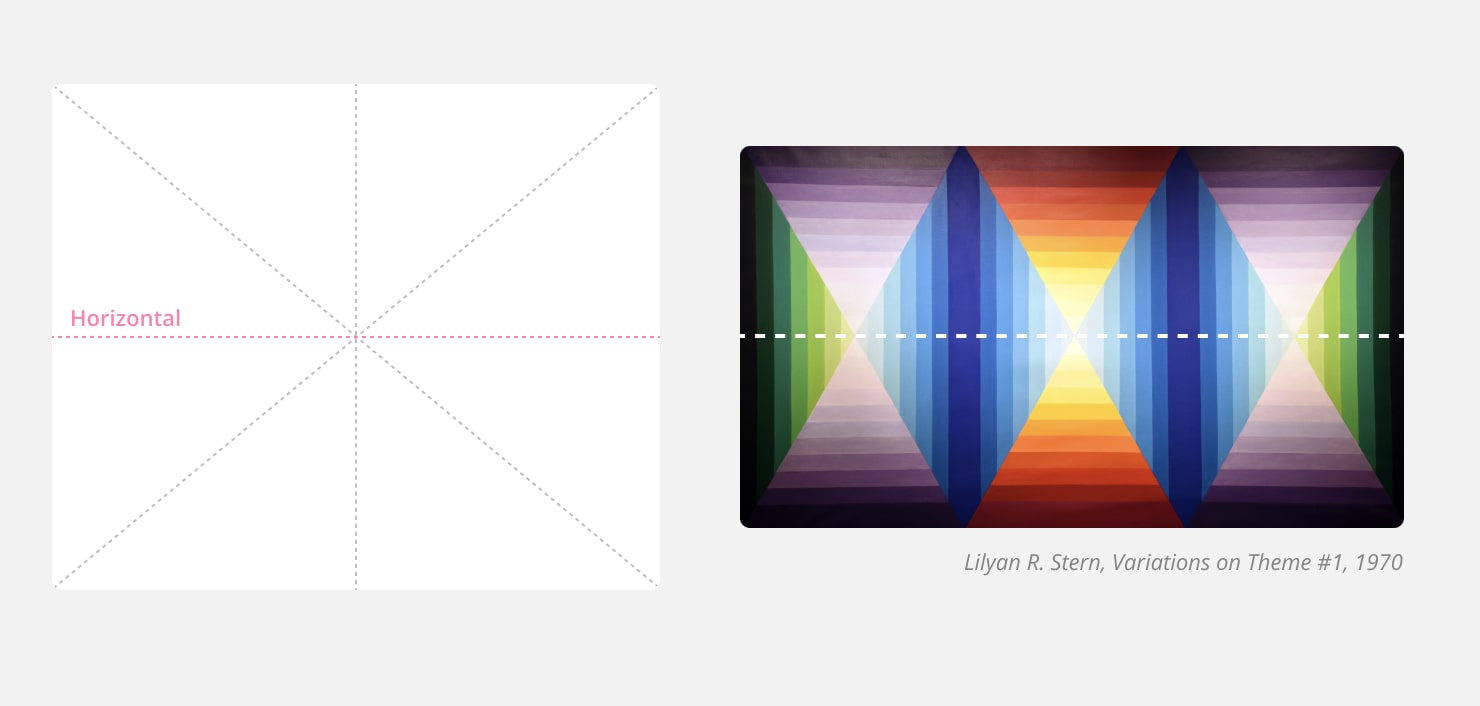
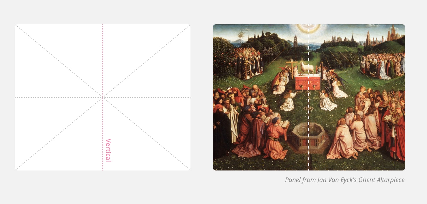
Symmetry is balanced, and therefore the line of symmetry used as a constructive guide helps your audience feel the balance or imbalance of the composition. Compositions that use symmetry axes are perceived to be more organized, orderly and balanced.
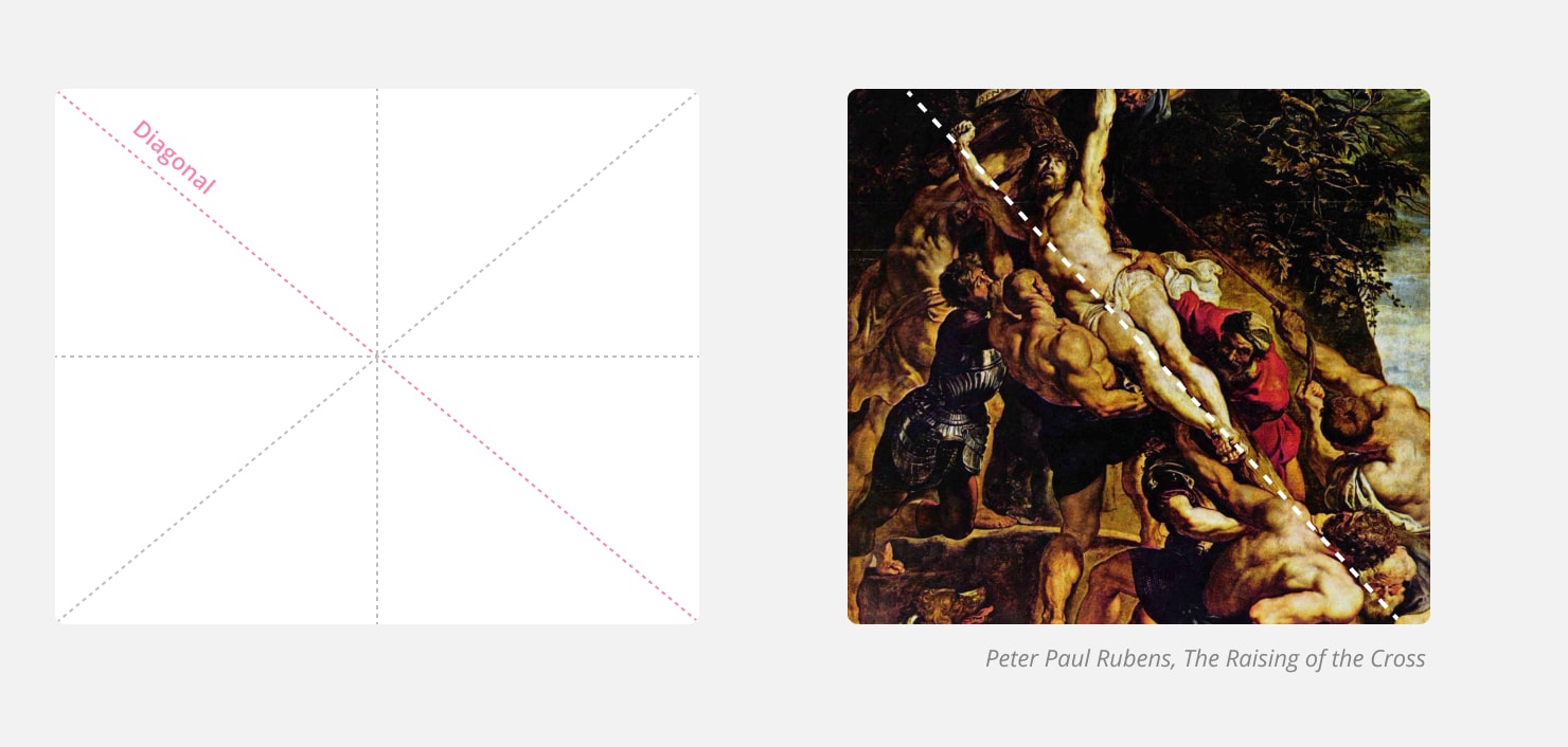
It is widely believed that the symmetrical type includes compositions consisting of two identical halves reflecting each other. In fact, this viewpoint is wrong. The presence or absence of an axis of symmetry as a structural component makes the composition symmetrical. A symmetrical composition is built around the axis of symmetry. The axis of symmetry is an imaginary line that divides the plane into two levels or mirrored halves. It comes in three types—horizontal, vertical and diagonal.
The example below depicts horizontal symmetry composition.
This one is vertical symmetry composition.
And this is an example of diagonal symmetry composition.
Asymmetrical composition, on the other hand, is built without symmetrical lines. Doing this evokes a sense of dynamism and absence of stereotypes, projecting strong individuality. It is harder to find balance in such a composition, but that is its essence.
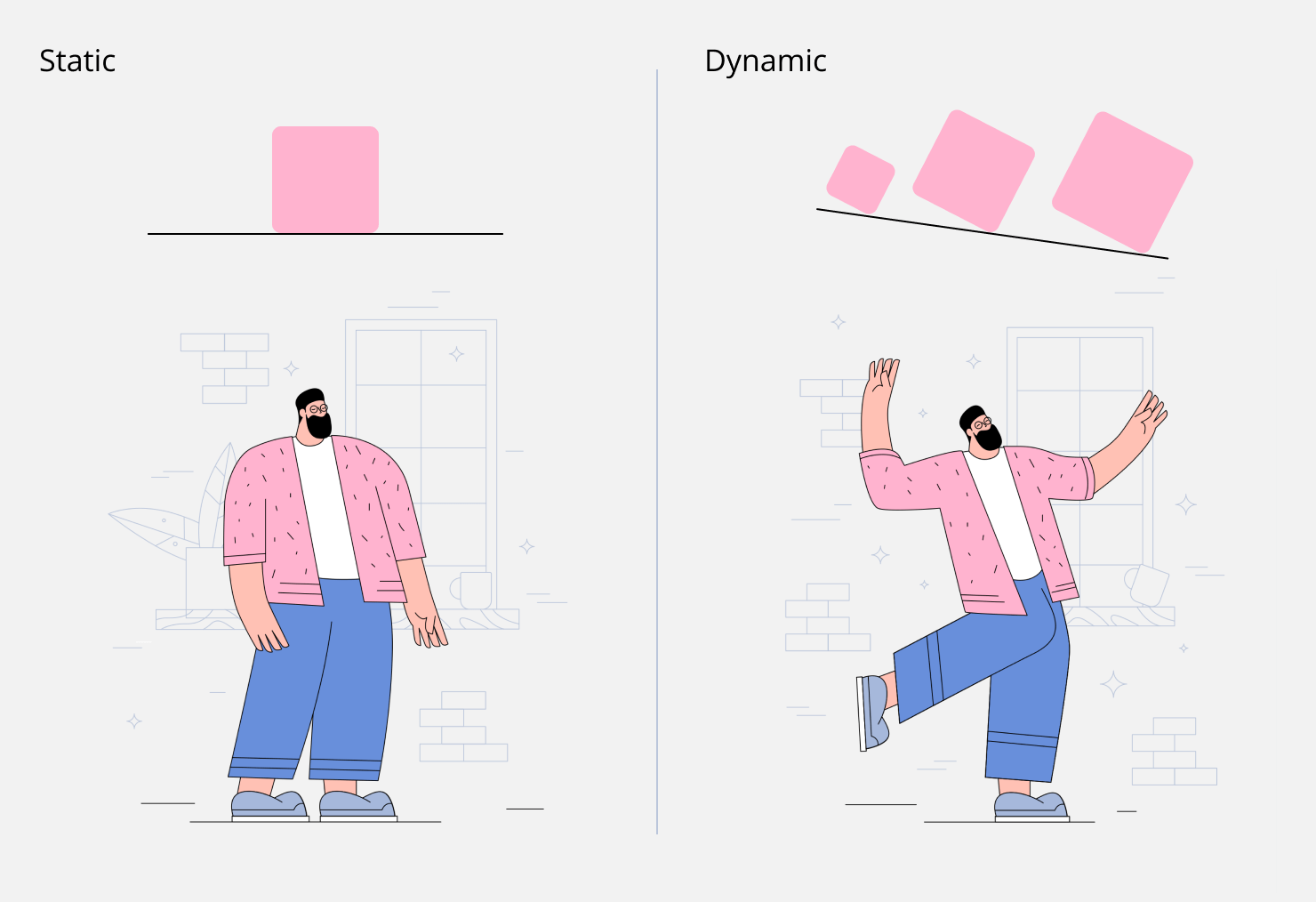
Static or Dynamic
In graphic design, we often deal with abstract shapes—geometric shapes, inscriptions, patterns and more. Our perception recognizes them as more or less static, i.e., those that are at rest. A composition based on horizontal guide lines is often perceived as more static with no prerequisites for movement. The more rectangular the graphic composition, the more likely it is to be perceived as static.
Dynamic composition conveys a feeling of movement. The viewer feels the dynamics when looking at such work. Dynamics can be transmitted in the following ways.
The first is that the image of movement is often created by placing the figure on an inclined diagonal as opposed to a static horizontal line. And, the greater the angle of inclination, the clearer the perception of the prerequisites for movement. Thus, our consciousness begins to anticipate the possibility of movement. Such diagonals can exist as guidelines, but they do not have to be obvious.
Another way to convey dynamics is to use visual strings─repeating the same element many times, with a slight change in intervals.
How to Define and Select Composition Types
Here are some tips on how to correctly determine the type of composition:
- A feeling of space, no restrictions and freedom make the composition open.
- A feeling of concentration and focus due to limitation makes the composition closed.
- A feeling of disorder and creativity makes the composition asymmetrical.
- A feeling of order and balance makes the composition symmetrical.
- A feeling of calm and stability makes the composition static.
- A feeling of movement and dynamics makes the composition dynamic.
The composition cannot belong to two types from one pair at the same time. That is, the composition cannot be both closed and open at the same time or both static and dynamic. But, in graphic design, it often happens that, within one plane, there is not one but several compositions at the same time. Therefore, when analyzing, consider this point. For example, you can have an open, dynamic asymmetrical composition, which makes full artistic sense of how it should look.
Expressive Means of Graphic Composition
To convey a certain plot with the help of graphic composition elements, it is not enough to simply place them in the space of the composition. We need to make them manifest and express themselves. In order to achieve this, you should use certain techniques, called expressive means of graphic composition. There are only seven of them, and again we will list them in pairs:
- Meter/Rhythm—responsible for transmitting a sense of dynamics.
- Symmetry/Asymmetry—to project a sense of symmetry of the composition.
- Proportion/The ratio of values—achieving the proportionality of the composition.
- Size/Scale—conveys a sense of scale.
- Likeness/Difference—combines elements into visual groups.
- Nuance/Contrast—allows you to convey the strength of the differences in some elements.
- Consonance/Dissonance—determines whether your story reflects a state of calm or chaos.
Let’s consider each pair in more detail to come to grips with their purpose in building a graphic composition.
Meter/Rhythm
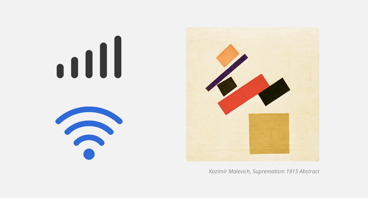
The main task of the pair, “Meter/Rhythm,” is visualization of dynamics. With this being present, you can convey a sense of direction, intensity and even strength. In order to estimate the rhythm, we need to determine the meter (which is used here in the primary sense—measurement), and we must determine the dimension. Having a dimension, you can convey a sense of rhythm, that is, how the element interacts with this dimension. The rhythm can be uniform, ascending or descending.
An example of visualization of dynamics in graphic design is the image of brightness or volume settings. By reducing or increasing the number of depicted elements relative to one other, we can convey the essence.
Symmetry/Asymmetry
Everyone remembers that the closer the composition is to the state of symmetry, the more optically balanced it is. To demonstrate the inequality, i.e., the imbalance of one element relative to another, we use asymmetry. Symmetry perfectly illustrates organization and order, and asymmetry is a creative mess.
Proportion/The Ratio of Values
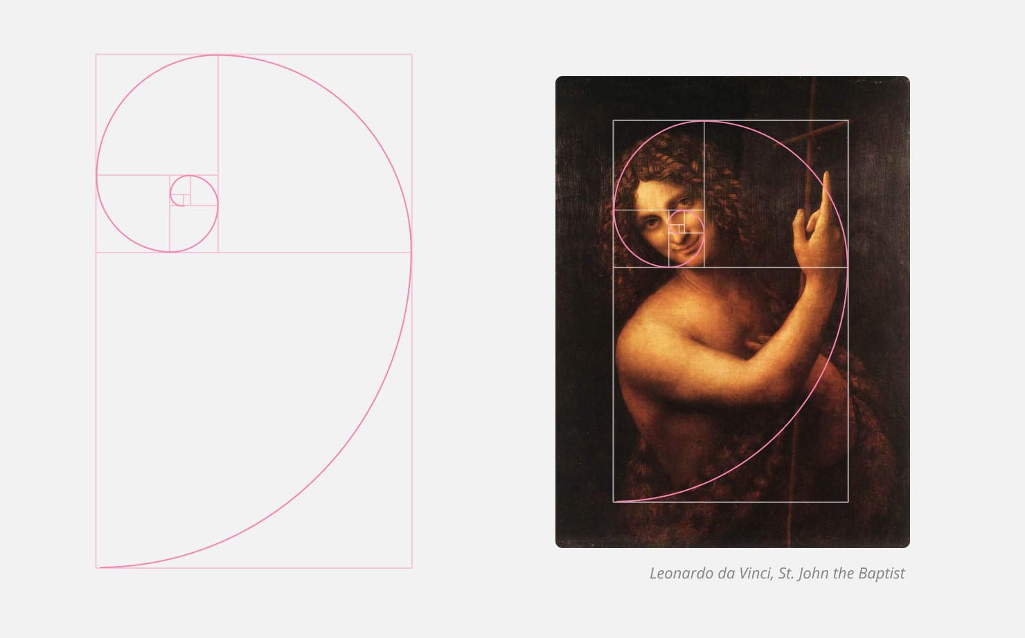
For your composition to be perceived harmoniously, it is useful to determine the basic proportion and build a composition relative to it. To ensure the proportionality of the graphic composition, designers often use modular grids. The size of the graphic element should be determined by its relative value and environment. Here we need the principle of the golden ratio, discussed further in our article about the rules of composition.
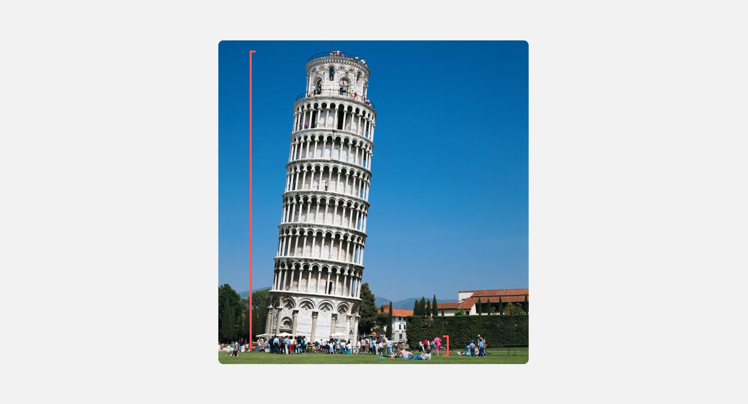
Size/Scale
To transfer the size of a large object in a photo, imagine a person who has no idea how big the Leaning Tower of Pisa is in Italy. If you show them the tower in the picture, a person will not be able to visualize its size. But, if you draw people next to this tower, it immediately becomes clear that it is very high. So, to convey the incomprehensible size of one object, we need another object of understandable size.
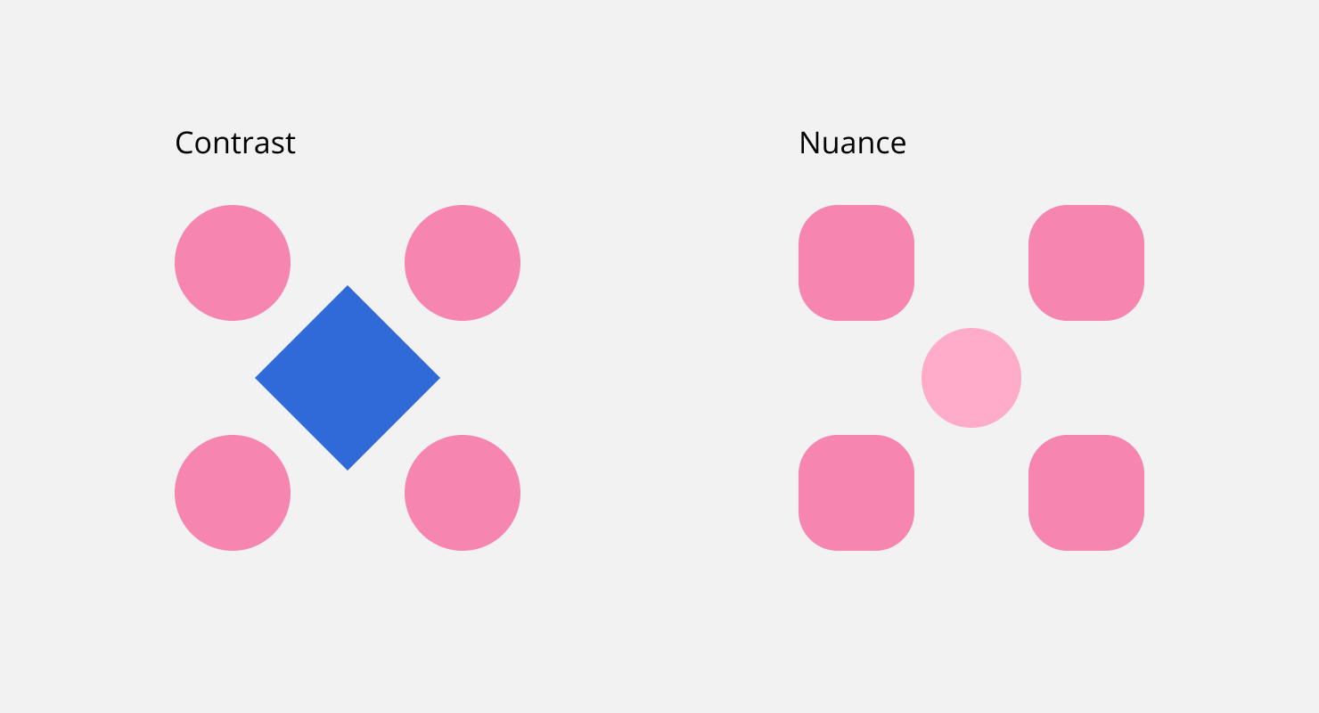
Nuance/Contrast
With the help of the “Nuance/Contrast” pair, you can convey how different the elements are in relation to each other and ensure the expressiveness of the visual component.
For reference, nuance is an insignificant difference between an element and other similar ones, and contrast is a significant difference. The greater the difference between the elements, the higher the contrast. Contrast can be conveyed in several ways, namely through colors, shapes of elements, emotional and meaningful metaphors.
Likeness/Difference
These means convey the idea of common features through visual similarity. Conversely, the less visually similar the elements, the stronger their essential difference. In graphical interfaces, the same functions have common visual features.
The implementation of these means is often ensured by the technique of visual rhyme. To make your inscriptions look harmonious with graphic images and decorative elements, it is important to learn to find common features in them.

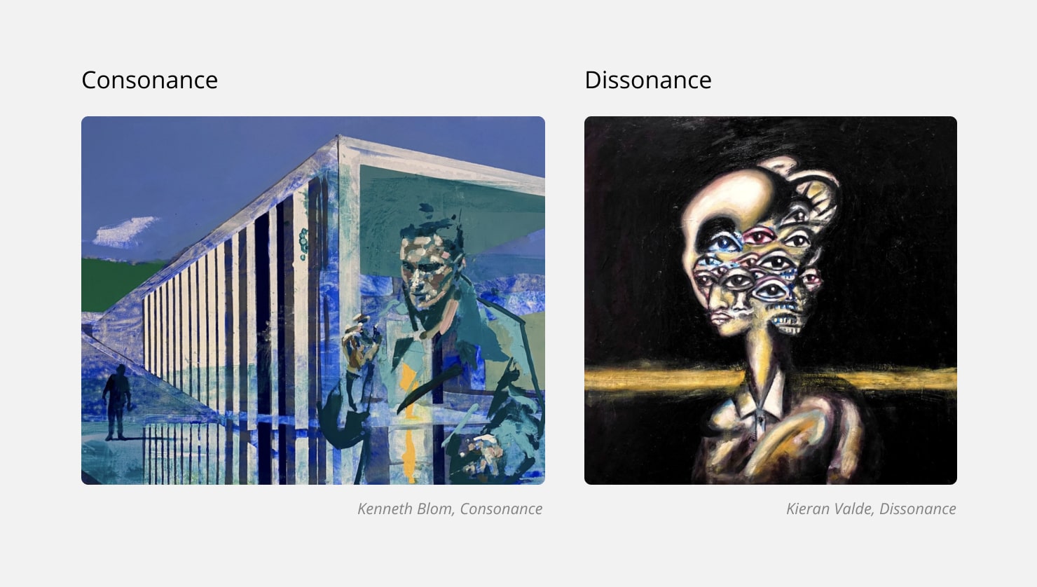
Consonance/Dissonance
In their essence, these expressive means help to bring perception closer to either harmonious or rebellious (confused). It’s up to the designer to decide which state to choose to implement a creative idea. To achieve dissonance, you can use different images that evoke feelings, dark color palettes or bizarre compositional solutions. To create a consonance, on the contrary, we recommend using happy paintings, warm and bright color palettes and delicate printing.
Thus, the expressive means of composition is a set of visual techniques that help you achieve a particular emotional or semantic effect—both from the composition as a whole and from its individual elements.
Conclusion
Whether you are a newbie with a creative mind just learning the ropes of graphic design or a pro with full knowledge of all the compositional expressive means, it’s never too late to learn something new. And, when you feel sure about the theory, that is the time to make the best of the practice. Try to incorporate the basic compositional principles given in the article, and may your designs be as harmonious or rebellious as you wish them to be.