Rules of Color Combination
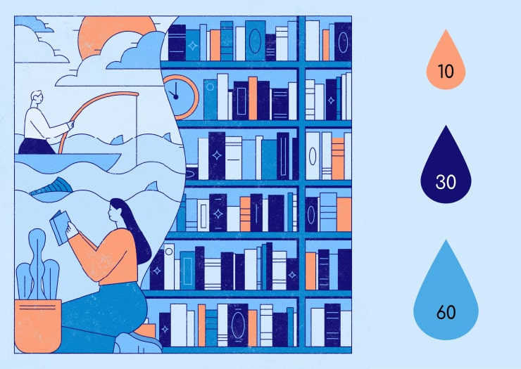
The rules of color combination are meant to help you when choosing a color palette for your graphic design creations. These vary with the type of color combination being used. For instance, for the 60-30-10 rule, we use a different proportion of three colors. The rule states to use primary, secondary and tertiary colors in 60%, 30% and 10% proportions, respectively.
When using a complementary combination scheme, the rules are different. In this type of palette, we will use colors directly opposite each other on the color wheel.
The rules of color combination are dependent on the type of color scheme you are using. Every combination set has different rules. To familiarize yourself with different color combinations, let’s start at the very beginning—the color wheel.
What Is a Color Wheel?
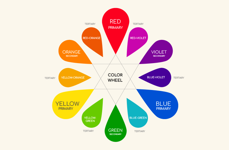
A color wheel (or color circle) is a circular combination of 12 different colors. There are three primary colors, three secondary colors and six tertiary colors on the color wheel. It illustrates color hues and is regarded to be a benchmark tool for creating color combinations.
Secondary colors result from a combination of primary colors. Tertiary colors are formed by the combination of different sets of primary and secondary colors.
The sole aim of a color wheel is to assist a graphic designer in creating different color combinations. With a color wheel, one can not only create predefined color combinations but can also curate customized and existing ones based on their creative abilities. When in doubt, you can always read The Designer’s Dictionary of Color by Sean Adams to assist you with picking colors.
Primary Colors
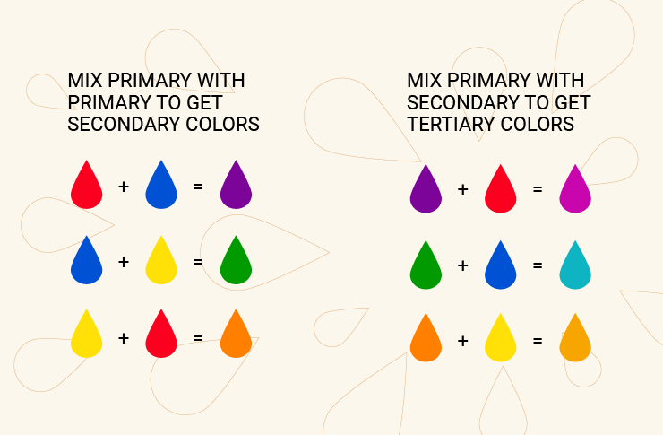
Primary colors (or base colors) are the foundation stone of the color world. There are three primary colors: red, blue and yellow. A combination of primary colors in different proportions produces secondary colors.
Every color known to date has been carved from the primary colors as they make up the base of forming different secondary and tertiary colors. The primary colors are the central part of a color wheel.
Secondary Colors
Secondary colors are the derivatives of primary colors. A secondary color combines two primary colors in definite proportions. There are three secondary colors on the color wheel, formed by the combination of primary colors.
The secondary colors (derivatives of primary colors) on the color wheel are orange, violet and green. These colors are used to create tertiary colors, which are widely used in color combinations.
Tertiary Colors
The combination of primary and secondary colors yields tertiary ones. Tertiary colors are also known as intermediate colors. There are six tertiary colors on the color wheel: yellow-orange, red-orange, red-violet, blue-violet, blue-green and yellow-green.
The primary, secondary and tertiary colors on the color wheel are used in specific proportions to create different color combinations.
The Major Rules of Color Combination
Every color combination methodology has a different set of rules to be implemented to achieve the desired color and psychological effect on a viewer. The rules for different color combinations are as follows.
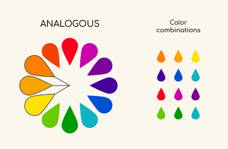
Analogous Color Scheme
The analogous color scheme is one of the most widely used schemes as it comprises primary, secondary and tertiary colors. The rule for this color scheme is very simple: you have to select three adjacent colors on the color wheel.
However, the key factor in this approach is that, among those three adjacent colors, the first color should be primary, the second should be a secondary color, and the third color is usually tertiary.
You will be able to get one of the best combinations by following this simple rule of analogous color combination. Combining all three types of colors will create a holistic combination that will be visually appealing to a graphic designer.
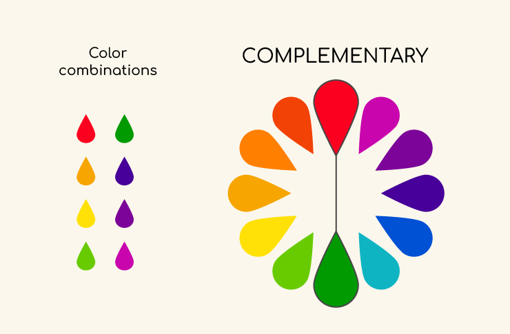
Complementary Color Scheme
The complementary color scheme is based on the concept of contrast. Its simple rule is to choose two opposite colors on the color wheel to create a complementary color scheme.
The complementary color scheme is based on contrast, and, therefore, it attracts a lot of attention. However, one must use it with great care and precision since it can overturn a graphic design layout.
It would be perfect if you created a balance while choosing opposite-based colors on the color wheel for a complementary color combination. One color should be a bit more dominant in saturation while the other should remain on the lighter side.
A complementary color scheme is usually made up of two colors. However, you can use different levels of saturation and shades to enhance your complementary color ambience.
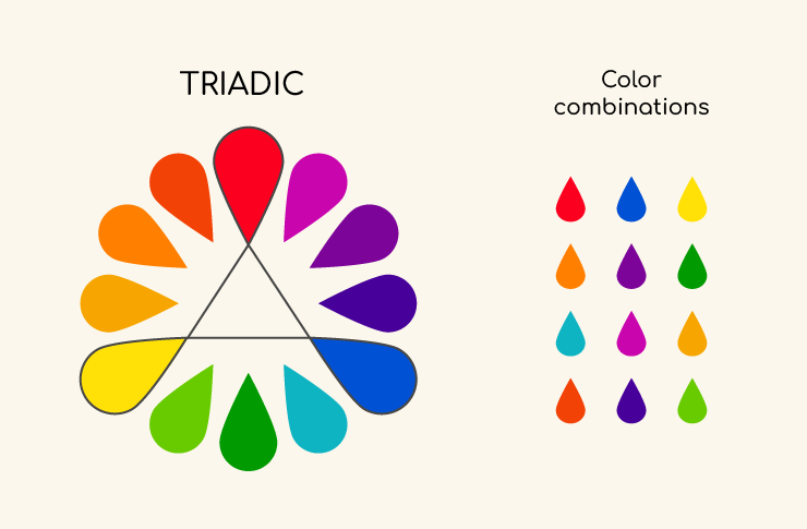
Triadic Color Scheme
The triadic color scheme also has simple rules to follow when creating the combination. The rule for this color combination states that you have to select three colors on the color wheel equidistant from each other. When you wish to add colors to the black and white photo, it’s crucial to use the top colorized software.
You will notice that, after selecting any three equidistant colors, you will get a triangular shape on the color wheel. That is the reason this color combination is called a triadic color scheme.
Saturation of Colors Rule
Terminologically, saturation is the measure of the intensity of a color. Saturation is the determining factor that will showcase the visibility of color under different lighting conditions. A highly saturated color will show a brighter color tone. On the other hand, a low saturation will be the dull side of the color with a grayish touch. Saturation is a crucial factor for graphic designers when selecting a color scheme.
How does the rule of color saturation work? Colors of a similar intensity are the most comfortable for the human eye. Usually, design professionals do not mix pastel colors with eye-bleeding neon tones because it will look out of place.
On the contrary, if you wish to be bold and daring, it’s a great idea to add a pinch of color as an accent to your illustration. These colorful accents are rather widespread in art. For example, one object of a vibrant color opposite a more moderate background will accentuate the composition. Note that the amount of an eccentric color is of great importance, so you should never overuse it.
The 60-30-10 Rule
The 60-30-10 rule is a graphical design rule used to create a customized color combination. In this color combination, primary, secondary and tertiary colors are used in the ratio of 60%, 30% and 10%, respectively.
The 60-30-10 rule creates a perfect harmony using the designated proportions of primary, secondary and tertiary colors.
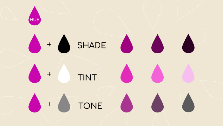
Shades, Tints and Tones
According to the definition, a shade is a combination of pure colors obtained by adding black into the host ones. It is the dark value of a color. A shade is an independent color obtained by mixing a base color with black.
Tints are the opposite mixtures of shades. A tint is formed by the amalgamation of pure colors with white color. A shade will increase the dark aspect of color, while a tint will enhance the lightness factor of color. Tints and shades are poles apart as they are formed by the mixture of colors with white and black, respectively.
Tones are the less vibrant version of the colors. A tone is formed by mixing a hue with a neutral gray color and the resultant color will have a less vibrant look. Similarly, tones can also be achieved by adding both black and white colors to the pure colors.
Conclusion
Creating a truly mesmerizing color combination is an art in itself. However, you do not have to be an artist to become adept at the creation of perfect color combinations. If you understand the color wheel and general rules of different color schemes, you will be able to carefully choose your customized color combination.
Apart from the color wheel and combination rules, you also have to take into account saturation, tones, tints and shades of colors while creating the perfect color combination.