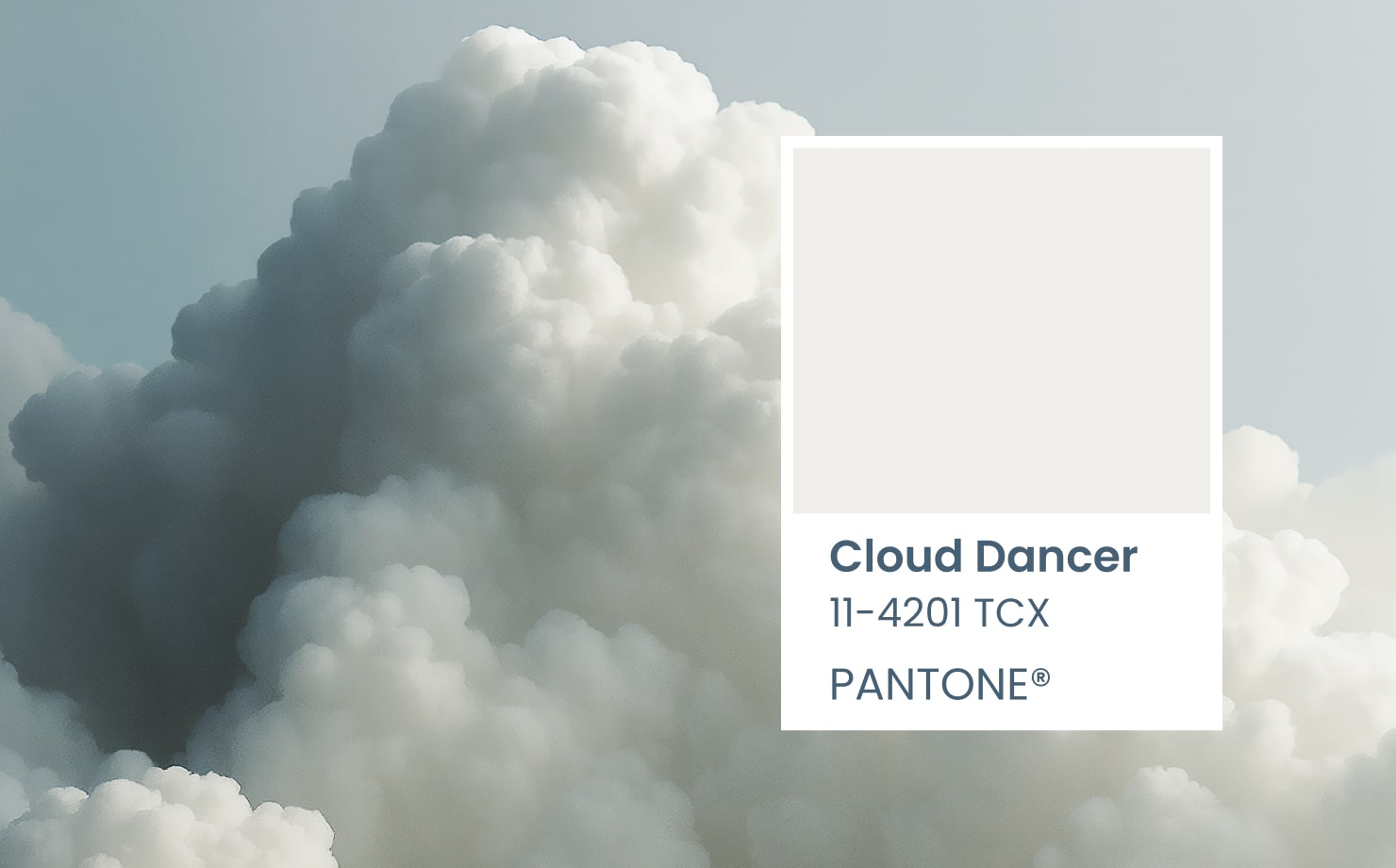
Pantone Color of the Year 2026: Cloud Dancer—a Study in Soft Radiance
Every December, designers around the globe wait for Pantone’s proclamation of the Color of the Year—a cultural barometer of emotion, aesthetics, and the visual language shaping our collective moment. Since Cerulean made history in 1999, the tradition has turned into a design-world holiday, influencing everything from branding to UI design, fashion to packaging. Pantone’s choices often capture the atmosphere of the years they represent: a reflection of hope, grounding, energy, or introspection.
And now, following Mocha Mousse (2025)—a grounding, cocoa-infused neutral full of warmth and understated sophistication—Pantone introduces Cloud Dancer as the Color of the Year 2026. This “billowy white imbued with serenity” has taken center stage, promising to inspire creativity across design, fashion, and interior spaces.
Cloud Dancer 2026: Purity, Softness, and Quiet Brilliance
Pantone Cloud Dancer is a soft white with a whisper of warmth, evoking tactile softness—cotton, paper, porcelain, silk, morning light. It is not a sterile white, nor an icy one: Cloud Dancer feels lived-in, human, and poetic. It reflects the cultural shift toward calm clarity and sensory gentleness, becoming both a grounding presence and a versatile stage for bolder chromatic statements.
Unlike the louder hues of previous years, Cloud Dancer invites subtlety. It celebrates quiet design, materiality, nuance—and the beauty found at the threshold between light and form.
Below are four practical and conceptual applications of Cloud Dancer for your 2026 design work.
Cloud Dancer for Logos on White Backgrounds
Working with a white-leaning tone on a white background may at first seem counterintuitive, but this is precisely where Cloud Dancer becomes an elevated designer’s choice.
Micro-contrast is the new luxury, as Cloud Dancer creates barely-there tonal separation—a technique used heavily in high-end branding, skincare packaging, and minimalistic identity systems. In bright colored logos with a defined graphic form Cloud Dancer can act not as the main color of the design, but as an “air stage”, emphasizing the strength and purity of the elements themselves.
For modern, bold, vibrant logos, Cloud Dancer works as a composition stabilizer—it softens the aggressive energy of the color. For minimalist geometric logos, Cloud Dancer enhances the feeling of purity, precision of forms and neutrality of the background.
Here are our best pairings for Cloud Dancer logos. Use it with extremely thin typographic lines for an ethereal look or matte textures with subtle grain overlays. You can even try structured grid layouts where the color carries conceptual meaning rather than contrast.

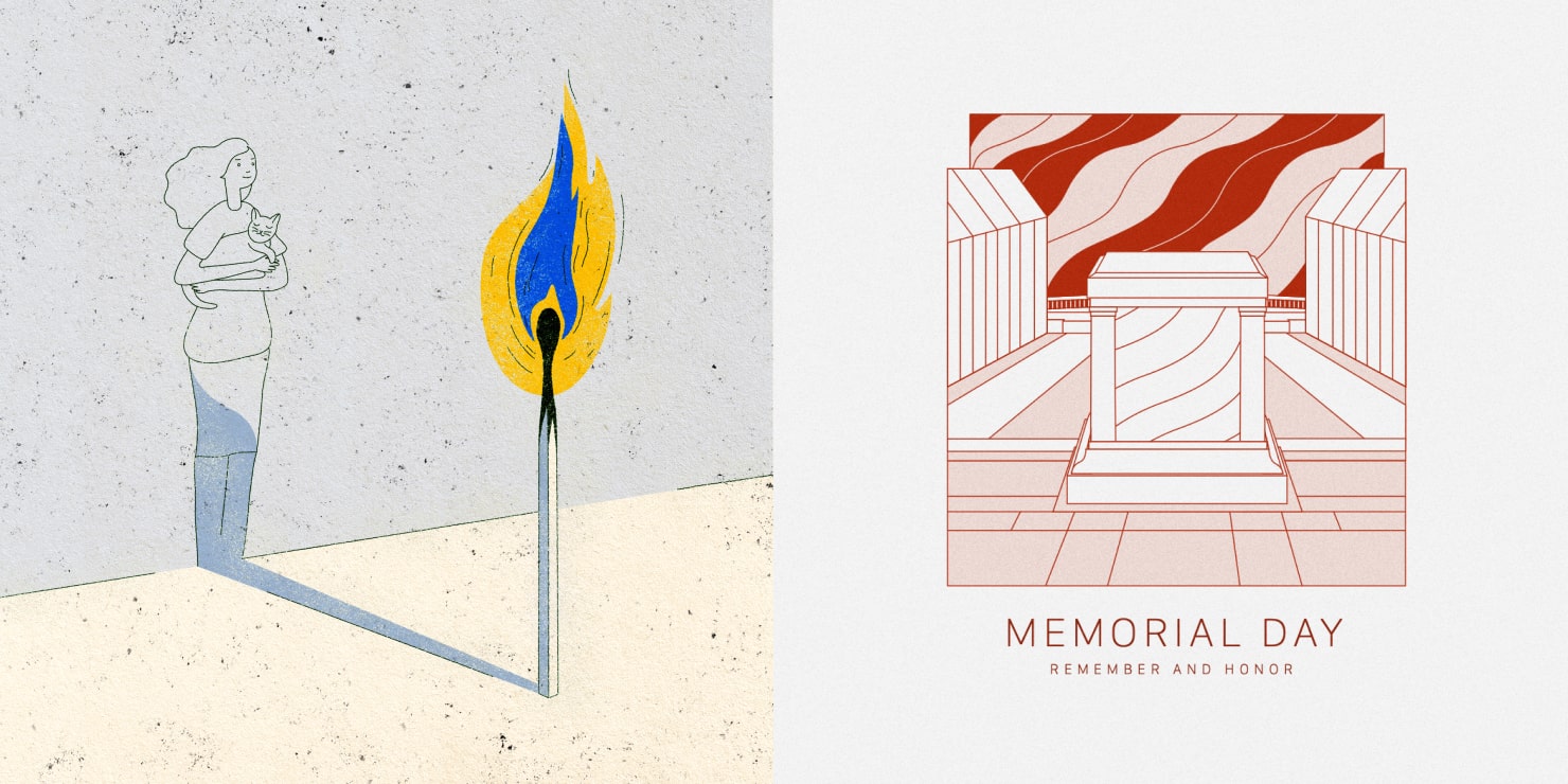
Cloud Dancer as Quiet Space in Illustrations
Negative space is the silent partner of every image, and Cloud Dancer is a master at shaping that silence. In graphic illustrations with clean lines and accent colors, it works as a soft base that enhances the contrast between minimalist forms and symbolic elements of the composition. Not only can it work as a negative space, but also as a calm atmospheric plane that supports mood and content. Cloud Dancer works beautifully as negative space as it softens transitions around illustrated objects. Used with precision and care, it reduces visual “noise” without washing out saturation and allows heightened storytelling through controlled emptiness. A designer can make it behave like paper, inviting tactile, editorial-style compositions.
Cloud Dancer can replace pure white in illustration backgrounds to create a more atmospheric, humanized canvas. The slight warmth adds depth and emotional resonance without altering the palette’s logic. It excels in botanical or nature-inspired illustration, minimalist geometric compositions, lifestyle editorial artwork, as well as in more conceptual compositions with a strong semantic center, enhancing emotionality through simplicity.
In other words, it is the new default “quiet white” for contemporary illustration.
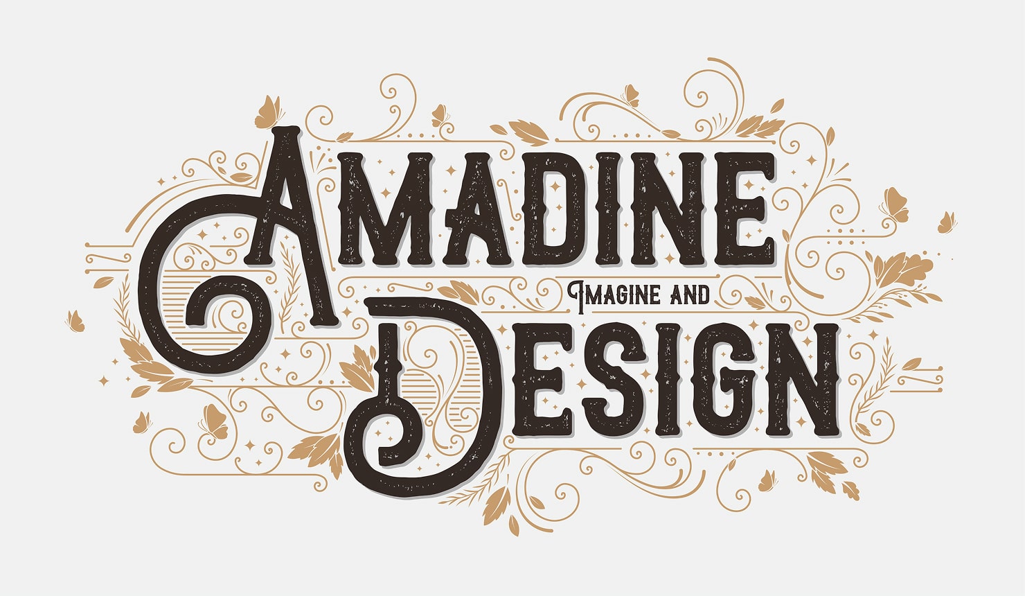
Typography With Cloud Dancer: When Letters Glow Without Shouting
Typography is where Cloud Dancer shows unexpected sophistication.
As body text on darker backgrounds, Cloud Dancer reads as a gentle off-white, reducing glare while retaining clarity. It is particularly effective in:
- wellness branding
- luxury websites
- artisan packaging
As display type Cloud Dancer becomes a sculptural element—especially powerful when paired with oversized serif forms or experimental ligatures. It carries elegance without coldness and even calm without monotony.
We’ve prepared the following pairing suggestions for your typography:
- With deep forest greens, muted blues, eucalyptus, slate for balanced calm.
- With metallics (especially brushed gold and champagne tones) for elevated editorial aesthetics.
- With Mocha Mousse for earthy, organic compositions that blend light and depth.
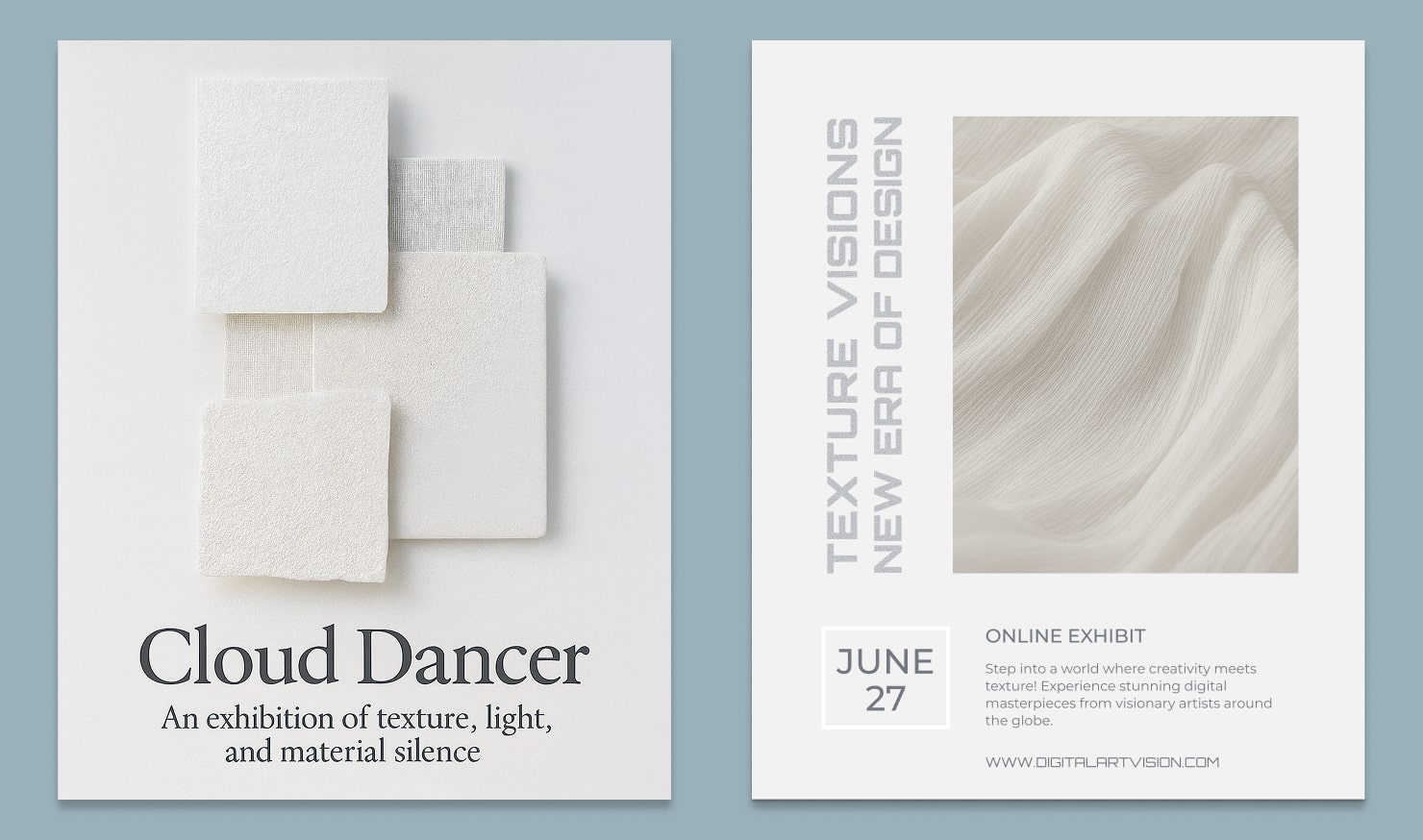
Cloud Dancer Interacting With Textures
Textures give Cloud Dancer dimensionality. Because the color is so light, its final effect changes dramatically depending on the material context.
On paper textures Cloud Dancer appears as soft artistic matte or handcrafted cotton. This way it works well for stationery, brand books, and packaging sleeves. On fabric textures it suggests purity and comfort: linen, muslin, brushed cotton. The color is ideal for sustainable brand aesthetics and lifestyle visuals. On metallic and glossy textures Cloud Dancer becomes futuristic when applied to glossy surfaces. And on pearl finishes, it radiates a subtle opalescence.
On Granular or sandy textures it’s perfect for spa, interior, and organic product design. The grain introduces shadows that deepen Cloud Dancer’s warmth. Cloud Dancer is one of those rare colors that inhabits texture rather than merely covering it.
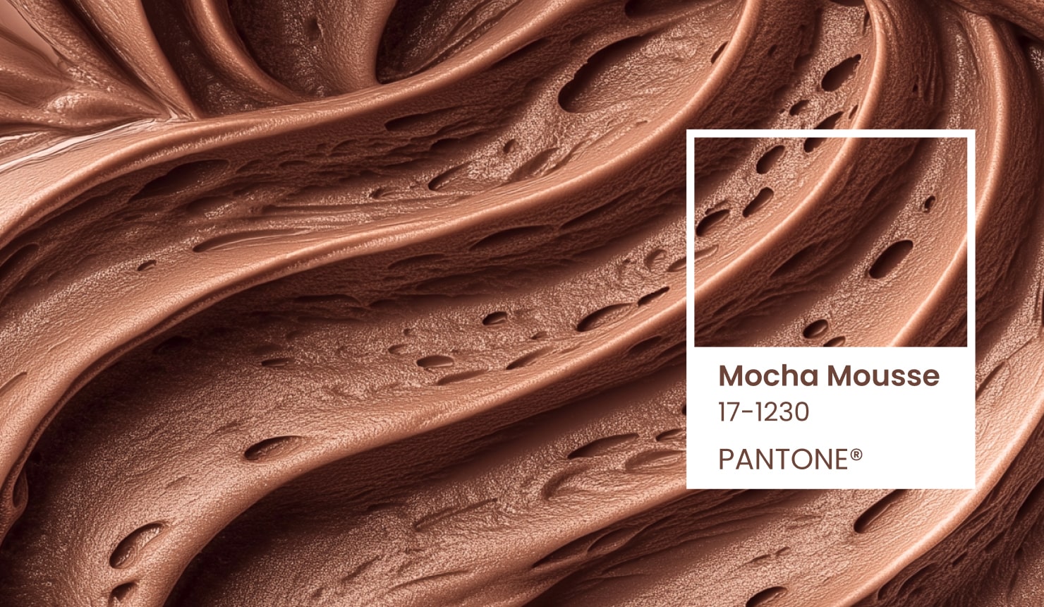
Mocha Mousse 2025: A Brief Summary of the Year of Warmth
Before Cloud Dancer, Pantone celebrated Mocha Mousse (2025)—a velvety, comforting brown inspired by cacao, clay, and the grounding energy of the earth. Designers embraced it for its ability to warm compositions without overwhelming them. It paired exceptionally well with soft pastels, coffeeshop neutrals, dusty blue, and warm metallics.
In practical use, Mocha Mousse became a go-to color for branding that wanted to feel approachable yet sophisticated. Its versatility made it suitable for product design, typography, and interior-inspired palettes—a reminder that “neutral” tones can hold emotional richness and cultural depth.
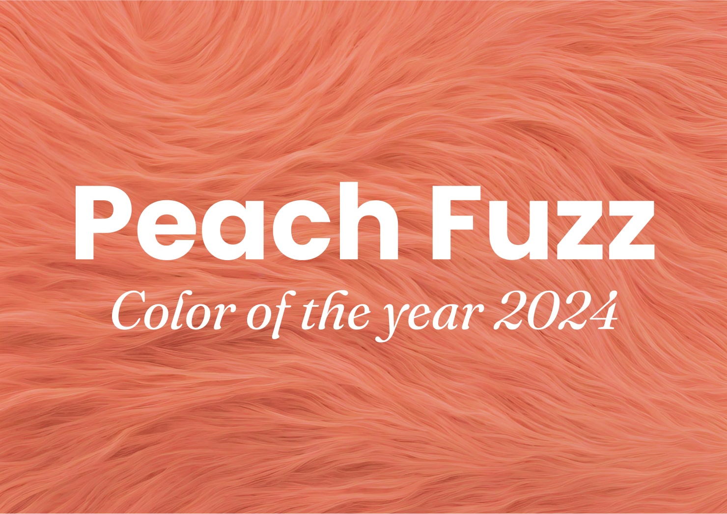
Pantone’s Peach Fuzz: The Best Peach Color Combinations of 2024
Before we dive too far into 2025’s palette, let’s revisit the effervescent warmth of 2024’s Pantone Color of the Year: Peach Fuzz. This cheerful hue brought a sense of vitality and joy to designs, making it a beloved choice for pairing with vibrant blues, mint greens, and warm terracotta tones. Peach Fuzz’s soft yet radiant quality made it a standout in both modern and classic palettes. It harmonized beautifully with pastel shades for a delicate, springtime feel while also standing up to bold, saturated colors for an eye-catching contrast.
In interiors, Peach Fuzz was often seen in accent pieces, from decorative pillows to painted walls, where it added a burst of cheerful energy. Designers frequently combined it with natural textures and materials, like rattan and raw wood, to emphasize its organic charm. Just as Peach Fuzz found its way into our hearts, Mocha Mousse promises to captivate us with its understated elegance.
Pantone’s Viva Magenta: The Best Crimson Color Combinations of 2023
The end of the year is a good time to take a retrospective look at Pantone’s Color of the Year choices over the past couple of years. As we look back to Pantone’s Color of 2023, we recall Viva Magenta, the bright vivid pink that stimulated energy and optimism.
Magenta found excellent pairings with the contrasting color green, prompting a rich, elegant feel to art and design. Viva magenta, or crimson has been combined often with blue, for a powerful contrast that can be dramatic. This pair is seen in many sports teams’ themes, conveying strength and unity. In fashion and interior design, crimson and blue gives a luxurious and sophisticated feel. This color is far from peach; it could, however, be used with peach as a definite contrast when a bolder, more powerful shade is needed.
Pantone’s Very Peri: The Best Purple Color Combinations
Looking back at 2022, Very Peri was the Pantone Color of the Year. The periwinkle blue shade conveyed motivation and relaxing emotions, especially welcome after coming out of a global pandemic state. Hopefulness and happiness are easy to see in many combinations with periwinkle. Flowers like aster, lilac and dwarf iris provide natural examples of periwinkle for artists to take inspiration from.
Combined with white, periwinkle provides a contrast, and is familiar in popular brands like Cadbury. Periwinkle is also a perfect contrasting shade to use with orange, representing fun, strength and energy. It’s also a perfect pair to pink as a complementary shade, especially to arouse an air of femininity or a feeling of nurturing friendship.
Conclusion: Cloud Dancer and the Return to Quiet Design
Pantone’s Cloud Dancer (2026) enters the visual world at a time when softness, clarity, and sensory calm are increasingly valued. It is not a color designed to dominate but to harmonize—to elevate contrast, define texture, and soften narratives.
Where Viva Magenta and Very Peri celebrated bold emotion and expansion, Cloud Dancer reminds us that beauty also lives in restraint, nuance, and the spaces between. For designers, it offers an invitation: embrace the quiet, honor the subtle, and let light shape the story.