Pantone’s Very Peri: The Best Purple Color Combinations
Simply put, Pantone is the name of the shade matching system in which each hue has a specific number and code. However, that’s not just color formulas to check online—you will deal with the big enterprise that is interested in color trend forecasts. Their offers are based on an in-depth analysis of current social moods and the impact of different tones. At this time, Pantone 17-3938 Very Peri has achieved a splendid victory for the title of the most influential gradient in the year 2022. And if you wish to always stay ahead of the trends, you can find the Pantone color of the year article useful.
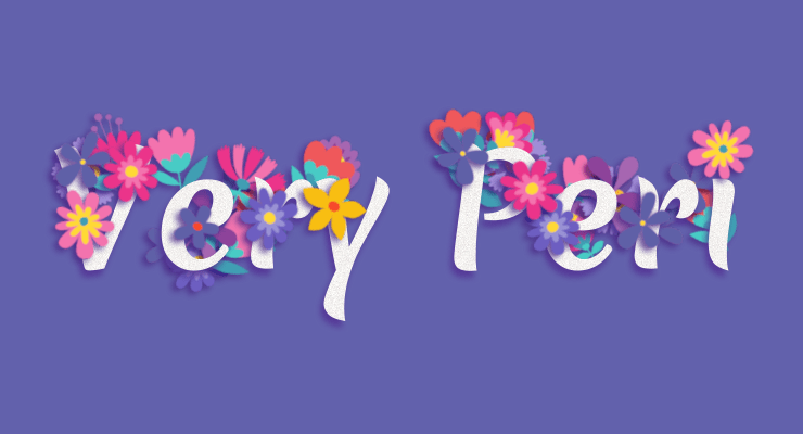
Pantone Color of the Year 2022
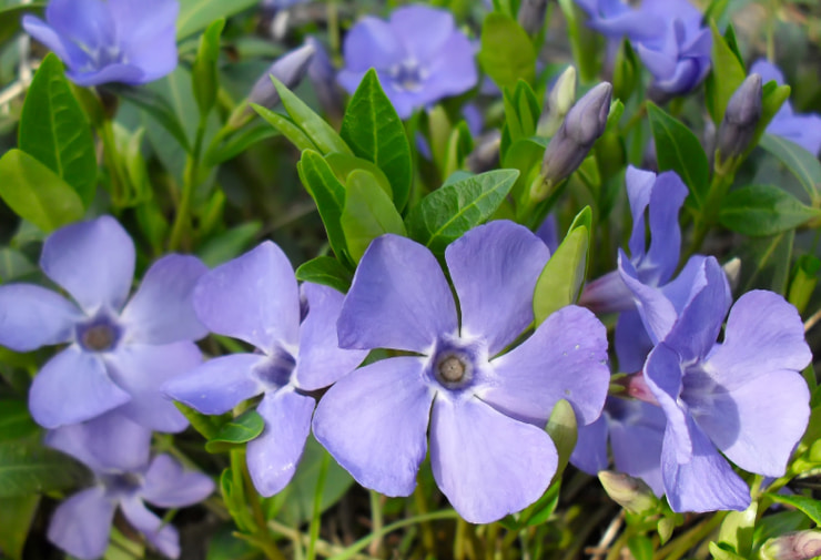
In its essence, Very Peri is a unique periwinkle shade that has a decent motivational and relaxing effect. Its qualities signify a mesmerizing delicacy, worth incorporating into people’s day-to-day lives. Given all the events and situations humanity has had to undergo in the last couple of years, the freshness and gorgeousness of Very Peri are critical for the path to a happy future, full of hopes and dreams.
The Best Purple Color Combinations
Peace… passion… imagination… purple has several different melodies to play. Depending on partners, particular sounds will be more melodic and pleasing. Be brave in your colorful experiments, and use the tips below to level up the quality of your artwork. Here you will get to know the colors that blend best with purple for an extremely outstanding effect.
Purple & White
On the one hand, these two tones are classic. Many famous brands have already achieved their recognizable flair through the right choice of visual patterns. For instance, Milka, Wonka and Cadbury logos evoke an honorable and trustworthy vibe. Their delicate tones with a homey aftertaste emphasize the sensual and delicate texture and aroma of their production.

On the other hand, there are so many natural white and purple color combinations that haven’t yet been implemented in the advertising digital arena. Dwarf iris, verbena, clematis, anemone, canterbury bells, china aster—these natural gifts from the environment shouldn’t be overlooked. Feelings and emotions that different products evoke can be smoothly transferred in alternative virtual goodies with the same concept and intention.
Purple & Orange
If you miss the juice of life in your work, then a purple and orange mix is a lifesaver. While orange symbolizes fun, strength, security, energy and strong social connections, purple lends wings of creativity, compassion and kindness to the mix. Surfing through the Amadine gallery, you will find numerous examples of how to best mix colors for stunning effects.
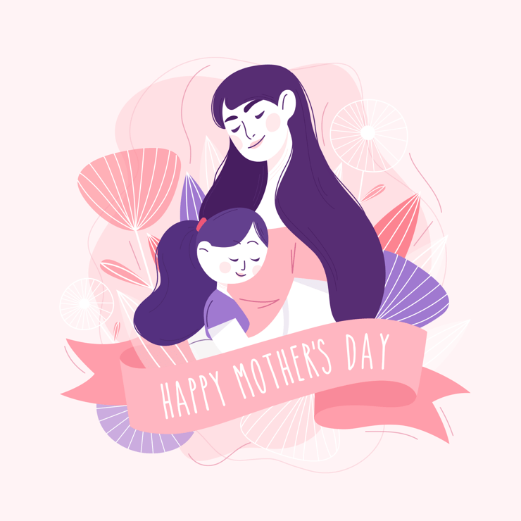
Purple & Pink
In many cultures, pink and purple colors have been considered girlish tones for a while, which has substantially limited its usage. Indeed, they are perfect visual symbols of motherhood and warm hugs, which are so beneficial during the hardship everyone is currently experiencing. However, trends are always changing, and the limitations and prejudice connected with gender tend to vanish, so it is high time to bring this color combination back into the fold.
Purple & Blue
For those who seek mysterious aesthetics, a combination of purple and blue will play well as soulmates. By selecting the right ratio of brightness and contrast, you can evoke the sweetest childhood memories in your viewers, connected with the same tones of their favorite cotton candy, for instance. Besides, their mutual harmony isn’t distracting and is simple to watch and see. So, there are multiple variants to choose from—the final decision is up to you.
Purple & Cyan
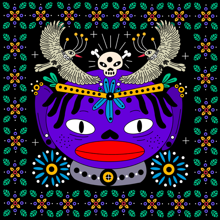
Cyan is the specific shade between blue and green that is also known as bright turquoise. Since it is another color with relaxing vibes, mixing it with Very Peri and other purple gradients guarantees gorgeous results. Progressing from dark to light and vice versa, this blending is perfect for neon color palettes and similar eye-catching templates.
For ombre illustrations and images in which vectors must be highlighted, purple and cyan are highly recommended. What’s more, their well-thought-out mix shows off stylish watercolor patterns. They will easily work as both a background and primary tone for multiple magenta pictures.
Purple & Yellow
These two tones have always been a good color marriage. Yellowish tones complement violet and blue drawdowns of ink, working nicely for pastel-oriented interfaces. The purple and yellow aesthetic is tender and simultaneously provocative. Coming together in the right proportion, their parallel mixing results in brilliant cosmic and futuristic vibes.
Purple & Gray
Thinking about complementary color palettes, people would rather match a purple color palette with yellow or green. At the same time, some neutral tones, which don't break the pastel harmony of periwinkle, would suit perfectly. That is the case with gray. This combination is frequently preferred for bedroom designs, but you are also welcome to create flyers or UI icon sets to achieve the effect of comfort and modernity.

Purple & Green
These colors are contrasting, so their combination within one vector graphic design will seem harmonious. If you desire to highlight the image’s expressiveness, a bit of warmth would help. For example, red and yellow can result in a stunning accent.
Purple & Red
Contrasting colors will work well for highly competitive projects. Given their brightness and eye-catching features, enthusiasts must choose the right contrast to make the design speak loudly and clearly. If you are interested in ombre designs, your work should include magenta notes as the main hallmark.
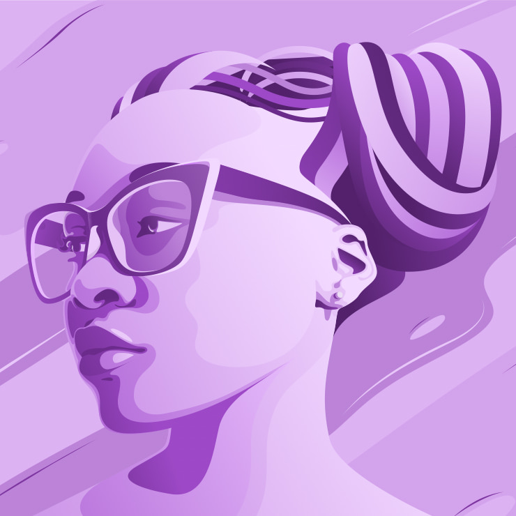
Purple & Purple
Gradients with analogous palettes create a wonderful monochromatic combination. Although the general tint is the same, such layouts reveal its hidden magnetism to the fullest. It is a perfect opportunity to proceed with an unrivaled venture of creativity on the basis of favorite tones. Very Peri incorporates mauve, lavender, pale purple, mulberry and purpure varietals with its periwinkle vibes.
Multiple Color Mix
“Richard of York gave battle in vain.” Sounds familiar? This simple mnemonic phrase to remember basic colors is incredibly popular, but it can play strange games with the minds of the most professional vector graphic designers. There are more hues and tones to be aware of and actively incorporate into your work. Just in Pantone itself, there are over 250 different tones of blue, and this number isn’t the limit! That’s why it is vital for designers to familiarize themselves with colors and ways to mix them for the desired effect.
The color theory explains primary, secondary, tertiary tones, etc., and these combinations on the color wheel should and must be applied whenever you deal with layouts for branding or other purposes. Getting to know how to mix colors and using the advantage of the 2022 Pantone color of the year, even your first creation will be bound to succeed. And to be at the frontier of color trends, check our the color of the year, which brings a new philosophy of a joyous and optimistic celebration.