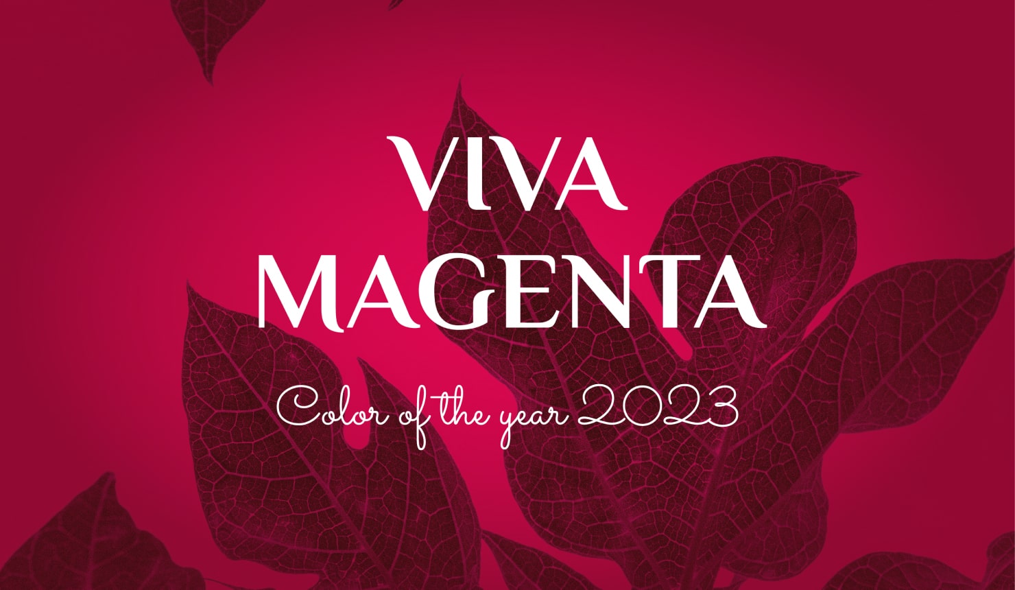
Pantone’s Viva Magenta: The Best Crimson Color Combinations
Pantone, the well-known company that specializes in the standardization of color across different mediums, provides the system to identify and communicate colors. Pantone’s official Color of the Year is chosen by a panel of trend forecasters, designers, and color experts who evaluate and discuss current trends, societal influences, and global events that shape color choice. They look for the color that best represents the mood and values in culture and forecasts the ones that they believe will be popular in the future.
Pantone chooses a color that reflects trends and cultural cues, and for 2023, that color was Viva Magenta, a bold and vibrant hue that speaks to a sense of optimism. With its crimson shade (18-1750 to be exact), it exudes a sense of confidence and joy, while also bringing a bit of playfulness. This color was a major trend in design, as it added a pop of color to any space while also bringing a sense of positivity and joy. From fashion to graphic design, you have seen this color popping up all over. And if you are more interested in the latest trends of Pantone colors, we have a separate article dedicated to the current Color of the Year.
The Best Crimson Color Combinations
Pantone, the company, mentions that crimson is rooted in nature, while also reflecting happiness. To some, crimson is reminiscent of flowers and sunset shades, and to others, the cloaks of fairy tale figures. Crimson is also used widely in fashion and advertising. Whether you use the color in your designs to reflect those characteristics, or something else, these color combinations will elevate your use of the sure-to-be-popular hue.
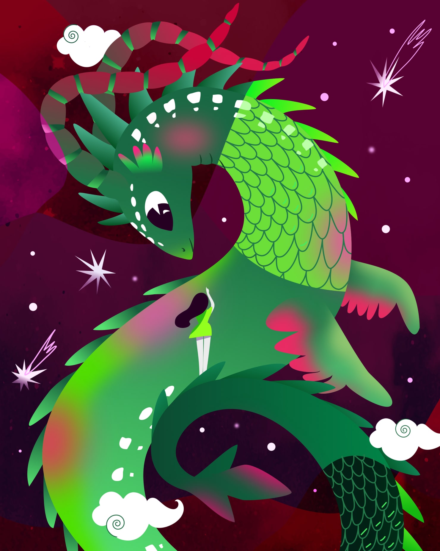
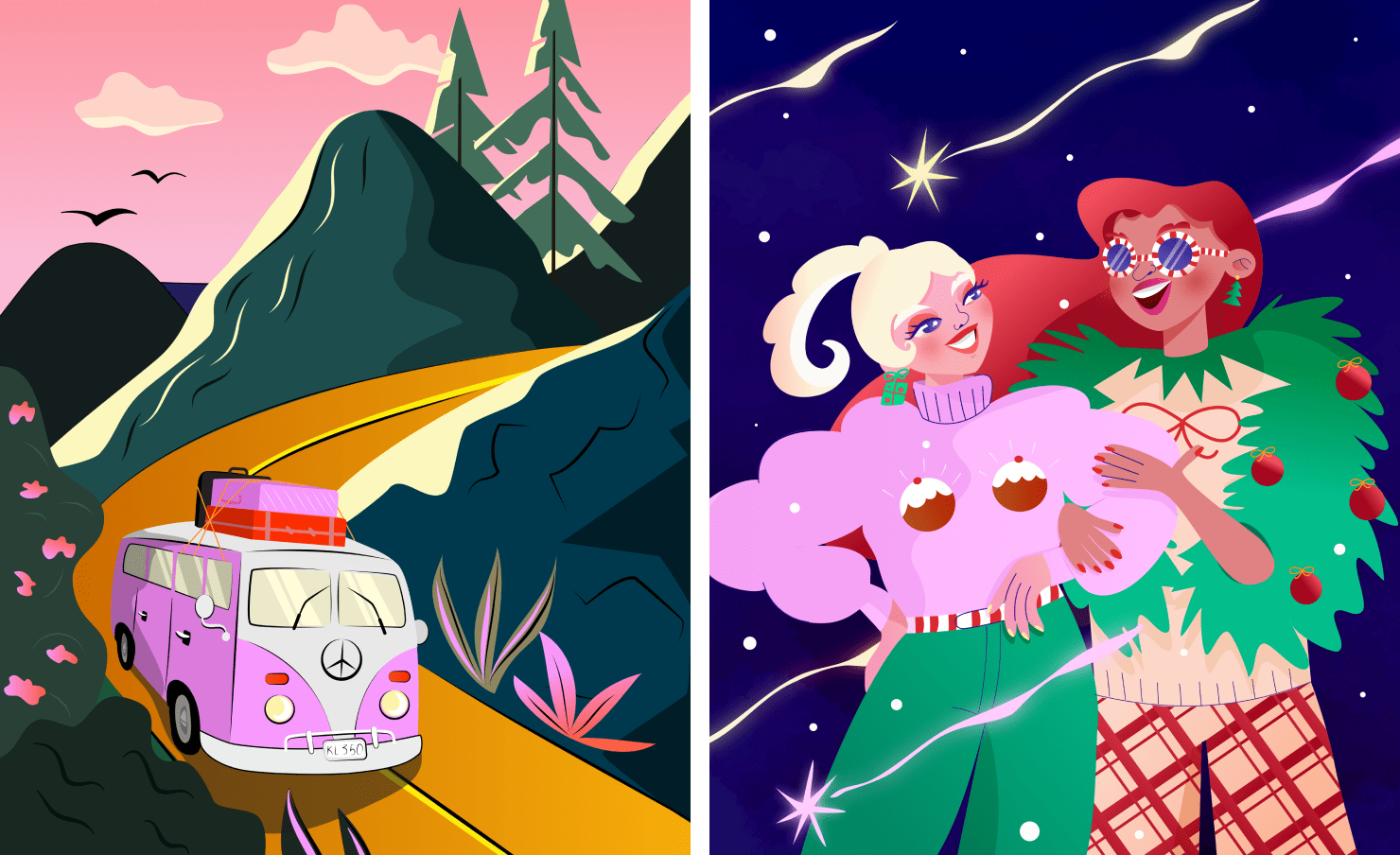
Crimson & Green
Crimson and green is a vibrant color combination that makes a statement. Together, crimson and green create a contrast that is eye-catching and powerful. The colors are complimentary as they are opposite on the color wheel, so the shades are pleasing when combined in different ways. This color combination calls to mind holiday decor, such as Christmas trees and red ribbons, and floral arrangements, as it evokes a festive and cheerful atmosphere. It can also be used to create a stunning and luxurious look in interior design, when used with fabrics like velvet or suede. Regardless of the application, crimson and green will always draw attention.
Crimson & Blue
Crimson and blue make a bold and interesting duo. The richness of crimson is strong and passionate, while the blue is calming and serene. Together, they create a powerful contrast that can be dramatic. This combination is often used for sports teams, as a powerful combination that conveys strength and unity. It is also often used in interior design, to create a luxurious and sophisticated look. This pairing communicates a nautical or traditionally historic sense, bringing to mind the flags of several countries. The combination of crimson and blue can be marked and strong, or subtle and timeless, depending on the medium.
Crimson & Pink
Crimson and pink together are a cheerful combination, perfect for adding a touch of femininity to any design project. The depth of crimson is complemented by the light, soft hue of pink, creating a beautiful slight contrast that is sure to draw the eye. In interiors this could add a romantic, girly feel. Used as paint for wall color, the air given off by these shades can be cozy and inviting. Used in print, the pairing is uplifting and happy. Whether used as accent colors or as the main color palette, the combination of crimson and pink gives off joy and warmth.
Crimson & Purple
Crimson and purple is a striking color combination that together can be very regal. With purple traditionally used as a royal color, when placed with crimson, it enhances the richness. For a traditional look, the two colors can be used for a classic palette of deep magentas and purples, adding an air of romance, high style and elegance. You can combine Viva Magenta with Pantone’s 17-3938 Very Peri, which was the color of the year 2022. As a modern pair, in more contemporary designs the colors create an energetic atmosphere, conveying excitement or creativity. This is a versatile pairing, and the combination works for different design styles.
Crimson & Earth Shades
The combination of crimson and earth shades makes a classic, timeless color palette mirroring nature. Crimson calls to mind the sunset, and the earth tones reflect a landscape, perhaps of a desert or trees in autumn. Earth tones bring a sense of grounding, and crimson might signify heat. The combination is timeless, and widely used in contemporary interiors, home decor, and graphics. Crimson and earth shades are a great color combination for designs that seek to communicate movement and warmth.
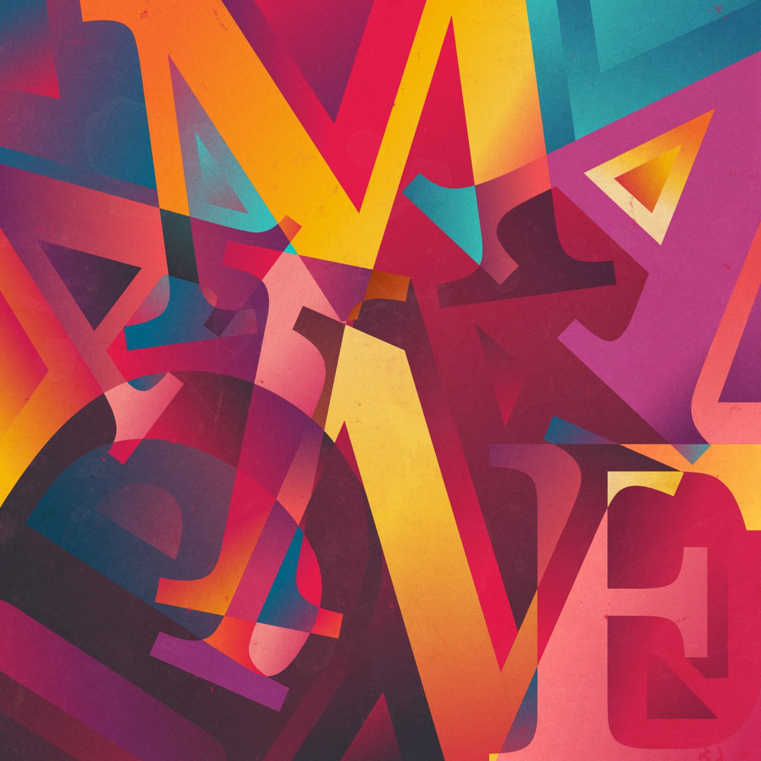
Crimson & Yellow
Crimson and yellow is a vibrant color palette that is effective at drawing visual attention. The combination of these two colors is often associated with energy, joy, and creativity. Crimson, in the magenta hue, is vivid and bright, as is yellow. Yellow is also cheerful, and can range from a light lemon to a deep golden hue. Together, these two colors make a stunning contrast that can be used to create a striking visual impact. Crimson and yellow are often used in branding and design projects, as this pair of colors conveys feelings of excitement and enthusiasm. It can be presented as an eye-catching palette in many different ways.

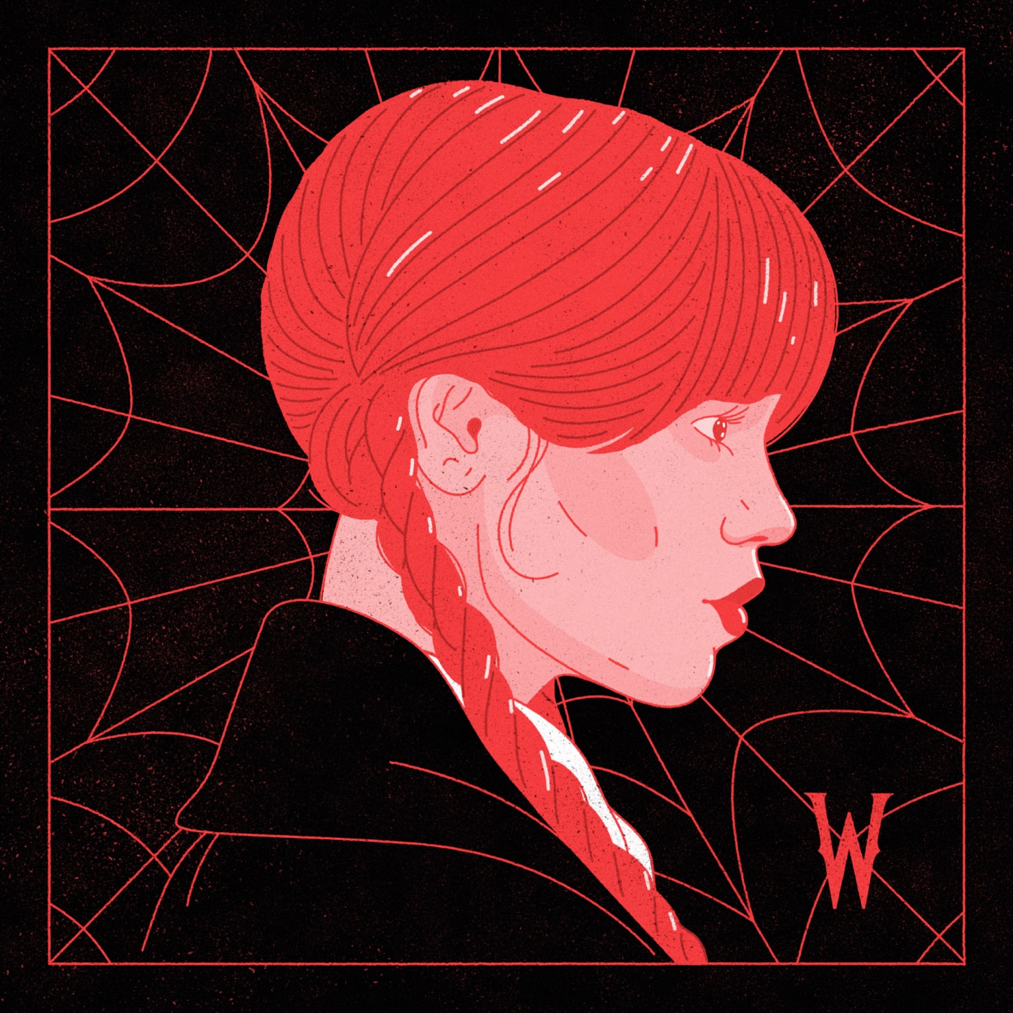
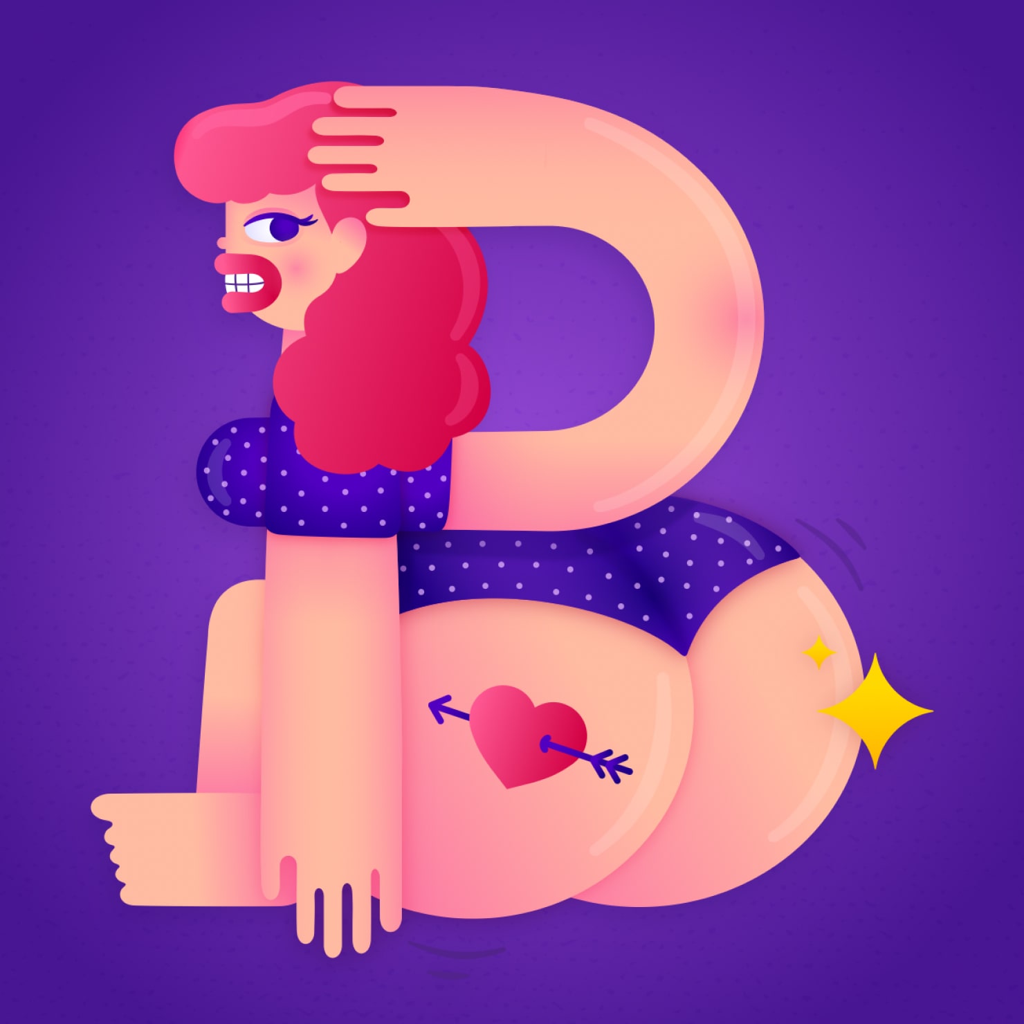
Crimson & Crimson
Using two different shades of crimson as a color pair is an interesting combination. The two shades add depth to designs. As a passionate strong color, crimson shades together are powerful and intense. They bring to mind roses, romance, and the heart. For example, you might use magenta along with a lighter, less intense shade of crimson. This color range is not meant to be subtle. These are a great duo to make a bold statement, or create a focal point. If your design calls for warmth or drama, crimson and crimson may be the fitting choice.

As the Pantone color of the year in 2023, Viva Magenta, a shade of Crimson, is a versatile color that is perfect to use in many designs. Paired with yellow, earth shades, blue, green or pink, crimson can evoke the range of emotions and senses. Keep in mind the basic design principles of color theory and apply them as you select the shades that convey the story you’d like to tell in your visual designs.