What Is UI Design
When using an app or a website, most people don’t stop to think about why the “add to cart” button is a certain color, or why the hamburger menu is often in one of the top corners, rather than at the bottom of a screen. Have you ever thought about why the icons are organized in this order, or why button corners are rounded rather than square?

As small as these decisions might seem, there are actually entire teams devoted to these specific design choices. In fact, there is an entire field of study that governs these visual design principles.
It’s called UI design, or User Interface design. The user interface is every element of an interface of a digital product that a user comes in contact with. UI design is different from UX (User Experience) design, although it is a part of UX.
The User Is at the Heart of UI Design
The main goal of UI design is to create an interface that is easy and enjoyable to use. Good UI design means a user understands clearly what to do and how to do it, at each step of interacting with an app or website. UI design principles keep the user at the center of each decision.
The User Interface contains every screen a user navigates through while using an app, each field a user might type in, and every menu a user accesses. Apart from the visual component, the interaction with different UI elements can be both tactile and sound. And it is very important to provide feedback through various channels.

UI Components
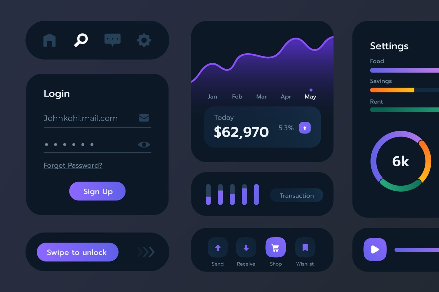
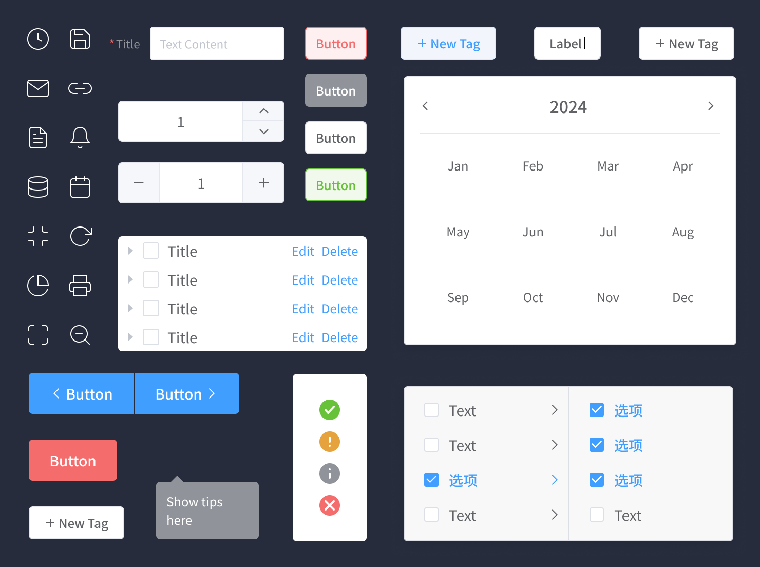
There are common UI components that make up most interfaces, and each component has a purpose. Below you can find some of the most common UI components:
- Button
- Radio button
- Toolbar
- Text field
- Checkbox
- Message box
- Slider
- Toggle
- Tabs
- Icon

UI Elements
All of these components fall under four main categories:
- Input controls (checkboxes, buttons, toggles, text fields, date field);
- Navigational elements (breadcrumb, slider, search field, slider, tags);
- Informational components (tooltips, progress bar, notifications, message boxes);
- Containers (accordion—a vertically stacked list of items that utilizes show/hide functionality).
Users have come to understand what each of these components does on a website, since these have been standardized over time. For example, users know that a search field will help navigate a website, and an input field is where they type information to input.
Good UI design will stick to using these components consistently, so users recognize the elements on the site, and know how to navigate through it and perform the actions they need.
UX vs. UI Design
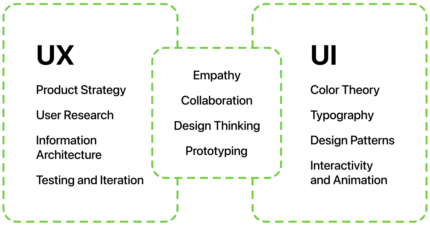
So how is UI design different from UX design? This is a common question, and it is easy to see how the two might be confused. UX design encapsulates the overall experience with a website or an app. It involves every user’s interaction with a site or digital product: the problem that brought them to a site, the solution a site provides, and the ease of using a site and performing tasks.
UI design involves the visual points where a user interacts with a site. UI design focuses on what a person sees and interacts with visually in order to use a website.
As an example, for a grocery delivery app, the UX designer would include thinking about what kind of experience the user will have from start to finish. For example, UX considers why the user might come to that particular app to order groceries, and what differentiates that particular app from others. UX covers navigating through the app, making choices of items to add to the cart, the checkout process, what kind of notifications the user will receive that the order is complete, and the delivery of the actual grocery order.
For the same example, the UI designer would consider only the visual aspects of navigating the grocery app. The UI will consider questions like these when designing screens for the site:
- How easy is it to add food to the cart?
- How easy is it to search for the items you need?
- Is it clear when an item is out of stock?
- Is the store brand reflected clearly on every page?
- Is the design consistent throughout the site?
These are all significant aspects of the user interface.
Another difference between UI and UX is that UX design can be applied to non-digital products and services. For example, a user experience team will be involved in vehicle design, and will think about each aspect of how a user interacts with the vehicle. By contrast UI design always applies to a digital interface.

The UI Design Process
Let’s try and enumerate the important milestones on the way of creating a successful User Interface for a website or an app.
Know and Understand the Product and Its Users
The first step of the UI design process is to understand the digital product and the user. Discover what your user needs to do and how the app will help them meet their goals.
Research and Analysis
As part of the research phase, UI designers will want to delve into their users, their preferences and pain points. This research might be the job of a UX researcher or another member of the design team. The UI designer will work with the product team to help them learn about the user.
During this stage, the UI designer also will consider other competitors and will analyze strong points and weaknesses. Are there any points where a competitor’s site is not clear, or doesn’t serve the user best? What are the best things about your competitor’s site? These are important questions to think about during the design process.
Designing Screens
Next, a UI designer thinks through the user journey. This means they begin to plan each screen a user will interact with as they use the site. They will design components for every step of navigating through the site to complete their tasks. The designer will consider colors, typography, imagery, animation and all the elements that make up the interface.
Creating Wireframes and User Flows
At this stage, designers create sketches of each screen and its elements. They will arrange the major elements to come up with an overall design. This can be done by hand, or with digital whiteboard apps, depending on preference.
Designers then create wireframes, where the layout and positioning of the elements on each screen comes together. You might use placeholders or filler text, because here, proportion and balance are critical to determine before filling in the details.
Next, designers will develop a user flow, where they determine how a user will logically progress from one screen to another.
Creating a Prototype
The next stage is to develop a prototype, or a high-fidelity version of the basic wireframes. Using design software like Figma, Sketch, Invision, or AdobeXD, each element is stylized, and components are designed. At this stage, it’s important to keep to basic design principles, so the finished product will be easy and pleasurable for the user to interact with.
Handing Designs Over to Developers
Once the design has been completed, it is handed off to the development team to turn into a workable product. This stage will take time, since this is where the vision is turned into a real functional app that is ready for the world. Often there are many iterations of the product before it is ready to launch. During this process, the UI designers continue to work with developers and other stakeholders.
UI Design Principles
There are basic UI design principles that are important to keep in mind when designing a digital product. These have been tested over time and have proven to be necessary for users to complete what they want to do easily.
Consistency
A product should be consistent visually and functionally. There should be uniform fonts, colors, buttons and icons that visually tie together all of the interface. An element should represent the same action throughout the app. Consistency makes things easy for the user.
Familiarity
UI design encourages using icons and elements that users are familiar with. Don’t incorporate surprise elements that users haven’t seen before. Familiar elements and icons make your product understandable to a wide set of users from the first interaction.
Put the User in Control
The interface should allow users to feel in control of their actions on the site. Their experience should allow them flexibility in choosing how to complete certain tasks.
Feedback
The interface should provide feedback for each step users take on the app. This could be a color change of a button after a click, or a text response to a user input. Feedback should be given when there is a delay or an error. Keeping users informed helps eliminate frustration.
Shortcuts
Provide ways that users can quickly move through the site, and shorten the steps needed to perform frequently used actions.
Accessibility
Interfaces need to be accessible to all users. Visual contrast is important, so users can easily read the page. Buttons and clickable links should be clearly identifiable. There are many standards around designing for users with disabilities, for instance, voice and gesture types of interface which should be considered to make the web usable for all. Remember that attention to accessibility in the design helps all users make the most out of the interaction.
Constant Testing
The testing is not exclusively saved for professional Quality Assurance and Design teams. The most unexpected results come from UI testing on target audience and even family and friends. Things that are obvious to a designer may be incomprehensible to an ordinary user.
Stick to the Essentials
One of the coolest and sometimes most difficult principles to implement is “everything that can be thrown away from the interface should be thrown away” or a classical stick to the essentials rule.
Skills of a UI Designer
UI designers have one of the most important jobs in the world, as they design products that people use, interact with and depend on every day of our lives.
UI design clearly covers a lot of details, likely more than you may have considered when using an app. To be a UI designer, there are many skills that are helpful to have. These skills include creativity, empathy for the user, ability to work in a team with other designers and developers, and the ability to solve problems.
During their daily work, a UI designer will often:
- Sketch out ideas by hand or on a digital whiteboard.
- Create wireframes digitally with drawing software.
- Implement basic design principles.
- Know color theory and how to use it.
- Use software like Figma or Sketch to create wireframes.
- Understand information architecture and page design.
- Know basic interaction design principles.

There are many courses offered in UI design to learn these skills. If you are interested in this field, start with a course on basic design principles to get a good foundation. Of course, an excellent way to learn is also to simply start designing a screen for a product you come up with, or one you already use. As you study, come up with your own designs and experiment with the software that UI designers use, like Figma or Sketch.
UI Design for Everyone
UI design covers a lot of visual elements: interactivity, visual design, and information architecture. A well-designed user interface is critical to ensuring a good user experience. UX design and UI design are two disciplines that go hand in hand, with UX design being the builder and UI design being the visual designer.
While UX design considers the overall user experience, UI design focuses on the visual and interactive elements that people use when interacting with an app or website. There are universally accepted principles that guide UI designers as they design a web page or app to make it easy and enjoyable for users. The UI design process includes understanding the context of a digital product and its users, creating wireframes, prototyping, and working with developers to bring the product to life.