How to Create Distinct Icon Set: A Comprehensive Guide
The fields where icons can be applied are breathtakingly divergent—from website interfaces to mobile applications, they make style the medium where they are placed to live. Their “talking” capabilities depend not only on their color or size, but also on the deepness and accuracy of lines, number of details, and the image created as a whole.
It seems pretty simple to design an icon itself even for a beginner. Taking into account how plenty of them have been seen, the process becomes intuitive, especially with the help of modern software like Amadine with its cohesive suite of tools. However, the task is more complicated when an icon set has to be created. Yet, knowing some tricks and professional pieces of advice always come in handy, and this case isn’t an exception. So stay tuned to come up with brilliant ideas for icon set designs and proper instruments for it. If you still wisht to use the professional experience, Google Icons or SF Symbols may help out when you are at a loss.
Style Alignment
Keeping it style-appropriate is essential. That doesn’t mean enthusiasts have to create the same copies of one sign, but the visual connections between them are to be obvious. The initial concept may be the use of the same color palette for your symbols, but you can go further than that. For instance, designers are welcome to apply bolded lines to make different-styled elements more cohesive.
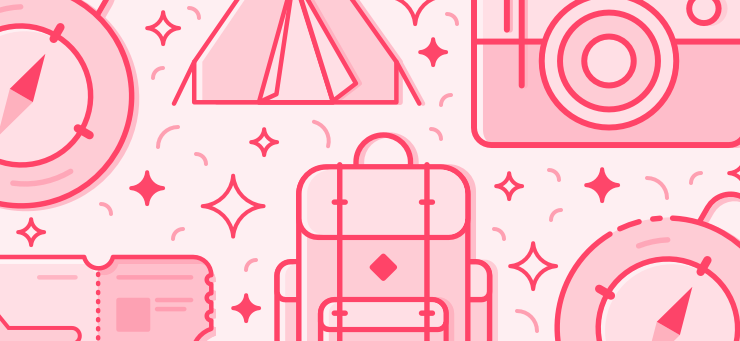
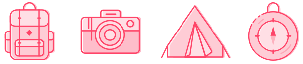
Besides, that could be graffiti effects or icons performed within one mood such as vintage, postcard, and more. The variety of icon formats includes the following:
- Outline—it is the creation of the icon without filling. The main advantage is that this silhouette is created with the sole help of the lines. These subtle characteristic cues help differentiate one item from another without difficulty.

- Skeuomorphic design—in this case, the icon style isn’t cartoon-like. On the contrary, it resembles the real appearance of objects, mimicking counterparts significantly.
- Hand-drawn—the self-explanatory nature of this notion makes it simple to imagine how such icons look like.

- Glyphs—in plain English, that is how the web page fonts will be like. This so-called graphical language is created in accordance with CSS and special web effects.
- Flat icons—this is one of the most spread types of icons. Here you achieve the intended design with clear and crisp images while keeping the volume within two-dimensional standards.
Choose the Right Size
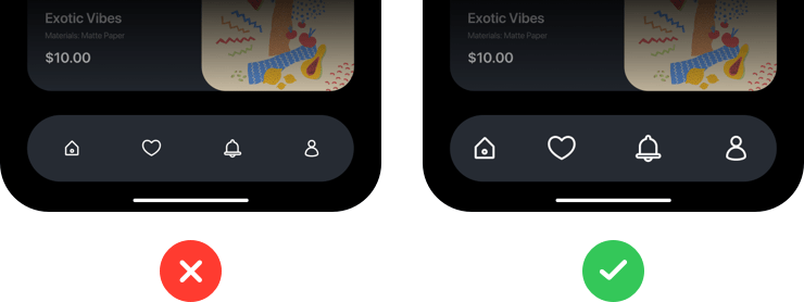
Of course, the size defines how visible your icon elements will be in the overall interface. What you need to ensure is that the selected format isn’t eye-irritating. So the perfect medium between small and large dimensions has to be kept.
With the help of an advanced design program, designers are welcome to experiment and pick up the best fit volume. Amadine is a powerhouse when you have to deal with its functions. Not only does it have all the classical vector drawing tools, but also this solution has a large library of icons and symbols, and you can also create your own sets and libraries. The already present library will significantly reduce the time and effort spent on designing each symbol and set in particular, if you wish to use the ready made solution. And for the custom made sets only your imagination is a limit.
It is unnecessary to mention that the sizing within one and the same icon collection should be the same, isn’t it?
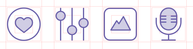
Using Grids
This technology is often underestimated. But even hand-drawn icons have to possess ideal alignment. That’s where the efficiency of grid tools is second to none. All you need to do to style your icons faster and make them more beautiful is to ensure their balanced sizing. The grid is necessary and important because icons should fall into the pixel grid so that there are no blurry lines, for example, when a straight line falls between pixels. At the same time, there should be a balance between alignment and a beautiful organic appearance of the icon such as smoothness of lines.
Of course, straightforward sticking to the grid lines may be unnecessary and spoil the effect—the main purpose here is to assist graphic designers in choosing the right proportions for their icon sets.
Working with the Results
During brainstorming, you can come up with a few design prototypes. From this perspective, the ability to share the concept with others and consult is essential, so don’t miss the chance to improve your set before the actual release. Testing how the layout will work for a particular user interface will also tell you a lot.
Once the hand-drawn sketch is created, you are welcome to recreate it in vector to ensure its beauty won’t be spoiled by sharing or saving. In Amadine you can import the hand drawn picture and draw over it on the layer above on your Mac, iPad or iPhone.
Editor’s Choice Recommendations
Here are some things beginners are welcome to bear in mind to make their layouts flawless:
- Simple and clear—don’t forget that you don’t have to include maximum possible details in your icon to make it eye-catching. The effect will be quite the opposite. Sometimes, it is much better to avoid noise and heavy concepts in preference to airy and fresh styles. Too many details aren’t good, too.

- Spacing—once again, pay attention to the size of your icon and always ensure its inner space is enough not to cause awkward visual effects.
- Contrast—color palettes can be any, depending on the final goals of your project. However, you should think about their visibility not only among each other, but also on the dedicated background. Don’t hesitate to check how to match different colors and use the knowledge for your own benefit. The best feature to help you with this in Amadine is Recolor, which allows you to change all the colors in your design with one light touch or adjust some particular colors one by one. The same rules apply to the visual unity within the icon layout itself. Choosing too dark tones makes it harder to notice the object’s contours and edges. At the same time, not enough contrast will lead to a result that your real-world compartments seem fake and unnatural.

Wrap It Up
Designing an icon set isn’t that complicated as it seems. Following basic tips and using a vector drawing app will let even the first-time user come up with a great layout. All that is left is practice, so enjoy the process and brainstorm new icon ideas while having a lot of fun!