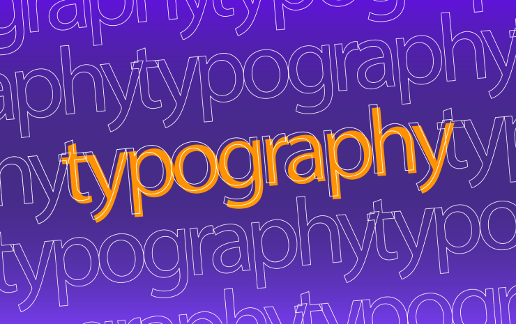
Rules of Typography
Typography is the art of text design. We can think of it as an artistic technique for creating illustrations and other graphic design objects. But, in addition to the artistic component, typography is primarily laws and rules that help the reader to easily scan and understand what is written. Typography carries not only an aesthetic task, but also a functional one, which means that the text should be easy to read.
Basic Concepts
First, let’s come to grips with the terms. A group of fonts with a common type of drawing and style is called a typeface. The font is a separate graphic style of letters and symbols (regular, italic, bold) inside the typeface. For example Arial, Helvetica and Times New Roman are typefaces, and Arial Bold, Helvetica Light and Times New Roman Regular are fonts.
Typefaces can be briefly divided into two main categories: serif (e.g., Antiqua) and sans serif (e.g., Grotesque). Monospaced and display typefaces are also distinguished among the others.
The size is the font size in points and pixels. It includes not only the height of the letter itself and all external elements, but also the space around it. Leading is the distance between the base lines of adjacent lines in the text. Tracking is the distance between characters in a text block that varies evenly between all letters, and kerning is the distance between one pair of characters. Let’s review simple rules that will help us improve our texts.
Rules to Help Make Text Better
When you start working with text on an everyday basis, you see that there are many possibilities to share the same thought in a visually different way. To prevent you from making the most common rookie mistakes, let’s take a more thorough look into the basic rules of typography.
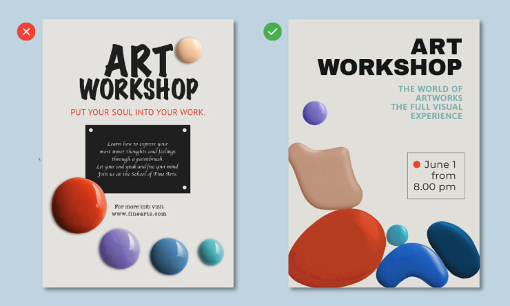
Use No More Than Three Typefaces
Experimenting with fonts is not worth it if you are a novice designer or if your task is simply to arrange the text on the website. Most often, two typefaces are enough to cover all your design needs. Moreover, you can get by with one typeface, using its different styles, and you will not lose anything.
Standard Fonts Are Better Than Decorative Ones
Contrary to beginner misconceptions, good typography most often consists of fairly simple font pairs. Handwritten and heavily decorative fonts rarely look relevant, and are often difficult to read, especially on websites. Don’t be afraid to use standard and familiar fonts. They are usually the best designed and won’t make your design look out of place.
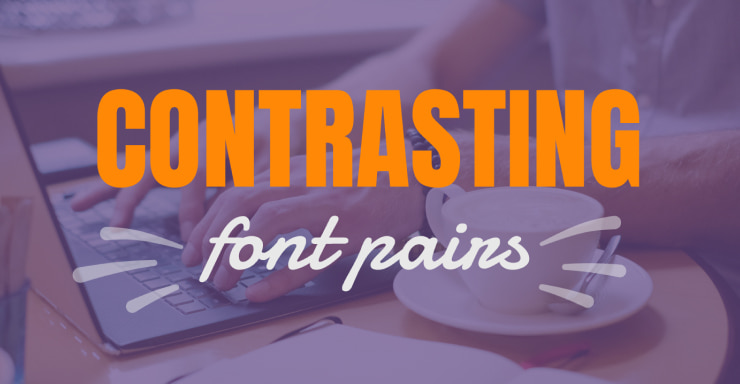
Contrasting Font Pair
When creating a font pair, choose fonts that look visually different but, thanks to one or two attributes, look attractive together. Combine serif typefaces with sans serif, or combine Bold and Regular or Light styles within one typeface.
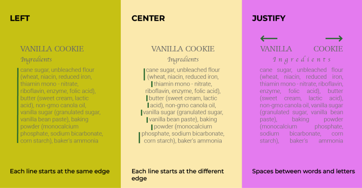
Use Left Alignment
Left alignment is suitable in most cases, as it is convenient to read, while being familiar to the eye. Use center alignment for headings, quotes or small amounts of text when there is only a central composition. Justified alignment should not be used at all, as it creates spaces between words and looks unattractive. This type of alignment is used for newspapers and some books, and special typesetters work on their adjustment. Right alignment is rarely used, most often for numbers in tables. If you want to learn more about alignment and graphic design principles, the top ten books on graphic design is a great read.
Line Length
Speaking of web typography, the number of characters per line should be in the range of 40–70 characters for computers and tablets and 30–40 characters for phones. For website texts, the optimal size is 16–20 px. This means that the approximate width of the text block should not exceed 760 px.
Balance Line Height, Size and Line Length
For website texts, paragraph line height sizes are around 120–170%, but you need to be careful here, because, at 120%, the text can look stuck together, and, at 170%, it is too sparse. Usually, the line height is chosen by the designer “by eye,” but the recommended line height is 150%. In this case, the lines do not fall apart but are well separated, and the text remains readable. You can take the font size and multiply it by 1.5 to get a nice value for line height. This rule works well for regular text, but, for the headings, it is often smaller. It can even be smaller than the size itself.
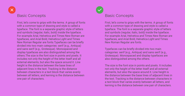
Divide Text Into Paragraphs
In the modern world, it is more difficult for people to perceive large volumes of texts. If you want your text to be read, break it into paragraphs according to the principle: one thought—one paragraph.
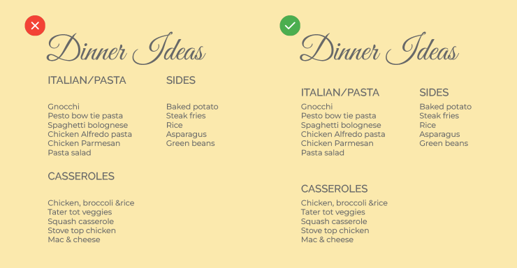
Create a Visual Hierarchy
To do this, you must follow a certain order in the design of headings and text body. The text should be structured, so define a title and headings at different levels. This will help to separate the information and make it easy to understand. There is a rule that will help you quickly find the right title size, take the font size (point size) and multiply it by 1.6.
Follow the Rule of Proximity
Objects located close to each other are perceived as connected. Text elements should be located so that the reader does not have any questions about what the heading or text refers to. Distances should be measured in such a way that the heading clearly relates to its text block, and does not hang in the air between the previous block and the next one.
Do Not Deform or Stretch Text
The font designers worked very hard and created the ideal proportions of the letters for us. Do not change these proportions.
Follow the Rules of Grammar
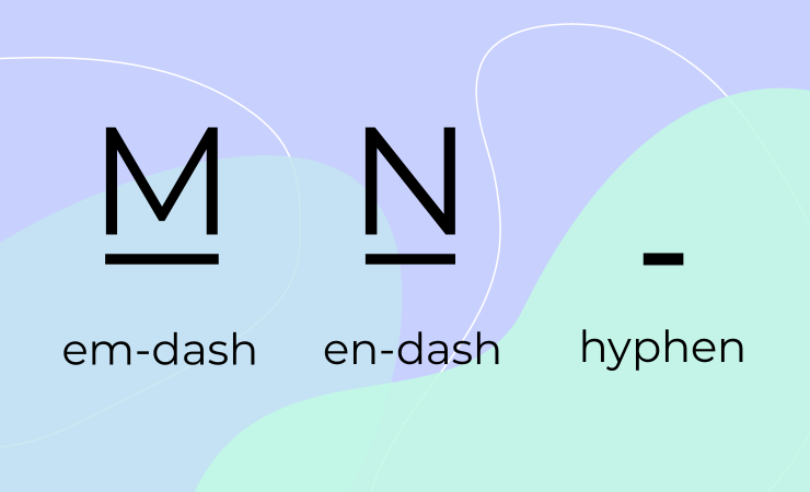
A common problem is confusion between hyphens and dashes. Remember that a hyphen is a short line that is used for hyphenation and compound hyphenated words. There are two types of dashes: em dash (—) and en dash (–). The names are self-explanatory, actually, as the en dash is approximately the length of the letter “n”, and the em dash the length of the letter “m”.
An em dash is used in sentences when it is necessary to break it into parts according to its meaning. An en dash is used when specifying a range of numeric values, such as 1989–2022 (but not when we write “from,” in which case we should write “to” between digits, e.g., from 1989 to 2022, the same as when reading the dates aloud), and also to indicate a connection or contrast between pairs of words (for example, conservative–liberal split).
Do Not Use Caps Lock
Using all capital letters only looks good in logos. You can sometimes use them in a title that consists of one word, at best. Do not use capital letters for typed text, as it will be difficult to read.
Free Space Is Not Emptiness
Remember that you don’t want to fill all the empty space in your design with objects. Objects should be surrounded by air. It helps us perceive individual elements and focus on what is needed. Leave enough free space.
Avoid Hanging Prepositions, “Widows” and “Orphans”
In order not to break up words with prepositions and abbreviations in the text, use a non-breaking space. Usually, you can put a non-breaking space using the key combination of Ctrl+Shift+Space for Windows and Option+Shift+Space for macOS.
Try to avoid hanging lines. A “widow” is one word on a whole line at the end of a paragraph or a very short line at the end of a text or page. An “orphan” is a hanging line that goes to the beginning of a new page or column. They must be avoided. Try reducing the letter spacing, break the line, or adjust the font size to get rid of them.
Instead of Conclusion, Get Inspired by Good Examples
In your everyday work, search for inspiration, find good examples in design communities and on the websites where designers post their work. Try to use techniques from good designs, use high-quality photographs and illustrations, and be careful when working with texts in your projects. Remember that you can break the rules, but only when you already know how to use them properly.