Rules of Composition
In the article Composition in Graphic Design, we learned a lot about composition and its components and types. In this article, we will discuss the most popular techniques and rules of composition to help you make your illustration look more professional and captivate your audience.
Rule of Thirds
First, divide the work surface into 9 equal squares, as shown in the illustration below.
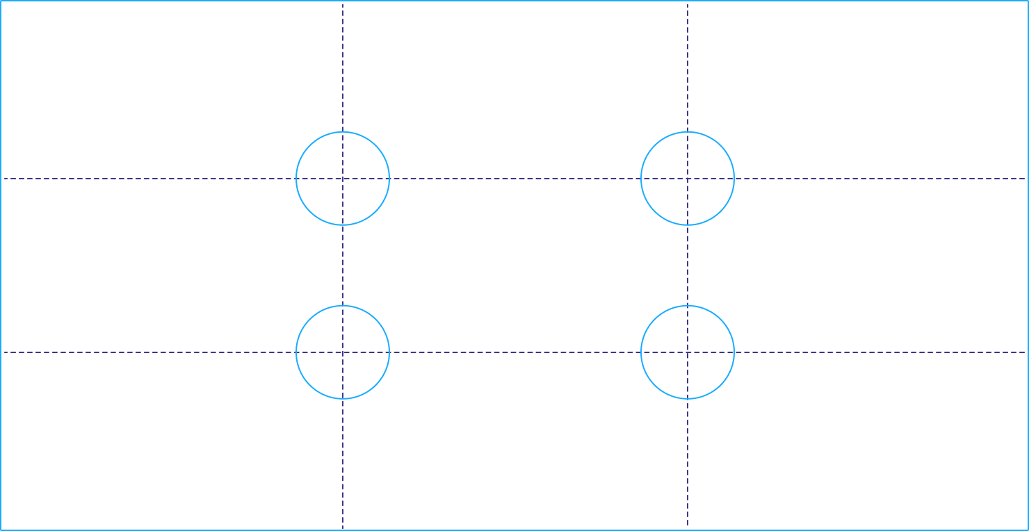
This is done in order to place the central object as harmoniously as possible with other elements of the composition. This way you can clearly see the center of the work surface and its peripheral areas. By placing key elements of the image along these lines or at their intersections, you will achieve a more attractive composition.
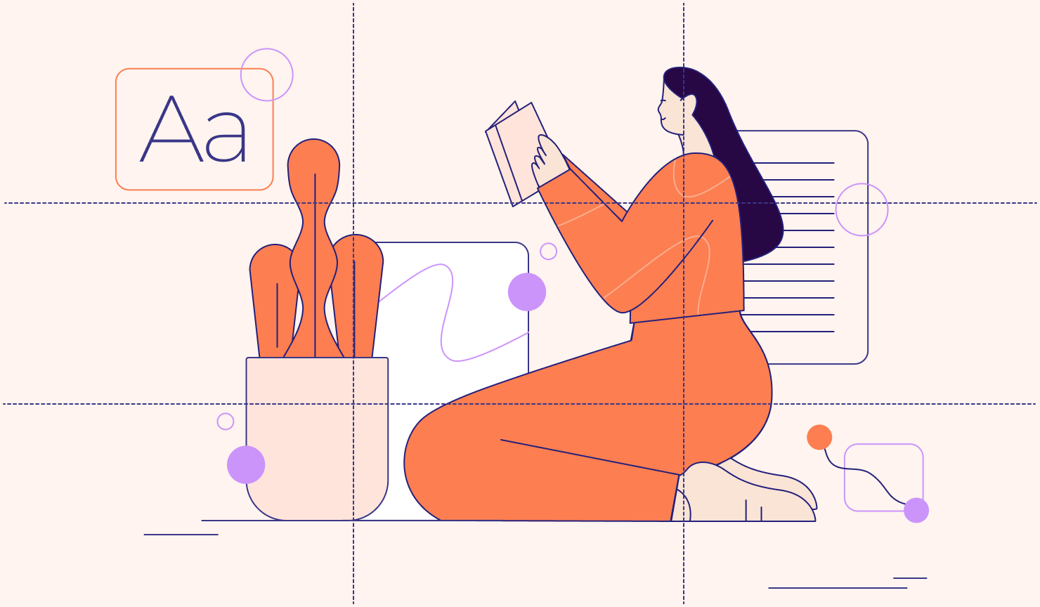
As you can see in the illustration, the main character is positioned at the intersection of the lines on the right side, which gives her a more favorable position and maintains balance in the whole picture.
Rule of the Golden Ratio
The golden ratio, also known as the golden number, the golden section or divine proportion, is the ratio between two numbers of approximately 1,618. It is usually denoted by the Greek letter φ (phi) and is associated with the Fibonacci sequence, in which each number is added to the previous one.
Studies have shown that projects created using the golden ratio are pleasing to the eye. We can use a golden section to help arrange our items so that the composition looks more aesthetically pleasing.
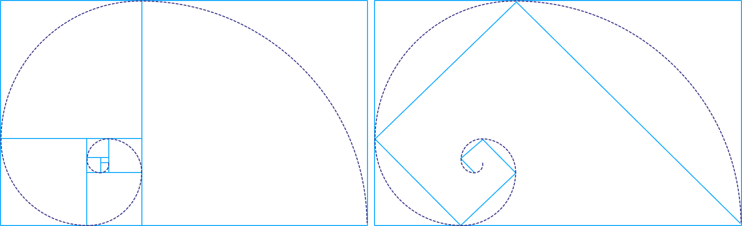
To create an illustration using the rule of the golden ratio, it is enough to visually imagine a spiral on a sheet and place objects on it. Or, focusing on a drawing, make a thin, barely visible line of a pencil directly on a sheet.

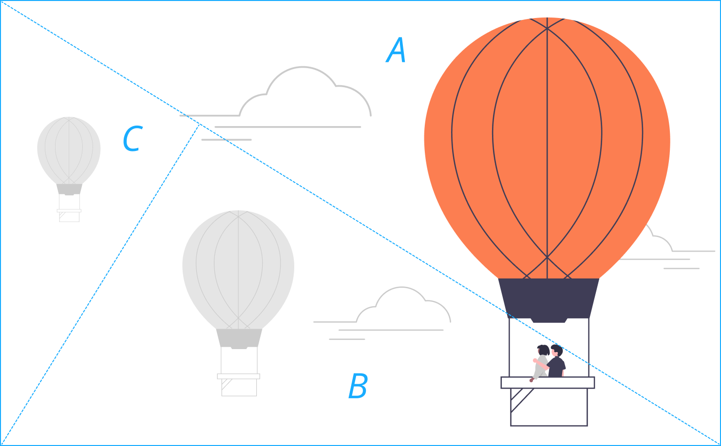
Golden Triangle Composition
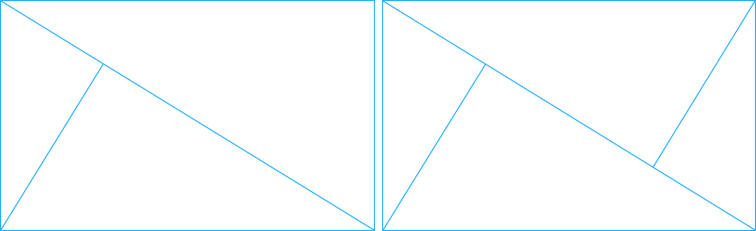
A diagonal golden ratio is widely used in composition and is called the Golden Triangle. First, we create a rectangle and draw a diagonal in it. Next, from the free corner, you need to draw a perpendicular line to the already drawn diagonal. As a result, you’ll get three triangles of different sizes. You should place significant objects of the illustration within these triangles.
This means that, for a harmonious composition, you need to correlate the scale of objects with proportions. A large object is placed in the largest triangle (A), a medium object in the medium triangle (B) and a small object in the smallest triangle (C).
If the number of objects exceeds three triangles, one more perpendicular line can be drawn from another free corner. Then you’ll have four triangles in which to position the objects.
Balance
Balanced composition in art refers to the arrangement of visual elements in a way that creates a sense of stability and harmony. Balance doesn’t necessarily mean that both sides of a composition are identical, but rather that they feel visually satisfying and complete.
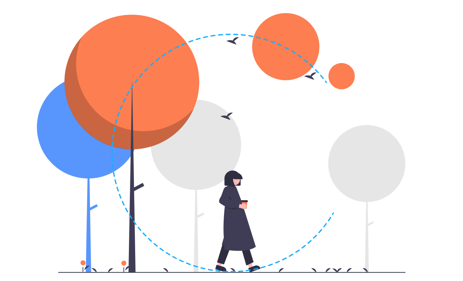
C-Shape Composition
C-shape balance composition in art refers to a visual arrangement where the elements of the artwork are organized in a shape resembling the letter “C.” This composition guides the viewer’s eye in a curved path around the artwork, creating a dynamic sense of movement and balance. The “C” shape often connects different focal points, leading the viewer’s gaze naturally from one element to another, enhancing the overall harmony and flow of the piece. This technique is used to create an engaging and aesthetically pleasing composition.
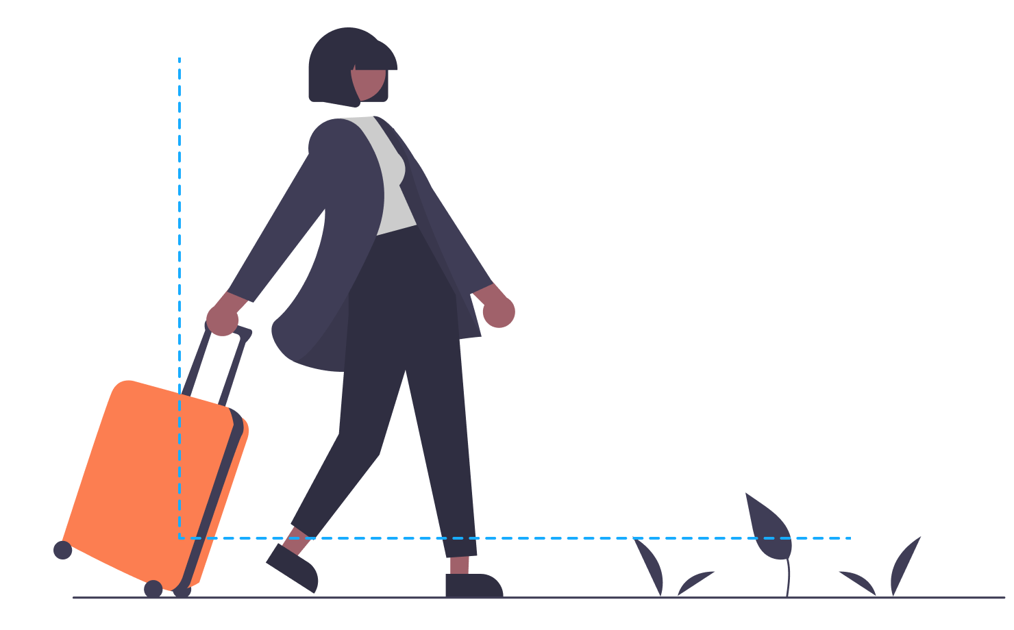
L-Shape Composition
L-shape balance composition in art is a technique where the main elements of a composition are arranged in the shape of the letter “L.” This typically involves placing a vertical element on one side of the artwork and a horizontal element along the bottom, creating an asymmetrical yet balanced structure. The negative space formed by this arrangement can lead the viewer’s eye through the artwork, making it a dynamic and engaging composition. This method is often used to create a sense of stability and direction in the piece while allowing for creative and varied interpretations.
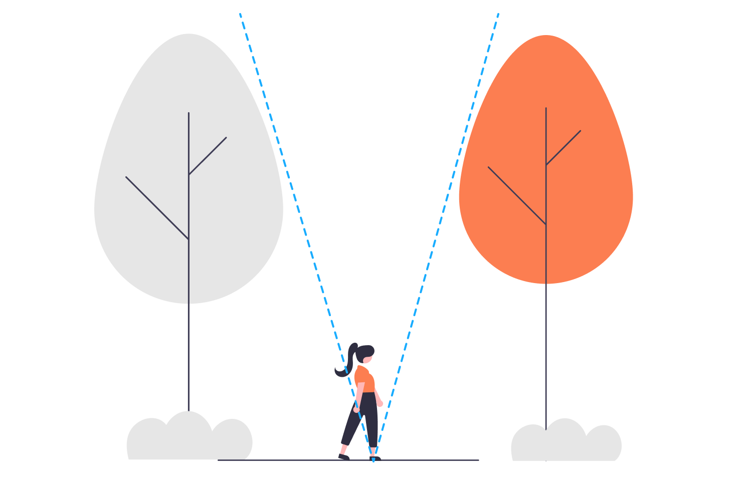
V-Shape Composition
A V-shape balance composition is a visual arrangement where elements are organized to create a “V” shape. This composition directs the viewer’s eye towards a central point or focal area, often at the bottom or top of the “V.” The lines or shapes forming the “V” guide the viewer’s gaze inward, creating a sense of balance and focus. It can be used to convey stability, strength, or convergence in a piece. The V-shape can be subtle or more pronounced, depending on how the artist arranges the elements.
Rule of Oddness
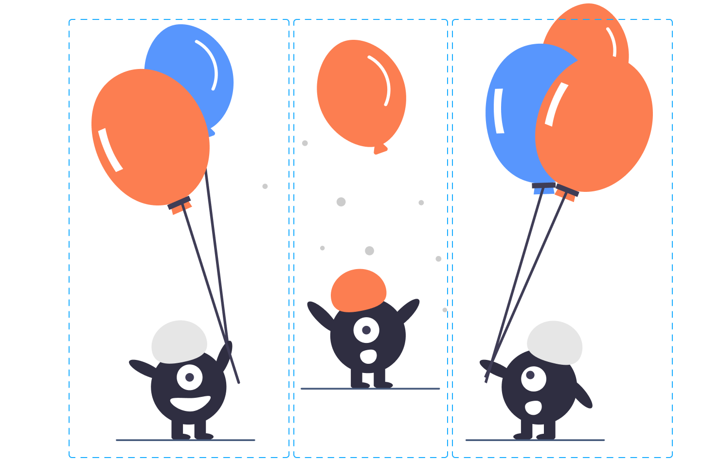
The rule of oddness is the idea that odd-numbered objects look more interesting and natural than even-numbered ones. That is, a group of three elements looks more interesting than a group of two or four. One of the reasons for this can be that even numbers may seem too symmetrical.
Guiding Lines
This is a technique of composition that directs the audience’s attention to the intended object with the help of lines. The reason for the effectiveness of this technique is simple—every time we look at an image, human instinct forces us to follow existing lines until they direct our gaze to the intended object.
Experiment
Experiment with different types of compositions. It is not necessary to always follow the type of composition that is most convenient or familiar to you. Feel free to experiment with the elements in the illustration and different composition types. It is always useful to try out something new, as you will be able to diversify your visual approach to illustration.