Jakob’s 10 Usability Heuristics: A Beginner’s Guide to Enhancing User Experience
In the world of UX design, creating interfaces that are intuitive, user-friendly, and enjoyable is of utmost importance. But how do you know what is intuitive to use and what kind of interface do people find enjoyable to interact with? These questions are answered in a set of principles called Jakob’s 10 Usability Heuristics, that have become the most used standards for interface design.

In this article, we will explore these 10 heuristics, and give a beginner-friendly introduction to these principles. We also will help you discover how using these principles in design will elevate your design skills.
What Is Usability?
First, let’s define what usability actually means. Usability answers this question: Are the interfaces a user interacts with user-friendly and easy to navigate? It evaluates how simple it is for individuals to use a design effectively the way it was intended.
There are five key components that define usability: learnability, efficiency, memorability, errors and satisfaction.
Who Is Jakob Nielsen and What Was His Influence?
Before we delve into heuristics, let’s quickly introduce Jakob Nielsen, the influential figure behind these usability principles. Jakob Nielsen is a usability consultant from Denmark. He is the co-founder of the Nielsen Norman Group in 1998, along with Donald Norman, another well-known usability authority. Jakob, along with his company, became a pioneer in the field of UX research and design. In fact, the Nielsen company has made major contributions to the design field. They have helped shape the best practices and guidelines that enhance user experiences across various digital platforms.
Understanding Jakob’s 10 Usability Heuristics
In the early 1990s, during the explosion of the internet, Jakob Nielsen recognized the need for a set of guidelines that could serve as a common framework for evaluating user interfaces. He collaborated with Rolf Molich to develop the 10 Usability Heuristics, which were based on research and analysis of user behavior. These give designers a practical toolset to identify and address usability issues in their designs, which results in improved user experiences.
Visibility of System Status
This means users should be informed about what is happening on a website within the system.
Visibility of a site is measured by how well the system gives the user hints about what’s happening behind the scenes. For example, when a user uploads a file to an online platform, often a site might provide a status bar with a percentage number during the upload. This helps users know how much time it will take until the upload is complete.
The best interfaces always give clear and timely feedback, so users don’t have to guess about the current state of their interactions with the app.
Match Between System and Real World
Matching refers to the idea that interfaces should speak the users’ language, and use familiar concepts and terminology.
Practically, when designing a system, this means using real-world language, instead of system-oriented language. For instance, the timers you may see on well-designed apps resemble real-world timers you would see on your watch. A calendar on a web page looks like the calendars we are accustomed to using in our everyday lives. Familiarity like this makes interfaces easy and enjoyable to use, and require no introduction to how to use them.
User Control and Freedom
Users should be able to navigate through a digital experience freely, and they should be able to correct their mistakes. Provide visible and easy options to undo or redo actions. The last thing designers want is for a user to abandon a site because they aren’t able to do what they want to do, or because they get stuck.
Giving users control and making options very clear empowers users to explore and do actions on the site, without the fear of getting stuck.

Consistency and Standards
The design elements and interactions should be consistent throughout the interface. Be intentional about visual elements and the layout of a website and make sure the theme is the same through every page. Don’t invent new terms to be clever or unique. Instead, use icons and language that are standard and recognized in the digital world.
This also applies to the tone of the copy through an app or website. If the tone of the website is professional, or conversational, witty, or funny—make sure that tone is applied through all interactions with the site.
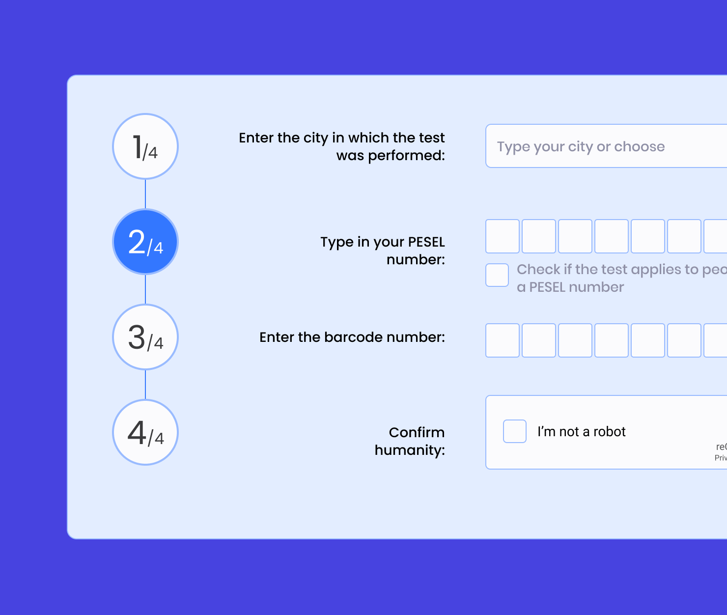
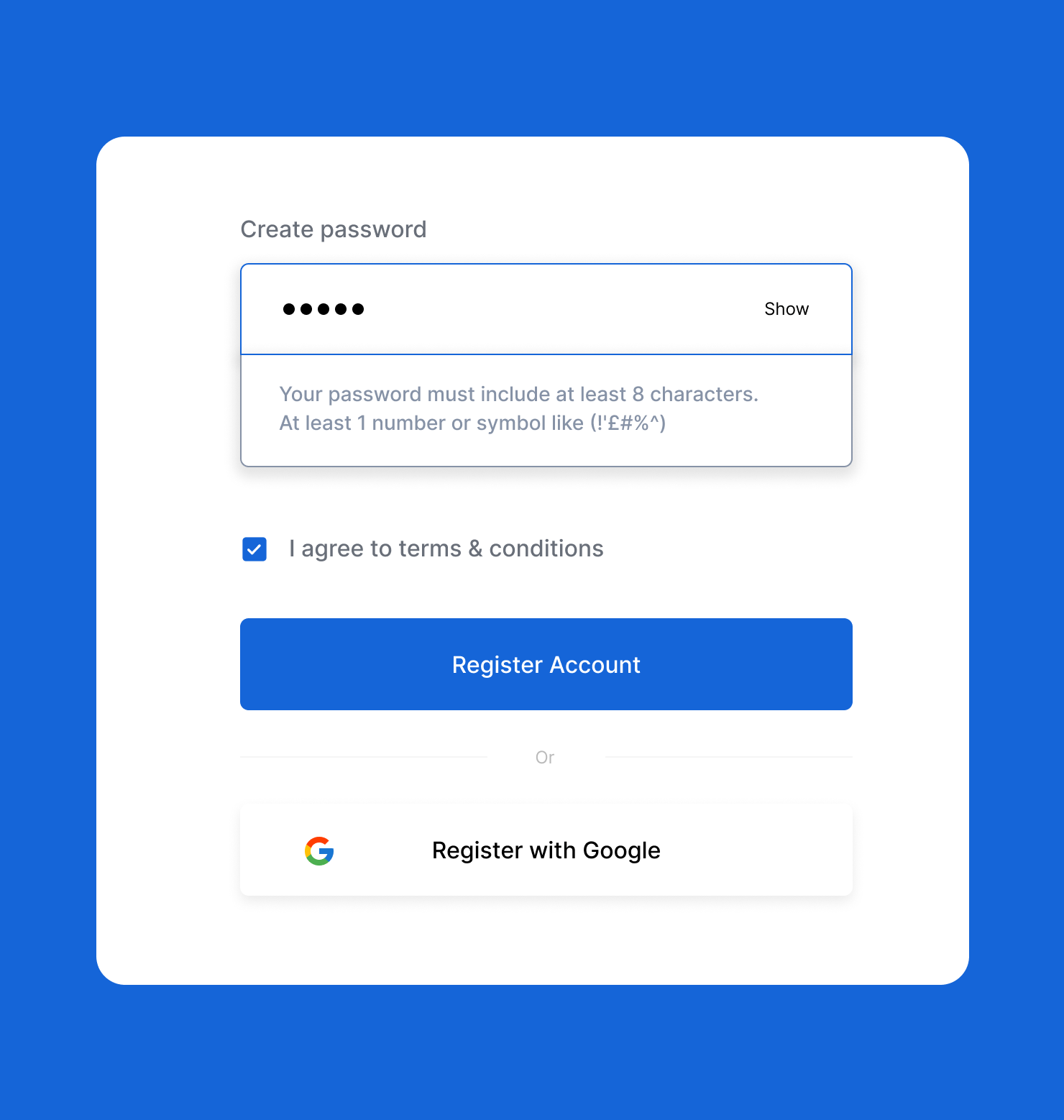
Error Prevention
The fifth heuristic is to anticipate and prevent errors by designing intuitive interfaces. Implement features such as confirmations, validation, and constraints to minimize the occurrence of user errors.
Recognition Rather Than Recall
Reduce users’ cognitive load—how much they have to think and problem-solve—by presenting information in a way that prompts recognition, rather than relying on recalling from memory. Always show relevant information, options, and instructions at the point of need.
Flexibility and Efficiency of Use
This means your system should cater to both novice and experienced users. Experienced users may want to use shortcuts to speed up navigation and actions. But for a first-time user, they simply need a clear way to do actions and move through the site. Your design should accommodate both.
Things like customization options and accelerators—alternative, faster ways to accomplish the same task—help all levels of users be more efficient when interacting with your interface.
Aesthetic and Minimalist Design
Strive for simplicity and elegance in design. It can be tempting as a designer to want to include many elements of artistic creativity. But designing for digital experiences is different from painting a canvas. For a user, the visuals need to be clean, so the most important elements stand out clearly.
Remove unnecessary elements and visual clutter and focus on functionality.
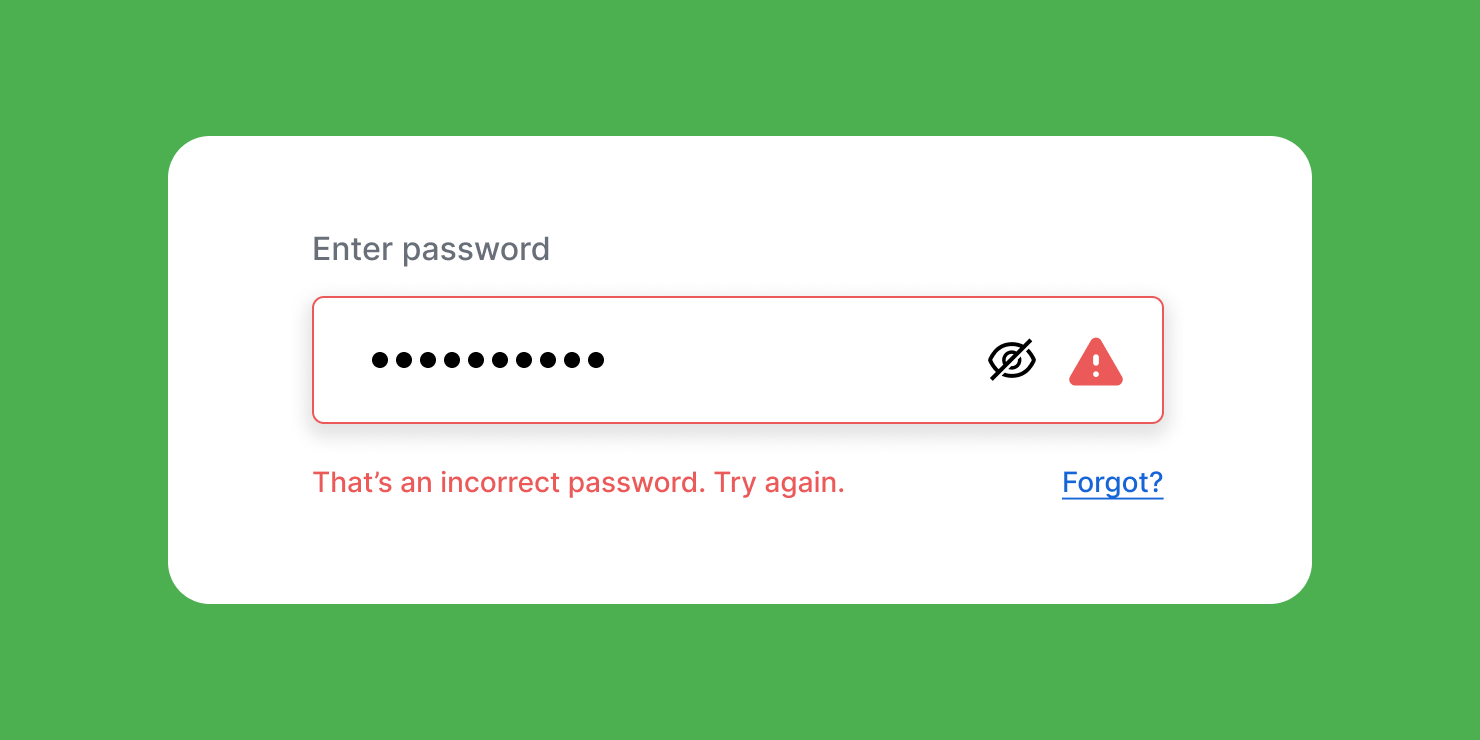
Help Users Recognize, Diagnose, and Recover From Errors
Clearly communicate errors to users in plain language. Giving a code 404 or 504 isn’t very helpful if a user doesn’t know what those mean. Instead, offer help and error messages that tell the user what is happening, and give them a solution to fix it.
Help and Documentation
Provide comprehensive and easily accessible help and documentation when necessary. Make sure users can find help whenever they need guidance. This might be a support email address, a chat bot for assistance, an FAQ section, or even a phone number. Offering help can reduce user frustration and make users feel empowered to try new things on an interface.
Applying Jakob’s 10 Usability Heuristics
As a designer, incorporating these usability heuristics into your design process can greatly enhance the user experience. Treat these as guiding principles when you create a wireframe, a prototype and a final design. It’s helpful to conduct usability tests along the way, so you can get feedback and iterate during the process. As you refine designs, always view them through the lens of the user, by asking the questions that the 10 Usability Heuristics pose.
Conclusion
Jakob’s 10 Usability Heuristics offer valuable guidelines for UX designers who want to make interfaces that users love. Designing for a wide range of users is not an easy task. But, these guiding principles give standards that, if applied, will help you create interfaces that everyone can use.
By understanding and applying these principles, designers can enhance the usability, efficiency, and satisfaction of the digital experiences they create. Remember to prioritize visibility of system status and let users know what is happening. Match the system with the real world so users are familiar with the terms and icons used. Provide user control and freedom so users guide their own experience. Ensure consistency, prevent errors, reduce cognitive load, offer flexibility, keep the design minimal and clean, assist in error recovery, and provide helpful documentation. By following these heuristics, designers can create more intuitive, accessible interfaces that users enjoy using.