RGB vs. CMYK: The Magic Behind the Colors Explained
For graphic designers and digital artists, it’s important to be able to understand the difference between the two color models, RGB and CMYK, and know when to use each. While these color models might seem similar, they have distinct differences that can affect the final outcome of your designs. In this article we’ll explore what is behind RGB and CMYK colors, how they are formed, and when it's best to use each model.

As a designer or artist new to digital design, knowing this information is important in order to create accurate and vibrant art that will look great both on digital screens and in print. So whether you're a beginner or a seasoned designer, read on to learn about RGB and CMYK colors and how to use them effectively in your work.
What Does RGB Stand For?
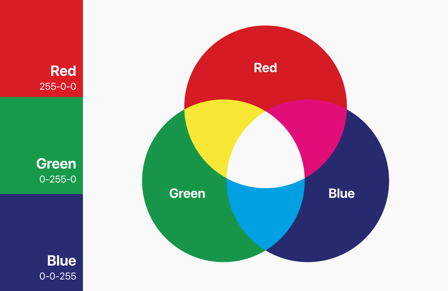
The first color model we’ll look at is RGB, which stands for Red, Green, and Blue. The RGB color model represents the three primary colors of light. When combined at different levels, these three colors can create a wide range of colors. RGB starts with black and adds light to create colors. This is different from other color models, like CMYK, which starts with white and subtracts color to make an image.
How the RGB Model Creates Different Colors
Different colors are created when each component of RGB is assigned a range of intensity, represented by numbers from 0 to 255. When all three colors are combined at full intensity, they create white light. When all three colors are turned off, the result is black. By adjusting the intensity of each color, a wide range of colors can be created, from bright red to dark blue to vibrant green.
How Our Eyes See Color
The total number of colors that can be created is 16,777,216, meaning that RGB offers such a range of colors that the human eye cannot even detect them all. So it is interesting to know that this color model is actually based on the way our eyes perceive color.
Our eyes have three types of color receptors, called cones, that respond to different wavelengths of light. The cones that respond to longer wavelengths are sensitive to red light, and the ones that respond to medium wavelengths are sensitive to green light, while the cones that respond to shorter wavelengths are sensitive to blue light. By adjusting the intensity of each of these colors, the human eye can perceive a wide range of colors.
When to Use RGB Colors
The optimal case to use RGB colors is any situation where colors are displayed on a screen or other digital device. RGB is the standard color model for electronic displays, including computer monitors, televisions, and mobile devices. RGB is also commonly used in digital design, including web design and graphic design.

Examples Where RGB Color Works Best
As a designer, you’ll want to use RGB color for things like:
- Web Design
- App Design
- Digital Branding
- Social Media Content
- Profile Photos
- Icons
- Thumbnails
- Infographics
- Photos for a Website
The CMYK Color Model
CMYK stands for Cyan, Magenta, Yellow, and Key (black). This is a subtractive color model, which means that it starts with white and subtracts color to create an image. The CMYK color model is used in printing, and is based on the way that ink is absorbed into paper. When all four colors are combined at full intensity, they create black. When all four colors are turned off, the result is white.
How Colors Are Made in CMYK
Colors in CMYK are formed by subtracting different amounts of cyan, magenta, yellow, and black ink from white paper. By adjusting the amount of each color, a wide range of colors can be created, from light pastels to dark, rich colors. On a lighter, generally white background, the CMYK model partially or completely conceals colors. Looking closely at a printed image magnified many times, you’ll notice that the image is actually composed of small dots. Each of the four colors is represented in a transparent overlay of dots, each in different intensity. The CMYK color formulas are represented in percentages from 1–100%.

When to Use CMYK Color
The best case to use CMYK is any instance where colors will be printed, including brochures, flyers, business cards, and other physically printed materials. CMYK is the standard color model for offset printing and digital printing, including inkjet and laser printers.

Viewing CMYK Colors on a Screen
When viewing CMYK colors on a screen, the colors may appear slightly different than they do in print. This is because screens use RGB colors to display images, so the colors may not translate exactly from CMYK to RGB. Designers can use color calibration tools to ensure that their colors are as accurate as possible across different devices and mediums.

Examples Where CMYK Color Works Best
As an artist, you would commonly use the CMYK Color Model for things like:
- Physical Merchandise
- Business Cards
- Magazine Photos
- Brochures
- Printed Ads
- Billboards
- Any Large Format Designs
- Books
- Packaging Design
Why Choosing the Right Color Mode Is Important
Color modes matter because different devices and mediums have different color capabilities. When designing for digital screens, RGB is the standard color model, while for printing, CMYK is the standard. By using the appropriate color mode for each medium, you can ensure that the colors will look as intended in your designs. When designing digitally for print, most of the top graphic design apps offer CMYK color support, as well as RGB color. When using Amadine, Adobe Photoshop, InDesign and CorelDRAW, you’ll find you can work in the CMYK color mode.
In conclusion, understanding RGB and CMYK color models is essential for anyone working with digital or print media. Knowing the science behind these color models and how colors are formed, any artist can create accurate and vibrant images that look great on any screen or printed material.