How to Draw an Abstract Letter in Amadine
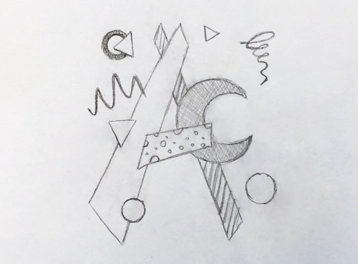
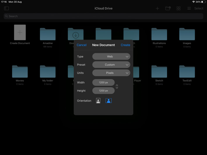
Let’s start from creating a document of the required size. In our case it will be a square of 1200 × 1200 pixels. You can create a document of your own size, as long as the orientation of the canvas matches the composition. If we have a sketch, we import it using > (or Drag & Drop on macOS).
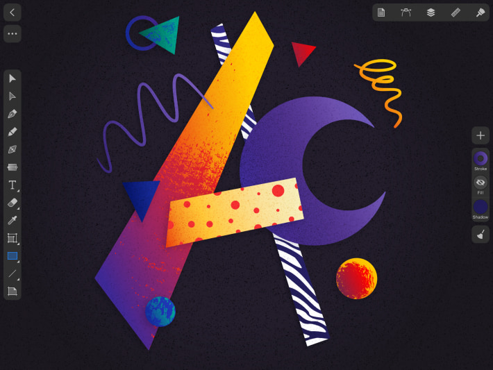
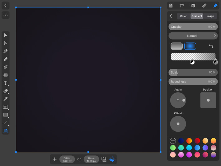
Then we create a square background the same size as our canvas using the . First, set the background Fill > Color #1D1824, then on top add another Fill > Gradient, Radial, Scale 50%, where there will be two dots with color #101010, one of them has opacity of the current color 0, the second has 50. Shift the color with a transparency of 0 to the middle of the gradient line as shown in the screenshot below. the background by clicking on the lock in front of our background in the Layers panel. If you are using a sketch, you can create the background later and draw the illustration over the sketch. You can even place the sketch next to our future image to look at it in the process. Don’t forget to also the sketch layer in the Layers panel. For convenience, you can leave the background and the sketch on one layer, lock it , and create a new layer to draw the illustration itself. On a Mac and iPad you can click on the at the bottom of the Layers panel, on iPad and iPhone this can also be done through the .
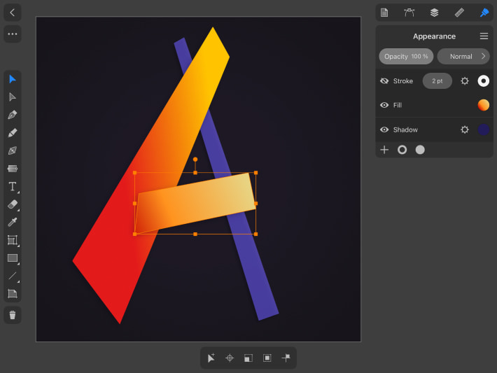
Next, using the or the , we need to draw the elements of our letter. We draw the letter A, respectively, its main elements are two intersecting vertical lines and one horizontal line in the middle. Our goal is to create an unusual shape, so try to draw not just straight lines or rectangles. Play around with the shape, move the points of the figures so that they turn out to be asymmetrical, possibly of different thicknesses and heights, arrange them in space at different angles so that they seem to float in the air. For the wide shape on the right, set the Fill > Gradient from red #E31A1A to yellow #FFC400. Also add a Shadow with the following parameters: Color #211C59, Opacity 30%, Offset 10 px, Blur 22 px, Angle 138°, Blend Mode Multiply. We will add this shadow to all elements of the illustration. You can vary the parameters depending on the effect you want to achieve. We will fill the second line of the letter A with a bitmap texture, so now you can leave it with any color. For the horizontal shape, set a Fill > Gradient with colors #C20000, #FF931E and #E8D382. We also should add the same shadow as the large line of the letter.
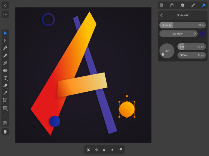
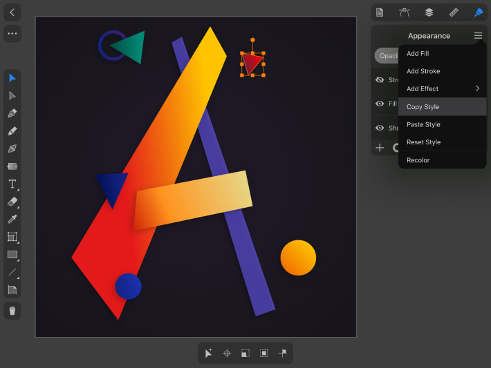
Next, we will create other shapes that will complement the composition. In our case these are circles, triangles, a ring, a curved line similar to a zigzag and a spiral. Draw circles and a ring using the . By holding one finger on the iPad or iPhone screen while drawing, we maintain the proportions of the shapes (on a Mac, hold down the Shift key to do this). Set Fill to the circles, add an orange-yellow Gradient from #F06E00 to #FFC400 for a larger circle, and a blue Gradient from #122383 to #1D35BA for a smaller circle. Also add Shadow to the circles with the same parameters as was indicated above. Turn off the Fill of the ring, set the Stroke to 12 pt and the Stroke > Gradient from #12227D to #342076. Add a Shadow to the ring, all the parameters are the same as for the other shapes, only the opacity is changed to 40%. Shape styles (colors, shadows, effects) can be copied and pasted to another object, this can be done through the menu on iOS / iPadOS or in the object’s context menu by right-clicking on macOS.
Triangles can be drawn using the or the , specifying the number of sides 3 in the Control panel. In the first case, we will most likely get an asymmetric triangle, and in the second—perfectly equilateral. If you want to change the shape of the triangle drawn with the Polygon Tool, you must first make an Expand. This function can be found in the inspector in the on iOS / iPadOS or in the Modify menu on macOS. Then you can move the points of the triangle with the . Place one triangle so that it slightly covers the ring, give it a green Fill > Gradient #00483D and #008874 and Shadow. Paint the second triangle with a blue Gradient with colors #000B4F and #12227D, also add a Shadow. And for the last small triangle, set a red Gradient #601E3E, #FF0000 plus Shadow.
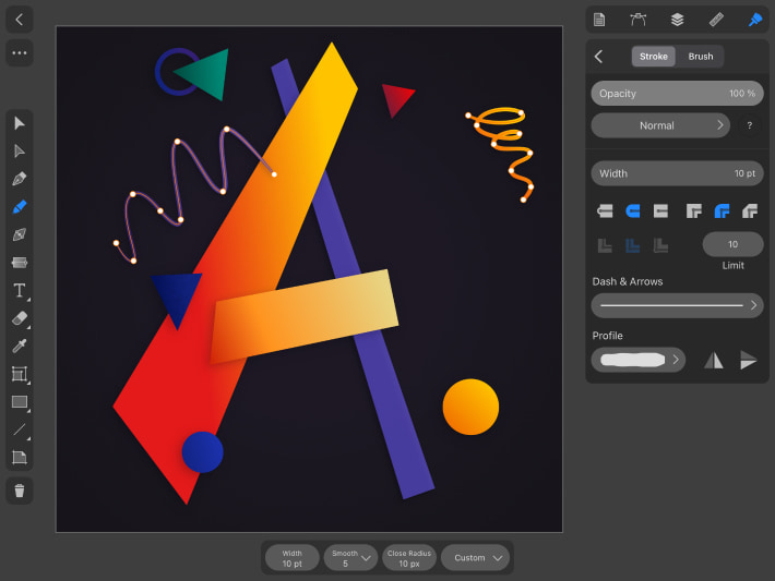
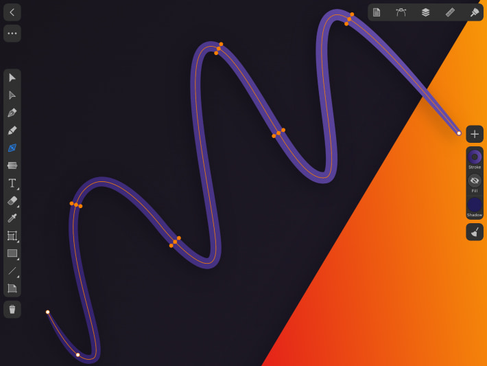
Next, select the , set the Control panel to value Smooth 5 and draw curved lines. By changing the value of the Smooth parameter, you adjust the smoothing of the line. You can also enable the Pressure parameter in the Control panel. If you can’t draw the desired shape right away by hand, don’t worry, you can correct the points, segments and form of the shape using the and the . The Control panel has a mode for the Selection Tool that allows you to move not only points and handles, but directly the segments themselves. To make the lines more interesting, use the to make the middle of the line thicker, and the edges, on the contrary, thinner. In Stroke settings, add a rounded edge for the ends of our lines. To preserve this line style for further drawing, select the Custom profile in the Control panel for the Draw Tool. Set the curved zigzag line to a Stroke of 10 pt and a Purple Gradient from #29195F to #644CA8, add Shadow. The spiral curve also has a Stroke of 10 pt, a Stroke of a Gradient from red #E31A1A to yellow #FFC400, and Shadow.
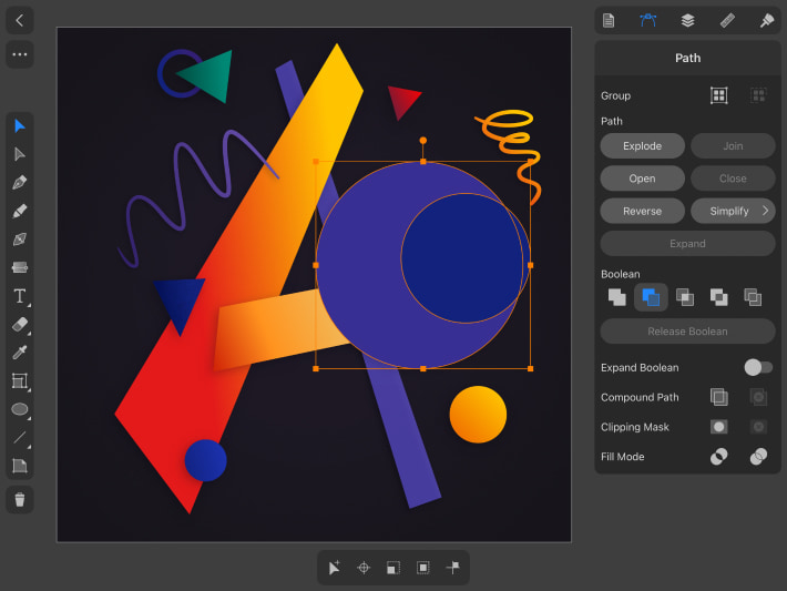
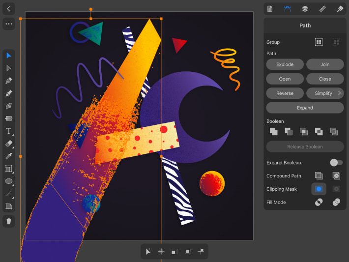
There is another large crescent moon-shaped element in the composition of our letter. We create it this way: first draw a circle with the keeping the proportions, draw another smaller circle on top and place it on the right edge of the large circle. Select both circles and use Boolean operations— to cut out a part from the large circle to get a shape that resembles a crescent moon. On iOS / iPadOS you will find Boolean operations in the in the inspector, on macOS they will appear in the Control panel at the top of the screen when you select objects. Before we Expand, we can move both circles and find the best shape. When the shape of the moon suits us, we Expand and set Fill > Color #5C4AAA. Next, add another Fill > Gradient from transparent #4C0037 (set opacity of the current color 0 in the color settings), to the color #5C4AAA. Make sure that in the Appearance panel list this gradient is located above the color that we added at the beginning. Next add another Fill > Gradient first color #6B56C7 with transparency 85 in opacity of the current color, second color #FF0000 with opacity of the current color 0 and add Shadow. At this stage, our crescent moon should have one Fill with a solid color and two gradients with transparencies. In the , move the moon shape under the middle part of the letter A. Next, we’ll start adding textures to our objects.
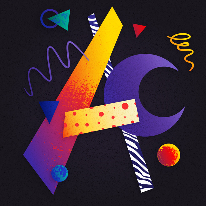
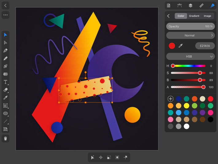
For the horizontal line of our letter A, let’s create something like a small pattern of circles. We will choose a simpler creative option, so let’s draw a certain number of circles of different sizes so that they go beyond the boundaries of our letter shape and group them. Set the color of the circles to #E21A1A. Next, duplicate the shape using > , place a copy of the shape above the group with circles in the and create a , on iOS / iPadOS this can be done through the > , on macOS menu Modify > Make Clipping Mask.
We have predetermined approximately which textures we want to see in our illustration. The letter A uses raster textures (pictures downloaded from the Internet) and vector elements of texture brushes, which can be found in vector EPS and SVG formats also on the Internet.
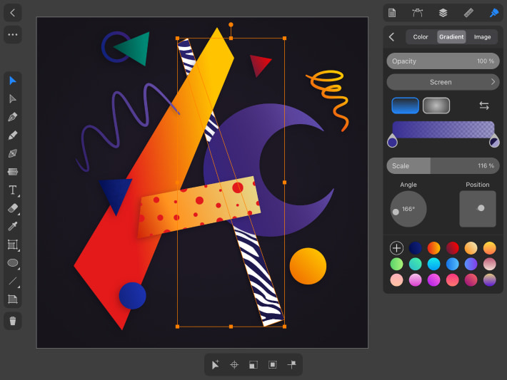
For the thinner element of the letter A on the right, we have chosen a texture that resembles a zebra pattern. In this case, we will use Fill > Image, where you can adjust the settings—scale, rotation, etc. You can choose the pictures and textures that you like and achieve other interesting results. Since our texture is black and white, add a Fill > Gradient on top with two #382F93 color pillars, one with opacity of the current color 50 and Blend Mode for the entire Screen gradient. You can experiment with blending modes and opacity of gradients and textures.
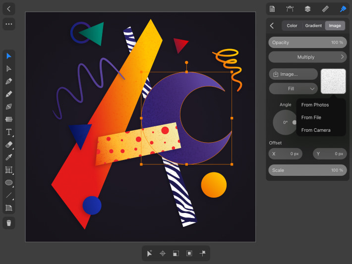
For the shapes outlining our letter, along with the crescent moon and blue triangle we use a noise texture. You can add it with a or you can also use Fill > Image. If we use a Clipping Mask, then we place the picture in the document using > (on macOS, you can also do this using Drag & Drop), place the picture under the copy of our shape and create a in the . We apply the noise texture in Blend Mode Multiply for dark shapes, Blend Mode Soft Light or Overlay for light ones, depending on the density of the texture, you can use transparency. You can experiment and try other blending modes.
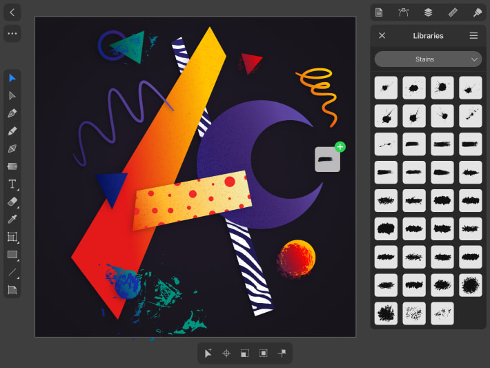
The grunge vector elements resembling strokes and scratches can be taken from the library of the Amadine app. In the , select (on macOS Window > Libraries), in the panel that opens, select the Stains category and drag out several objects in the form of brush strokes. This can be done using tap (or click for macOS) on an object or drag & drop. Increase the object to the desired size using the while holding your finger on the canvas (or Shift on the mac). If you want to use your own vector elements, then import them via > . We apply vector elements to our objects using a . The vector shape we have placed in the mask will have a Fill > Gradient from #33217D to #E51C1C. We will also add vector texture elements to the rest of the shapes—circles and triangles. Let’s assign gradients to the texture elements. For the yellow circle it will be a red Gradient #601E3E, #FF0000, for a texture on a blue circle Gradient #132589, #00947F, on a green triangle Gradient #132589, #007894, on a red triangle we will assign a texture element Fill > Color #E1070E.
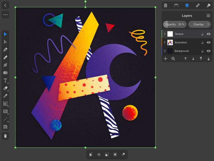
To add texture to the background, unlock it on the layers and use Fill > Image to add a picture with the texture. Use Blend Mode > Multiply. Next, create a new layer above all the layers of our illustration. Add another light texture that is common for the whole picture, it can be noise or scratches, choose what you can find on the Internet or create it yourself. We will add this texture as a picture via Menu > Import, give it a transparency of 10% and Blend Mode > Overlay. This final texture should be light and not overpowering, but just create an overall background for the illustration.
Try not to overload the illustration and keep the balance between simple shapes and complex elements, harmoniously combining colors. The illustration is ready—letter A in abstract style. You can use this technique and try to create other letters, numbers or objects in a similar style. Look for inspiration from abstract or cubist artists such as Picasso, Kandinsky and others, as well as contemporary designers. If you are in search of motivation, you can look up the ideas in the article about finding graphic design inspiration.