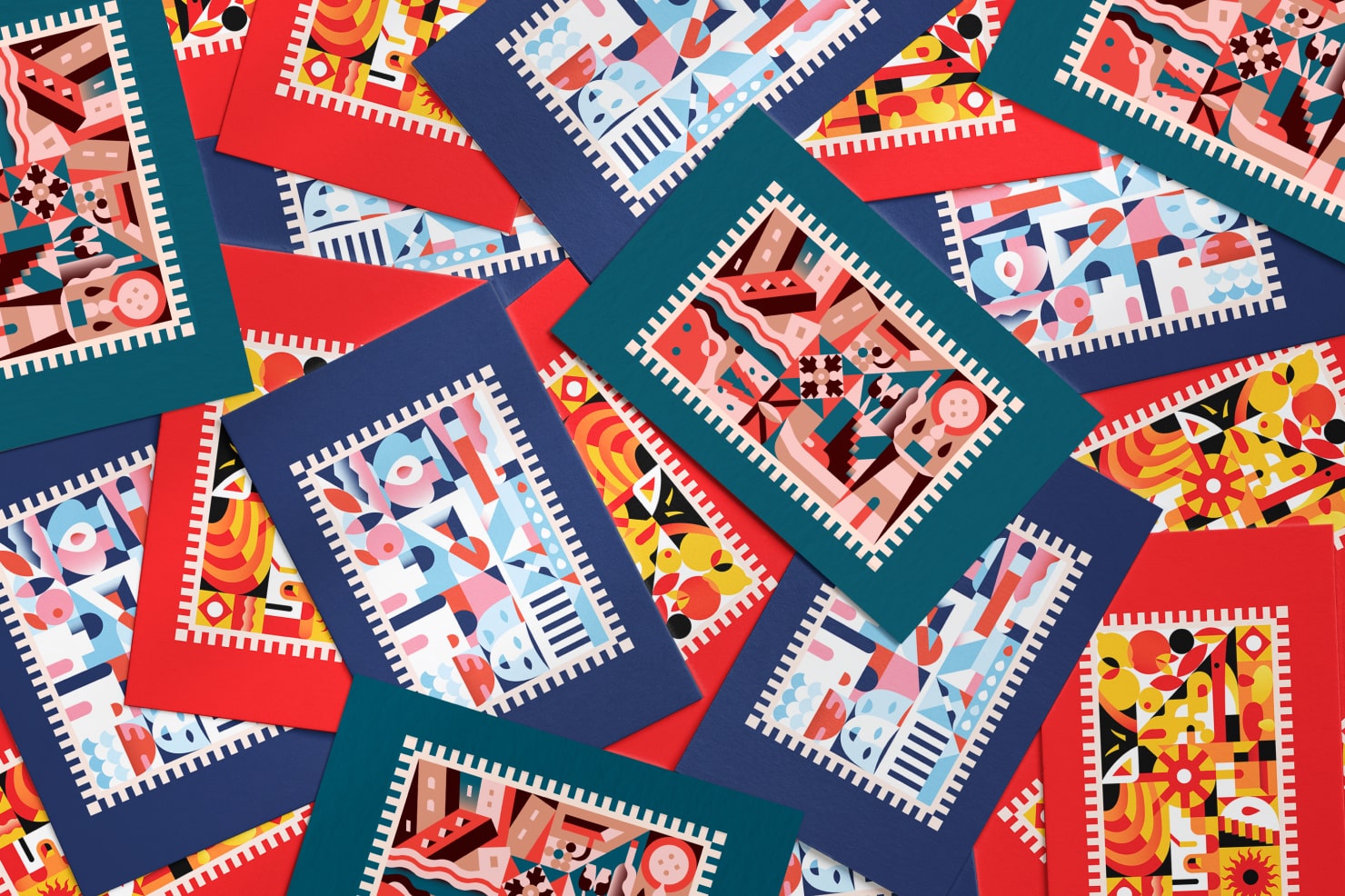
Preparing Amadine Files for Printing
As an artist working in digital media, one of the skills you’ll want to become proficient in is how to properly prepare your art files for different purposes. One of the advantages of creating vector files in Amadine is that your designs will have a wide range of applications, including printing in large format. When there are vector designs that you’d like to print, you’ll want to learn to prepare your Amadine vector files for a print shop. Sure, if a print shop has some requirements for the files, then these requirements must be met. However, in this article we will focus on cases where there are no requirements or they are not clear enough to follow straightforwardly.
The Right Resolution for Professional Printing
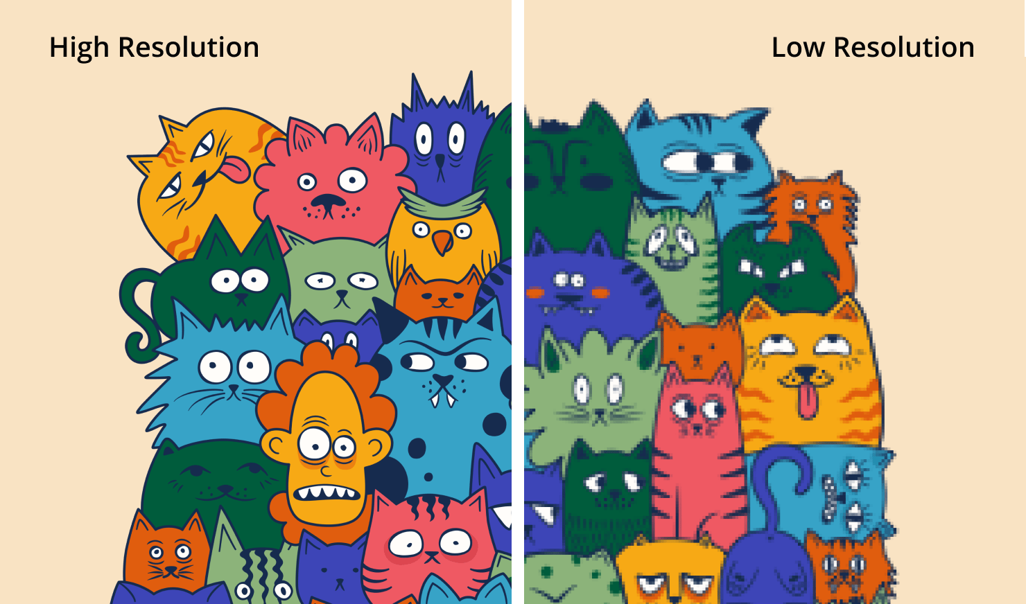
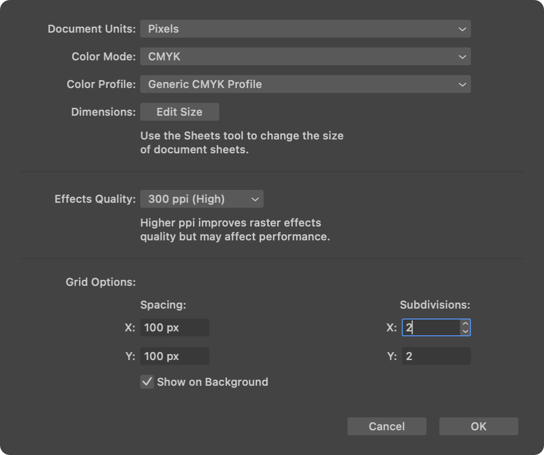
When it comes to vector design, we usually talk about resolution in two ways. First, when bitmap effects like Shadow or Glow are used in the design, as well as textures, which can also be applied to shapes. In this case, the original resolution of effects and textures will affect the quality of the printed image. Thus, you need to take care of the resolution of raster images added to the document as a background or a texture. For high-quality print media, your raster images must be at a resolution of at least 300 dpi (dots per inch). Anything lower than 300 dpi may result in blurry and pixelated images.
The second case where we may encounter resolution values is when exporting to a graphic file for a print shop. This resolution can be set in the Amadine Export dialog on a Mac, or Export panel on your iPad or iPhone. For PDF and EPS formats, we will only focus on raster design elements quality. In raster formats (for example, TIFF), the whole design converts to raster completely. The most important thing here is to consider the resolution while exporting, so that your document appears optimal when printed. However, if you need to export 100% vector design and/or text to PDF, you don’t have to worry about resolution.
The Correct Color Mode: CMYK, Not RGB
Something you need to keep in mind is that colors on the screen may not match those on paper, so it’s key to use the appropriate color model (CMYK or RGB) to make sure colors translate from the screen to the printed version. CMYK (Cyan, Magenta, Yellow, and Black) is the standard color space for printing, while RGB (Red, Green, and Blue) is used for digital displays. In fact, CMYK is needed for accurate color rendering, so if the customer does not care about the colors—you can hand over RGB. The same goes for the designs with few colors, which are not bright. Here RGB is also suitable for printing.
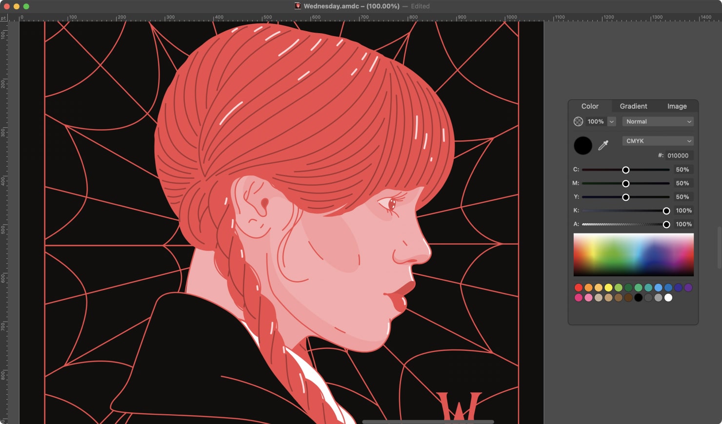
But if you need your documents to look in print exactly as on screen, you’ll have to add graphics to the document in the CMYK color mode. The Amadine app is rather convenient for such tasks: if your document is not already in CMYK, the app will automatically convert it to CMYK. When creating a document for printing, go to Document Settings on a Mac and select CMYK in the File > Document Setup > Color Mode menu. On iPad or iPhone, Document Settings will show RGB and CMYK options under Color Mode.
Use a CMYK Color Scheme for Vector Objects
In some cases, CMYK color model may not be enough to be set on the document level. In addition to the color profile of the document, it is important to use the CMYK color scheme everywhere, for all vector objects, e.g. when choosing the color of a line, fill, gradients and effects.
It is also necessary to avoid using opacity and alpha channels as much as possible, as the print result will differ from the image on the screen. In any case, we recommend printing a small tester document to make sure that neither software nor printer spoils the design.
Balancing the Mix of Base Colors
From a practical point of view, the designer does not have to check how black is produced for each object. But it’s better to be on the safe side and to be able to look into every nook and cranny when planning for a perfect print. In theory, the program should set acceptable black color intensity by default, as does Amadine when converting RGB into CMYK. So this section is more educational in its nature.
You can easily adjust the intensity of the four colors in the CMYK profile for your design in Amadine, using sliders for each. If you have a lot of texts, the full black (0 0 0 100) is pretty reliable, but doesn’t produce rich black color for the backgrounds, illustrations, etc. Rich black is made by adding other Cian, Magenta and Yellow colors to full black. But this black is better to use when there are other colors around. If the black spot stands alone, the effect of mismatching can come out which will lead to a colored halo around the black spot.
Note that when a large amount of different inks is used, such as in the case of achieving rich black ink (e.g. 65 54 70 100), this can cause the paper to become too saturated with ink, resulting in a “wet” appearance that can affect the quality of the printed material. To prevent this, printers often recommend that you limit the amount of ink used by adding 50% for each non-key color (50 50 50 100 maximum), in order to achieve a more balanced result. This also helps to avoid issues such as ink bleeding, smudging or pooling on the printed material.
Converting Text Into Curves for a Print Shop
One more step in preparing your vector art for publishing is to convert any text into curves before exporting to vector formats, such as PDF. The way text appears in a design on your screen might be completely different from the way another user sees it on their screen if they don’t have the same font installed. This can become quite an issue, when sending a design to the printer. To solve this, you’ll want to convert any text to curves, so that it becomes a part of the whole vector art. It will look exactly like your text but have no quality loss when you scale up and no further connection to the font. This simple step ensures the design won’t have any font-related errors.
Be sure to check spelling and punctuation to avoid mistakes before converting text. Once the text is converted to vector art, it can’t be changed, and one mistake would require you to recreate the whole image. By following these tips, you can prepare a high-quality vector file with text for a print shop or a home printer that will look great on paper.
We highly recommend converting the text to curves in a copy of the design, so that the text remains editable in the original file. Keep in mind that all the above advice only makes sense when exporting your design to PDF. When exporting to a raster format, you do not need to convert anything—the text turns into a picture, as was mentioned before.
File Formats in Amadine
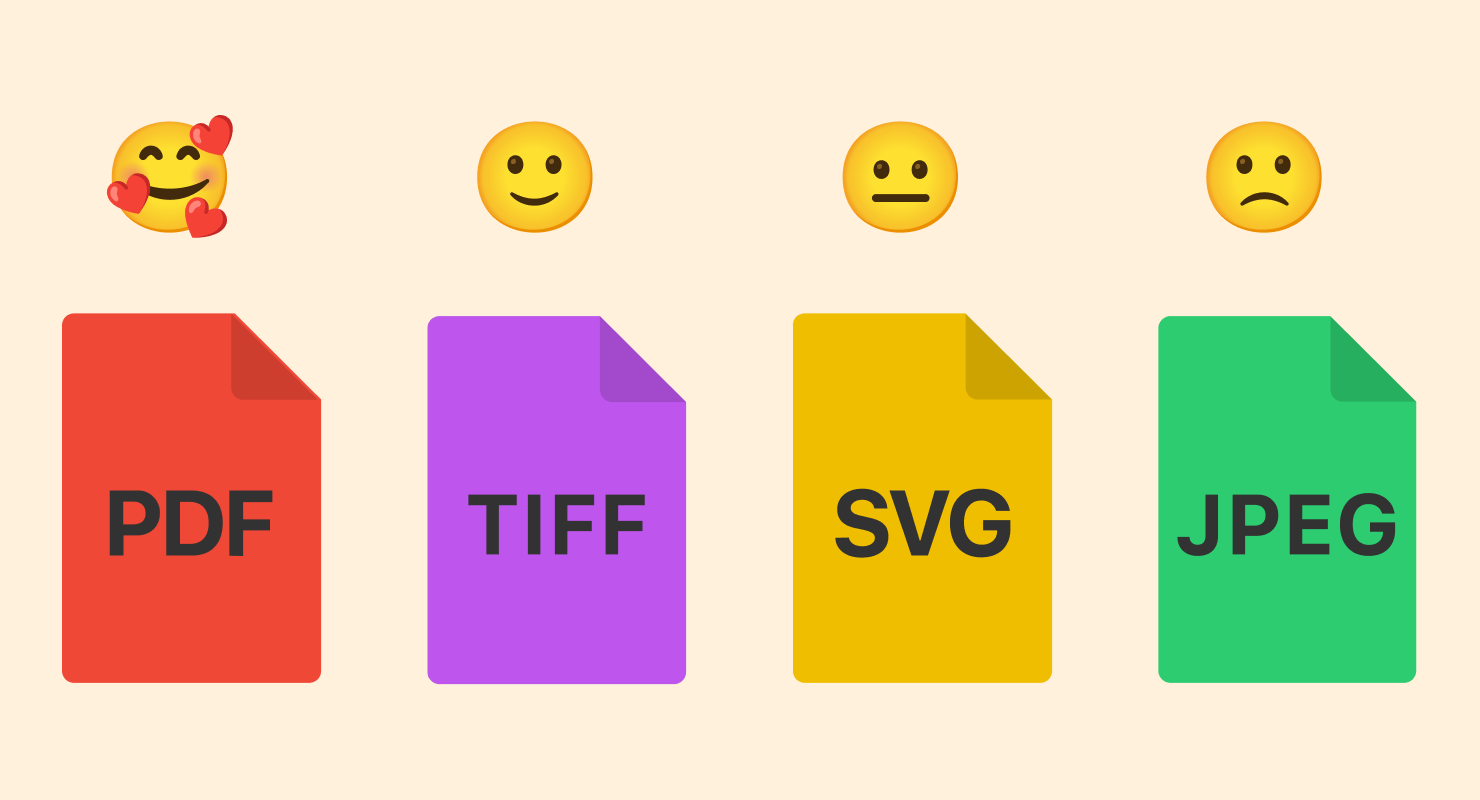
When it comes to file formats, it is important to find out the printing company’s file format preference before uploading your work to them. Almost all print shops accept materials in PDF and TIFF formats. PDF is preferable, as it will preserve all vector parts of the document intact. Amadine allows you to save your design in both of these formats with the required quality. Using JPEG file format is not recommended, as it loses quality due to compression. Strictly vector formats like SVG are usually not the best choice either, as they require separate software to be correctly shown.
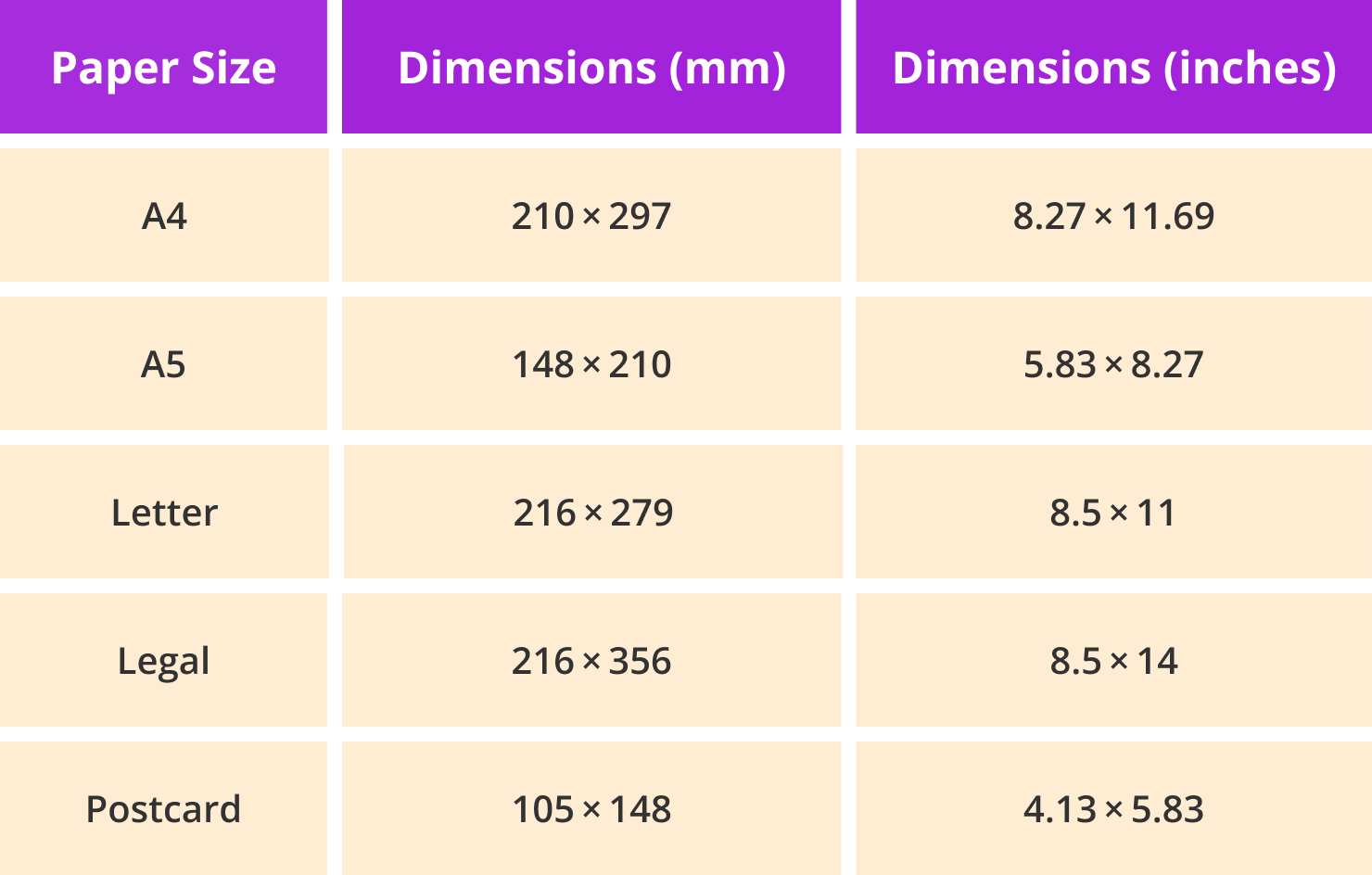
The Most Popular Paper Sizes
Finally, paper size, crop marks, and bleeds are other important considerations when preparing the file for printing. Typical paper sizes include A4, A5, and US Letter—8½ × 11 inches.
Bleed Areas in Preparing Your Design
When designing a file for print, consider the bleed area. A bleed refers to the area of a design that extends beyond the final size of the printed page. This area is added to make sure that when a page is trimmed to the final size, there are no white borders around the design.
Commercial printers use paper that is larger than the final page size to print a design with bleeds. After printing, the paper is trimmed to the final size, which removes any excess bleed area and creates a design that extends to the very edges of the page. It is a good idea to include a bleed of at least 3mm (about 0.125 inches) on all sides to ensure that the design extends beyond the edge of the paper. This ensures that there are no white edges after the design is cut to size.
Crop Marks for the Printer
Providing cutting guides with your design will help the print shop align the paper before cutting. Crop marks are small lines, one vertical and one horizontal, that appear at each corner of a printing document to show the printer where to cut the page. These marks are not visible while you are designing your print file, but can be added when saving the file as a PDF. Make sure to set up crop marks as a separate layer in the design file, so they can be easily removed before printing.
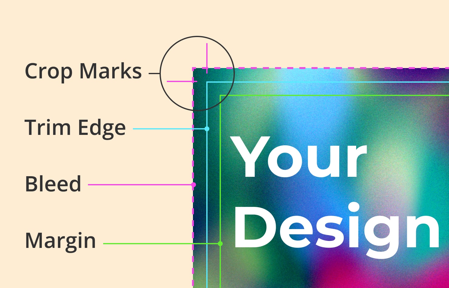
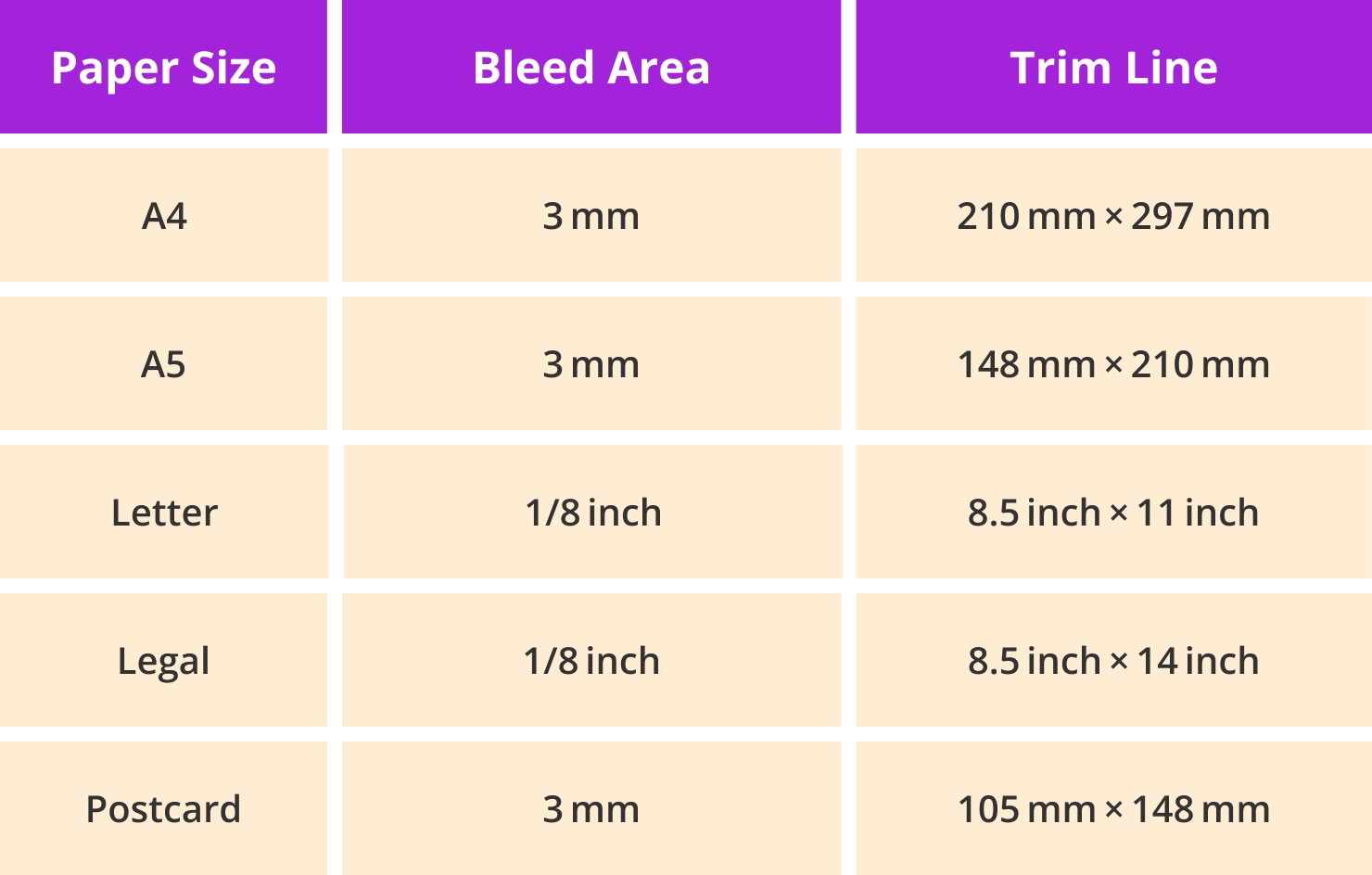
Paper Sizes, Bleed Areas and Trim Lines
Check out the most common paper sizes with the bleed areas and trim lines included below.
Key Takeaways for Printing the Amadine Document
The Amadine app makes it easy to prepare your vector file to be professionally printed. Let’s sum up a key checklist of tips to prepare your file:
- Set resolution to a minimum of 300 dpi.
- Convert color mode of the document from RGB to CMYK if requested by the print shop.
- Convert text to curves.
- Use a CMYK color scheme for vector objects: stroke, fill, effects, etc.
- Select the required file format.
- Select the paper size, bleed area and crop marks.
If you take these steps, your vector file will be properly set up to look its best when printed. However, if you are printing something very large or an expensive series, it’s always better to print a tester and make sure that everything looks its best!