Color Calibration Tools for Designers or How to Achieve Accurate Colors
Few things are more frustrating for a designer than finishing a project that looks perfect on screen, only to discover that the printed version appears dull, oversaturated, too warm, or completely different on another device. A carefully selected beige suddenly turns pink. Shadows disappear into black. Brand colors lose consistency across platforms.
This problem usually has nothing to do with your design skills. The real issue is color accuracy.In 2026, graphic designers work across more screens and environments than ever before. A single project may move between an iPad, a MacBook, an external display, a client’s Windows laptop, a print shop proofing system, and social media platforms that compress images differently. Without proper color calibration, maintaining visual consistency becomes almost impossible.
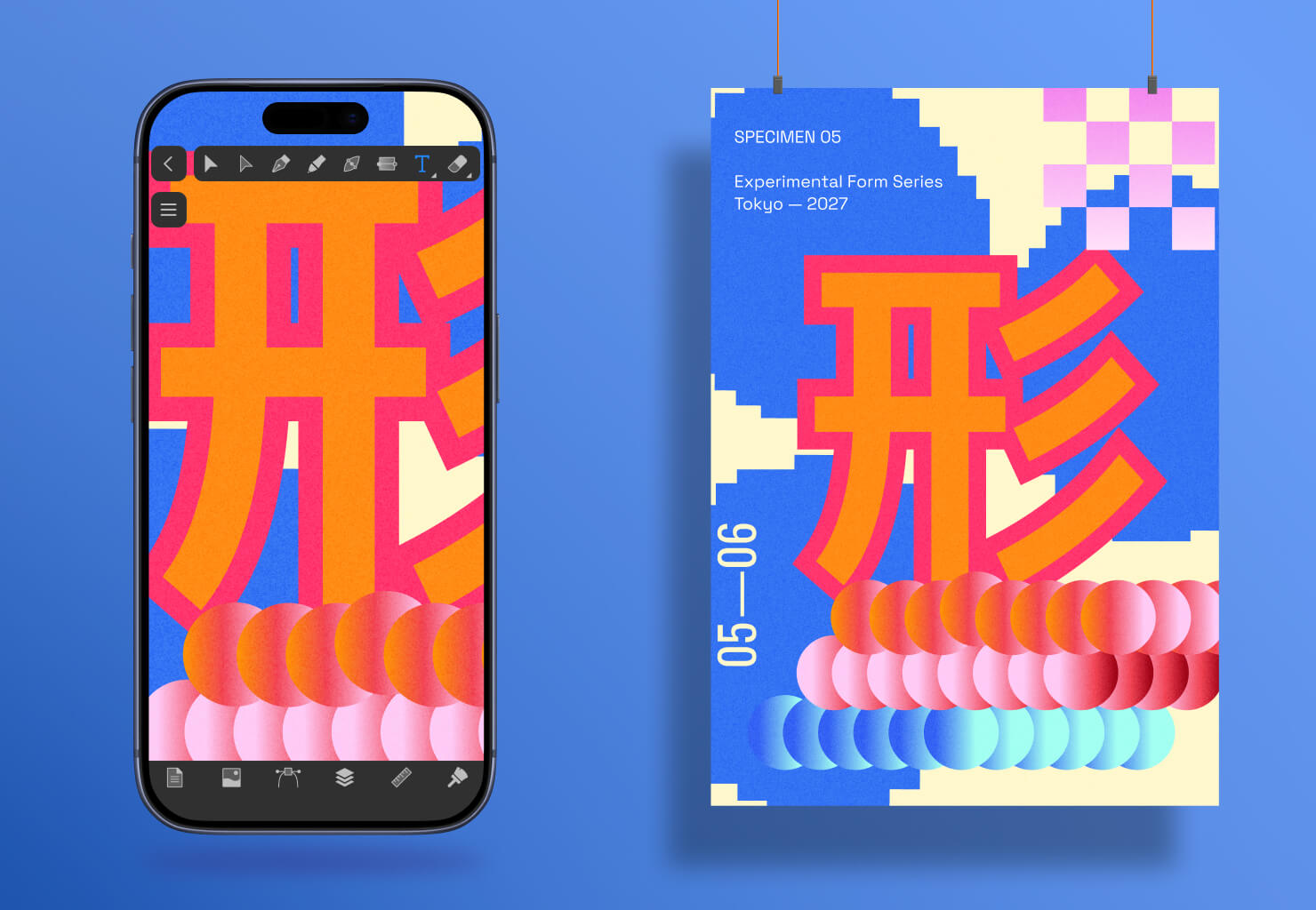
Color calibration tools help designers ensure that colors appear as accurately and consistently as possible across devices and outputs. Whether you create logos, illustrations, UI interfaces, marketing materials, or packaging designs, understanding color calibration has become an essential part of a professional creative workflow.
What Is Color Calibration?
Color calibration is the process of adjusting a display so that it reproduces colors accurately according to established standards.
In simpler terms, calibration helps your monitor display colors closer to “real” or intended values instead of exaggerated or distorted ones.
Most displays are not perfectly accurate out of the box. Many modern screens are intentionally tuned to look brighter, more saturated, or more contrast-heavy because it appears visually impressive in stores. While this may work well for watching movies or casual browsing, it creates problems in professional design work.
It is also important to distinguish between three related concepts:
- Calibration adjusts the display itself.
- Color correction changes colors inside an image or artwork.
- Color management ensures consistent color communication between devices using profiles and standards.
A calibrated monitor becomes a more reliable foundation for all design decisions that follow.
Why Color Accuracy Matters in Graphic Design
Color accuracy is not a niche concern reserved only for photographers or print technicians. It affects nearly every area of modern graphic design.
Branding and Identity Design
Brand identity systems rely heavily on consistency. A company may invest years into building recognition around a specific blue, red, or green tone. If that color shifts noticeably across screens or print materials, the visual identity weakens.
This becomes especially important when designing logos, social media assets, packaging, and advertising campaigns intended to appear unified everywhere.
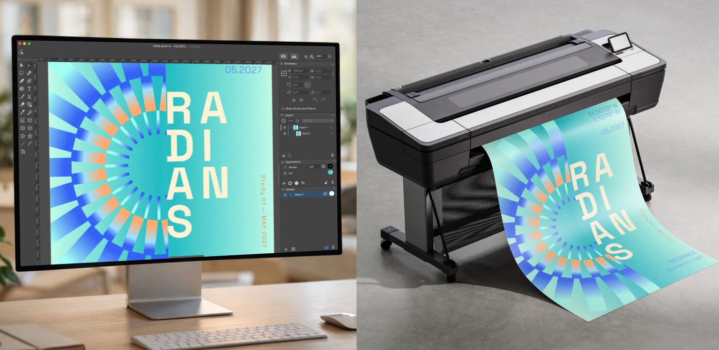
Print Design
Print workflows remain one of the biggest reasons designers calibrate displays.
A design created on an overly cool or overly bright monitor may print significantly darker or warmer than expected. Packaging, brochures, posters, and business cards can become expensive mistakes when screen colors fail to match printed results.
Proper calibration helps reduce the gap between RGB screen previews and CMYK print output.
Digital and UI Design
Modern interface design depends on cross-device consistency. An interface that looks elegant on one screen may appear washed out or overly saturated on another. Designers working on mobile apps, SaaS dashboards, websites, or marketing graphics need predictable color behavior across multiple display types.
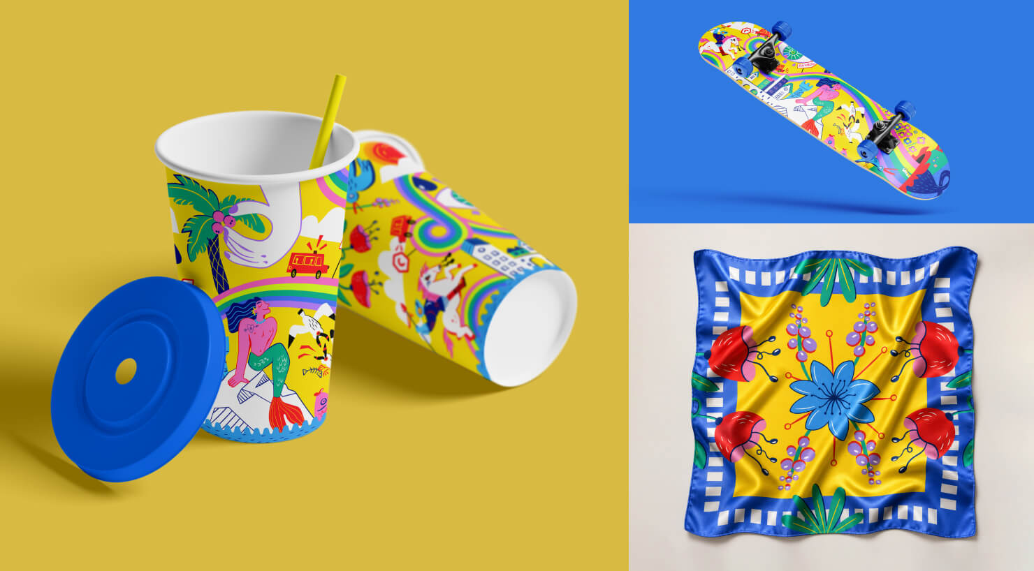
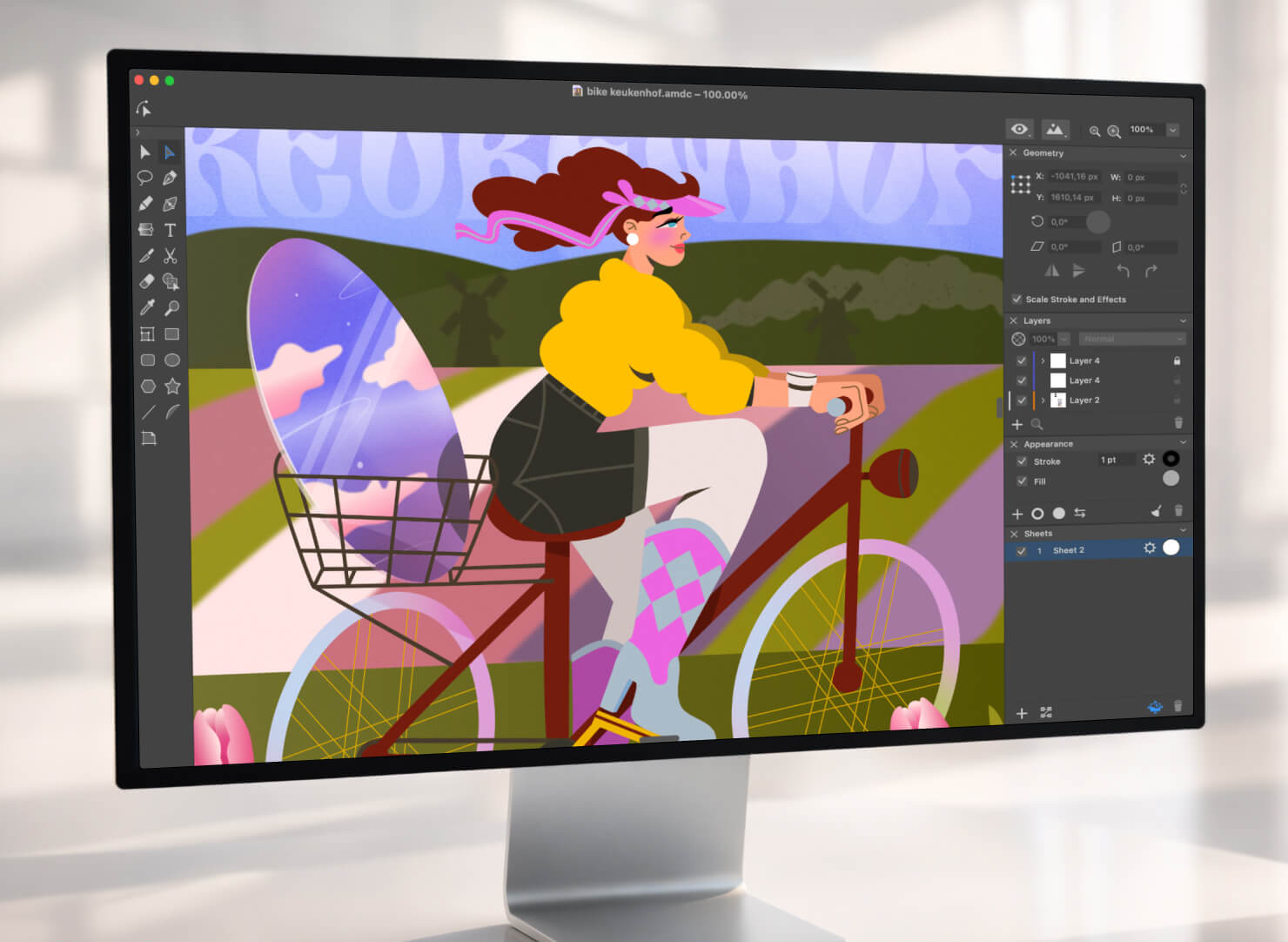
Illustration and Visual Art
Illustrators often work with subtle gradients, lighting transitions, and atmospheric color palettes. Uncalibrated displays may hide details in shadows or distort delicate hues.
This is particularly noticeable in skin tones, environmental illustrations, cinematic gradients, and low-contrast artwork.
Signs Your Monitor Needs Calibration
Many designers work for years without realizing their display is inaccurate. Fortunately, the warning signs are usually obvious once you know what to look for.
Your monitor may need calibration if:
- Printed designs consistently look darker than expected
- Colors appear dramatically different on other devices
- Black areas lose detail and appear “crushed”
- Whites look yellow, blue, or gray
- Clients mention color inconsistencies
- Your display appears unnaturally vivid or oversaturated
- Dual-monitor setups display noticeably different colors
If any of these problems sound familiar, calibration can dramatically improve workflow reliability.
Hardware vs Software Calibration: What’s the Difference?
One of the biggest misconceptions about color calibration is that all methods achieve the same result. In reality, there is a major difference between hardware calibration and software calibration.
Hardware Calibration
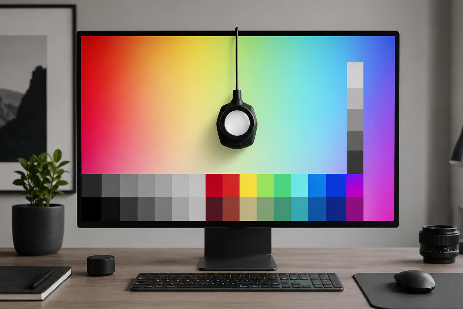
Hardware calibration uses a dedicated external device called a colorimeter or spectrophotometer.
These devices measure the actual colors displayed on your monitor and compare them against standardized target values. The software then creates an ICC color profile that corrects inaccuracies.
Popular calibration hardware in 2026 includes:
- Datacolor Spyder series
- Calibrite Display Pro
- X-Rite legacy devices still used in studios
Hardware calibration provides more precise grayscale reproduction and improved print reliability. Overall, designers may expect significantly higher accuracy with better consistency in their design colors.
Professional print designers, photographers, and brand designers typically rely on hardware calibration because visual guesswork is eliminated.
Software Calibration
Software calibration relies on manual adjustments or built-in operating system tools.
macOS includes a Display Calibrator Assistant, while Windows offers Color Management settings. These tools allow users to adjust gamma, brightness, contrast, and white balance visually.
Software-only calibration is useful for casual creators, beginner designers, and improving obviously inaccurate displays. However, human eyesight adapts quickly to color shifts, making manual calibration less reliable than hardware measurement.
Software calibration is better than ignoring color accuracy entirely, but it cannot match the precision of dedicated calibration devices.
Best Color Calibration Tools for Designers in 2026
Choosing the right color calibration solution depends less on “the best device overall” and more on the type of creative work you actually do. A packaging designer preparing CMYK files for offset printing has very different needs from an illustrator working primarily for Instagram, app stores, or digital publishing.
In 2026, calibration workflows have also become more fragmented because designers increasingly work across multiple screens simultaneously: external monitors, MacBooks, iPads, and even OLED smartphones used for previewing social media graphics. Understanding which tools fit your workflow is far more valuable than chasing the most expensive hardware.
For Professional Print Designers
Designers working in print production require the highest possible level of color consistency. Packaging design, editorial publishing, large-format printing, and brand identity systems depend heavily on accurate CMYK previews and predictable output.
This is where professional calibration ecosystems become essential. Let’s look at the three biggest options.
The Calibrite Display Pro (hardware) series remains one of the most trusted solutions for professional creatives in 2026. It is particularly valued for excellent color accuracy, reliable ICC profile generation, and compatibility with modern OLED and mini-LED displays.
For designers working with print vendors, Calibrite devices help minimize unpleasant surprises during proofing stages. The device measures actual monitor output rather than relying on visual estimation, making it significantly more precise than software-only methods.
BenQ Palette Master (software) is closely tied to BenQ’s professional designer monitors and provides hardware-level calibration support. This distinction matters because hardware-calibrated monitors store correction data directly inside the display itself instead of relying only on operating system adjustments.
BenQ’s ecosystem has become especially popular among editorial designers, photographers, illustrators and hybrid print/digital studios.
Its appeal lies in balancing professional-grade accuracy with a workflow that is less intimidating than some traditional enterprise calibration systems.
Eizo ColorNavigator (software) remains the gold standard for elite color-critical environments. ColorNavigator software paired with Eizo ColorEdge monitors is widely used in high-end publishing, professional photography, prepress production, and color grading studios.
The system is designed for extremely stable long-term color performance. Many Eizo displays even include built-in calibration sensors that automate periodic recalibration. For most casual designers, Eizo may be excessive. But for studios where color precision directly affects expensive production workflows, it remains one of the strongest ecosystems available.
For Freelancers and Illustrators
Not every designer needs enterprise-level calibration hardware. Freelancers, independent illustrators, and digital artists often need practical balance between accuracy, affordability, and simplicity.
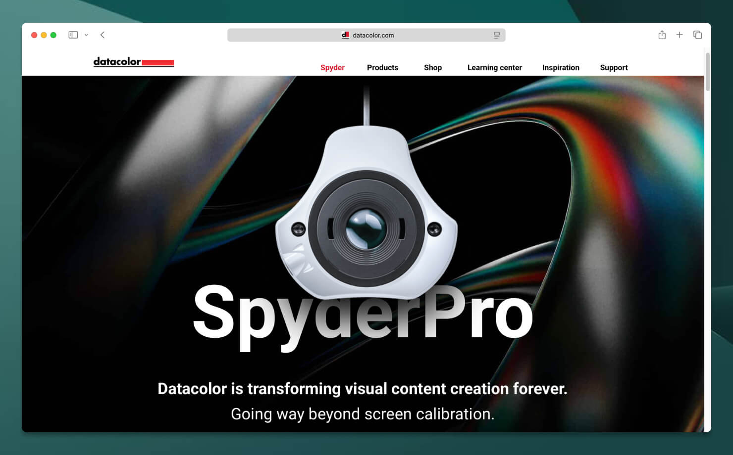
The Datacolor Spyder (hardware) series has become one of the most approachable calibration solutions for creative professionals who want reliable color without building a full prepress environment. Spyder devices are especially useful for digital creators: illustrators, logo designers, social media creators, web designers, and freelancers working remotely.
The software workflow is beginner-friendly while still providing meaningful improvements in color neutrality as well as brightness consistency, shadow detail and gradient smoothness.
This is often the point where many designers first realize how inaccurate their displays were before calibration.
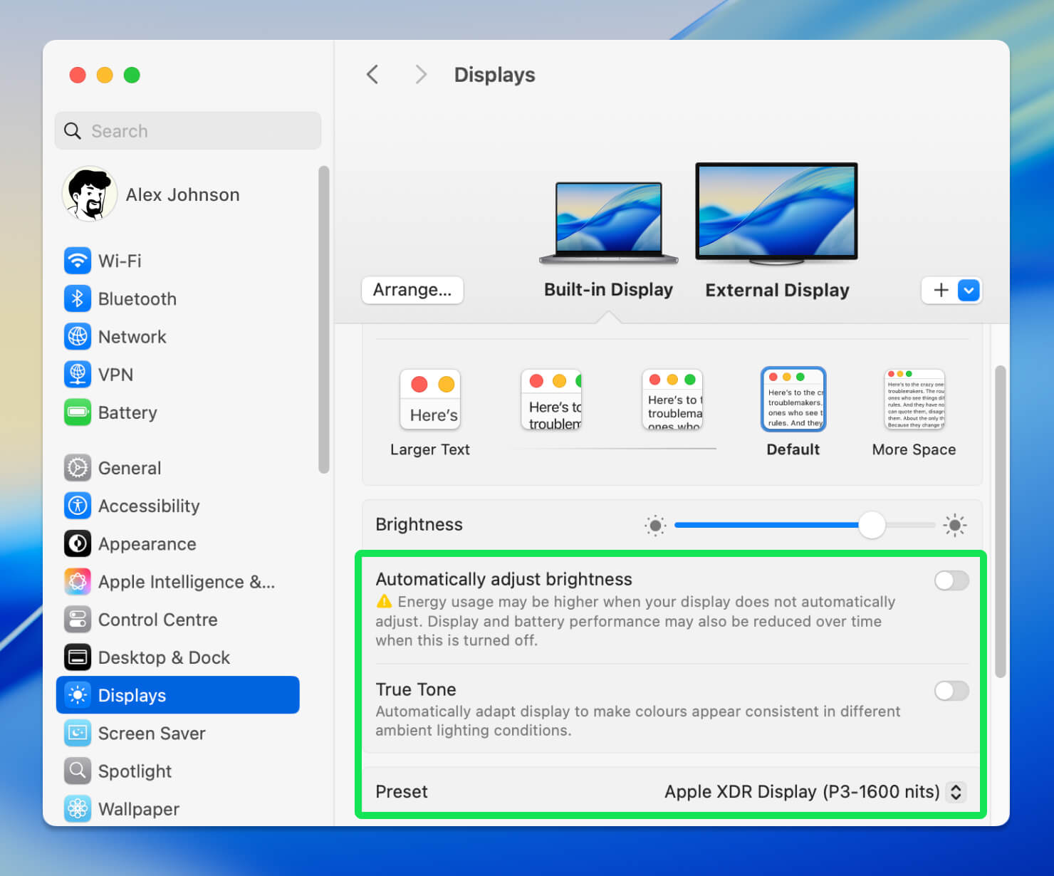
Apple’s built-in macOS Display Calibrator Assistant (software) is not a replacement for hardware calibration, but it remains surprisingly useful for many creators. For beginners or students entering graphic design, it provides a practical starting point for understanding main concepts: gamma, white point, brightness adjustment, and visual neutrality.
The advantage of macOS calibration tools is accessibility. No additional hardware is required, and the process is deeply integrated into the operating system. However, it is important to understand its limitations: human eyesight adapts quickly, which means visual calibration is inherently subjective. Two people may calibrate the same display differently.
Still Apple’s built-in tools can significantly improve color consistency compared to factory default settings.
Color Calibration for iPad and Apple Ecosystem Users
This has become one of the most important calibration discussions in modern graphic design. A growing number of designers now create professional work directly on: iPad Pro, MacBook, Studio Display, and Apple Silicon desktop systems.
Apple displays are among the most color-accurate consumer screens ever produced, but several system features can unintentionally interfere with professional color workflows if left unmanaged.
Liquid Retina and Tandem OLED Displays
Modern iPad Pro models with Tandem OLED technology deliver extraordinary contrast, brightness, and color depth. Similarly, Liquid Retina XDR displays on MacBook Pro devices provide extremely wide color gamuts and impressive HDR capabilities.
For illustrators and interface designers, these displays can feel almost perfect out of the box. However, highly vivid OLED displays sometimes create the illusion that colors are more balanced or detailed than they actually are on standard consumer screens. Designers working primarily on OLED devices should regularly preview projects on secondary displays to ensure broader consistency.
True Tone Issues
True Tone dynamically changes screen color temperature depending on ambient lighting conditions. For everyday use, this feature is excellent. It reduces eye strain and creates a more natural viewing experience. For design work, however, True Tone introduces inconsistency.
If your display becomes warmer or cooler throughout the day, your perception of neutral colors changes as well. A beige interface may slowly drift toward yellow without you realizing it. Professional recommendation: disable True Tone while performing color-sensitive work.
Night Shift Problems
Night Shift presents a similar issue. By intentionally warming display colors in the evening, it fundamentally alters: white balance, grayscale neutrality, and shadow perception.
Designing with Night Shift enabled can result in exports that appear unexpectedly cold or blue on other devices. Many experienced designers create Focus modes or automation routines that disable all these features: Night Shift, True Tone, and adaptive brightness whenever professional creative apps are launched.
Apple Reference Modes
One of the most significant developments in Apple’s professional display ecosystem is the introduction of Reference Modes. Available on newer iPad Pro and MacBook Pro models, these modes allow displays to emulate industry-standard color conditions used in HDTV production, photography, web content and HDR workflows.
For graphic designers, Reference Modes provide a much more controlled environment than standard adaptive display settings. This becomes particularly valuable when working on brand systems, marketing visuals, video thumbnails, and digital illustrations.
While not a replacement for dedicated hardware calibration in professional print environments, Apple’s Reference Modes significantly improve consistency for designers deeply integrated into the Apple ecosystem.
Fortunately, Apple’s ecosystem remains one of the strongest environments for color-managed creative work, especially when designers understand how to control adaptive display features properly instead of leaving everything on automatic settings.
How to Calibrate a Monitor Properly
Good calibration involves more than clicking a single button. A professional workflow usually follows several important steps. First, allow your monitor to warm up for at least 20–30 minutes before calibration. Display colors shift slightly while the panel stabilizes.
Next, disable visual enhancement features such as True Tone, Night Shift, Dynamic Contrast, as well as any Blue-light filters. These technologies intentionally alter color temperature and interfere with accuracy.
Ambient lighting also matters more than many designers realize. A brightly sunlit room changes how your eyes perceive contrast and color balance. Ideally, calibration should happen in consistent neutral lighting.
Most professional workflows target:
- White point: D65
- Gamma: 2.2
- Brightness: around 100–120 cd/m² for print work
After calibration, the software creates an ICC profile that your operating system uses to display colors more accurately.
Calibration is not permanent. Displays drift over time, especially older panels. Many professionals recalibrate every month or every few months.
Common Color Calibration Mistakes
Ironically, some calibration attempts actually make color accuracy worse.
One common mistake is calibrating in an extremely dark room. This often leads designers to increase monitor brightness too aggressively, causing printed work to appear darker later.
Another issue is trusting factory “vivid” modes. These settings may look attractive initially but usually exaggerate saturation and contrast beyond realistic values.
Many designers also forget that printers require separate color management. Even a perfectly calibrated display cannot compensate for poor printer profiles or incorrect print settings.
Dual-monitor inconsistency is another frequent problem. Calibrating only one screen while using both simultaneously can lead to confusing visual discrepancies.
Calibration for Print vs Digital Design
Not every designer needs identical calibration targets.
Print workflows typically prioritize:
- CMYK accuracy
- controlled brightness
- soft proofing
- paper simulation
Digital workflows focus more heavily on:
- RGB consistency
- mobile responsiveness
- web-safe color behavior
- cross-device appearance
This distinction matters because print and screen technologies fundamentally display color differently.
A glowing RGB monitor can reproduce colors that physical ink simply cannot. Calibration helps designers understand and manage those limitations instead of being surprised by them later.
The Future of Color Accuracy in Creative Workflows
Color workflows are becoming increasingly sophisticated. Modern OLED displays, HDR content, and ultra-wide color gamuts provide incredible visual capabilities, but they also introduce new complexity. Designers now work across devices capable of displaying colors differently depending on brightness levels, adaptive settings, and rendering technologies.
Artificial intelligence is also influencing creative workflows. AI-generated images often contain highly saturated palettes and unusual tonal transitions that require careful color management during editing and export.
At the same time, cloud collaboration has made consistency even more important. Teams working remotely across different devices and countries need dependable color workflows to maintain visual coherence.
Color calibration is no longer just a technical concern for specialists. It has become part of the broader language of professional digital production.
FAQ
What is color calibration and why is it important for designers?
Color calibration is the process of adjusting a display so that colors appear accurately and consistently. For graphic designers, photographers, and illustrators, calibration helps ensure that colors look the same across different devices and match printed output as closely as possible.
How often should I calibrate my monitor?
Most professionals recalibrate their monitors every four to eight weeks. Display characteristics gradually change over time, and regular calibration helps maintain consistent color accuracy for design, illustration, and print projects.
Do I need a hardware color calibrator?
A hardware calibrator provides the most accurate results because it measures colors directly from the screen. While software-based calibration tools can improve accuracy, professional designers working with branding, print, or photography generally benefit from using dedicated devices such as Calibrite or Datacolor calibrators.
Can I calibrate a Mac display without additional hardware?
Yes. macOS includes the Display Calibrator Assistant, which allows basic manual calibration. However, for professional color-critical work, a hardware calibrator delivers significantly more accurate and reliable results than manual adjustments.
Does True Tone affect color accuracy?
Yes. True Tone automatically changes the display’s white balance based on ambient lighting conditions. Designers should disable True Tone while working on color-sensitive projects to ensure consistent and predictable color reproduction.
Should designers use Night Shift when working on graphics?
No. Night Shift intentionally shifts colors toward warmer tones to reduce eye strain. While useful for general use, it can distort colors and should be turned off when creating or reviewing design work.
What is an ICC profile?
An ICC profile is a standardized file that describes how a display, printer, or other device reproduces color. Color-managed applications use ICC profiles to maintain consistent colors across different devices and workflows.
Why do printed colors look different from my screen?
Screens emit light using RGB color, while printers reproduce color using CMYK inks. Without proper calibration and color management, differences between display technology, paper, ink, and lighting conditions can cause noticeable color shifts.
Are Apple’s Liquid Retina and Tandem OLED displays suitable for professional design?
Yes. Modern Apple displays offer excellent color accuracy, wide color gamut support, and high brightness levels. When combined with proper calibration, disabled True Tone and Night Shift settings, and appropriate reference modes, they are suitable for many professional design workflows.
What are Apple Reference Modes?
Reference Modes are display presets available on certain iPad Pro and Mac models that target specific professional workflows. They help maintain consistent color reproduction for tasks such as graphic design, photography, video editing, and print preparation./p>
Final Thoughts
Color calibration tools are not about making your display look more impressive. They are about making your work more trustworthy. Accurate color helps designers maintain consistency and reduce printing surprises. Perfect color management also improves client confidence and helps build stronger brand systems. All in all, designers always strive for making better creative decisions.
Whether you work on logos, illustrations, UI design, editorial layouts, or digital campaigns, calibration creates a more dependable visual foundation for your workflow.
In 2026, professional design is increasingly defined by precision across platforms, screens, and formats. And color calibration remains one of the simplest ways to bring that precision into everyday creative work.